You’re probably staring at a blank business card template, wondering what information to include.
Do you include your logo? How do you ensure it aligns with your brand’s visual identity? What typography should you use to represent your brand accurately?
How can you leverage color and layout to create a unique business card?
We’ll walk you through the must-have elements for your business card, offer design tips to make your card stand out, and introduce you to LogoMaker, a powerful tool for creating a unique logo.
What is a business card?
A business card is a small, printed card containing your contact information and other details about you professionally.
When you meet a potential client, partner, or colleague, you give them your business card as a physical reminder of your interaction.
It’s also a reflection of your brand identity. Your card’s design, color scheme, and overall aesthetic say a lot about your business.
Despite technological advancements, business cards remain important for establishing personal relationships with your clients and conveying professionalism.
Benefits of having a business card for owners
Nowadays, emails and social media connections often dominate professional interactions. So, are business cards still in trend? Are they old-fashioned? What benefits do they have?
Let’s explore the benefits of holding onto this seemingly old-fashioned tradition.
1. Enhances professional credibility
Statistics show that 72% of people form an opinion about a company based on the quality of its business card.
A business card that looks professional and feels premium instantly boosts your credibility among peers and potential clients.
When you hand someone a well-crafted business card, you send a message that you take your business seriously and pay attention to detail.
2. Facilitates networking opportunities
Networking is essential for growing your business. Your business card is a key tool for making new connections.
When you attend industry events, conferences, or meetups, having a stack of business cards on hand makes it easy to exchange contact information with potential partners, clients, or collaborators.
Instead of scribbling your phone number on a napkin or trying to remember someone’s email address, you can hand them your business card.
This ensures they have your correct contact details and gives them a tangible reminder of your interaction. It increases the likelihood that they’ll follow up with you.
3. Acts as a direct marketing tool
Interestingly, business cards have an average conversion rate of 12%, significantly higher than websites at 2.35%.
Unlike online ads or mass emails that can be overlooked or forgotten, a business card is a physical object that potential clients might come across multiple times, reminding them of the person and the brand.
Each time you hand out a card, you directly interact with a potential client. The card offers a tangible reminder of your brand that they can refer to when a need for your services arises.
4. Serves as a cost-effective marketing tool
Compared to other forms of advertising, business cards are a relatively low-cost way to promote your brand and reach potential customers.
For a small investment, you can print many cards to distribute at events, meetings, and other networking opportunities.
For example, starting at just $14.95, you can make custom business cards with LogoMaker.
Unlike digital marketing campaigns that require ongoing costs or complex strategies, business cards are a one-time expense that continues to generate leads and sales over time.
Design tips for your own business card
Your card’s design is just as important as the information it contains. The design greatly influences how people perceive your company and whether they engage with your products or services.
The design is so important that 39% of people say they wouldn’t do business with a business that has a cheap-looking business card.
So, designing a business card requires careful consideration of various elements, including:
- Color scheme
- Typography
- Layout
- Overall aesthetic
At the same time, it’s important to balance creativity and clarity. While you want your business card to be memorable and distinctive, you also need to ensure that it’s easy to read and contains all the essential information people need to contact you or learn more about your business.
In this section, we’ll explore three key design tips and what to put on your business card.
1. Utilize high-quality imagery and logos
A well-designed logo and carefully chosen images can significantly impact how your business card is perceived.
You don’t want to use low-quality images, especially for your logo.
A pixelated, blurry, or poorly designed logo will instantly diminish credibility and make your business appear unprofessional. A sharp, clear, and visually appealing logo conveys a sense of professionalism, attention to detail, and commitment to quality.
When designing your logo, consider using a tool like LogoMaker to create a unique and eye-catching design instead of starting from scratch.
LogoMaker is an easy-to-use platform that lets you create professional logos without graphic design experience. With its intuitive interface and wide range of customizable templates, LogoMaker simplifies the logo creation process.
Once you’ve created your logo using our platform, our AI will create various business card designs embellished with your newly made logo.
This ensures that your branding remains consistent across all your marketing materials.
In addition to your logo, incorporate high-quality images into your business card design. Depending on your industry and brand personality, this could include:
- Product photos
- Headshots
- Creative graphics that help tell your brand’s story

Tips for choosing the right images for your business card
Choose images that are clear, compelling, and relevant to your business. They should be high-resolution files that will print clearly and crisply. Low-quality or pixelated images will make your card look amateur and unprofessional.
Also, consider the placement and size of your images on your business card. You want your logo and any other graphics to be prominent enough to be easily noticeable but not so large that they overwhelm the other important information on your card, such as your name, title, and contact details.
One effective strategy is to use your logo as a focal point on one side of your card and then incorporate any additional images or graphics on the other side or in a smaller, secondary position. This creates a balanced and visually appealing layout that draws the eye to your most important branding elements.
Finally, don’t be afraid to get creative with your imagery and logos while maintaining a professional and cohesive overall design.
For example, if you run a sustainable fashion brand, incorporate organic, nature-inspired graphics or images that reflect your commitment to eco-friendly materials and practices.
Or, if you’re a tech startup, use sleek, minimalist designs and high-tech imagery to convey a sense of innovation and cutting-edge technology.
2. Choose the right color scheme
Colors have the power to evoke emotions. convey meaning, and influence how people perceive your business
According to color psychology statistics by Insights In Marketing, 85% of people are heavily influenced by a product’s color.
So, when choosing colors for your business card, consider your brand’s personality, values, and target audience. Different colors communicate different traits and elicit specific responses from viewers.
For example, blue is often associated with trust, reliability, and professionalism, making it a popular choice for corporate and financial industries.
On the other hand, green is frequently linked to growth, harmony, and environmental consciousness, making it well-suited for businesses in the health, wellness, or sustainability sectors.
Also, consider the psychological impact of color combinations. Certain color pairings create visual harmony and balance, while others may clash or appear jarring.
For example, combining blue and white conveys trustworthiness and stability, while bolder choices like red and yellow signal energy and excitement.
How do you know which colors to use? Start with your brand’s existing color palette.
This lets you incorporate the same colors on your website, logo, and other marketing materials to create a cohesive and consistent visual identity across all touchpoints. It helps reinforce your brand recognition and make your business more memorable to potential clients.
Tools for finding the right color scheme
If you don’t have established brand colors yet, several tools and resources are available to help you generate a cohesive and visually appealing color scheme for your business card.
- Adobe Color: Adobe Color is a free online tool for exploring, creating, and saving color schemes. You can also browse user-generated color palettes for inspiration.
- Coolors: Coolors is another popular online color scheme generator. You can create color palettes by manually adjusting sliders, exploring pre-made schemes, or uploading an image to extract its colors.
- Canva Color Palette Generator: To use this Canva tool, upload an image that resonates with your brand. The tool automatically extracts a color scheme based on the image’s dominant hues.
- ColorSpace: ColorSpace provides a color gradient tool, a color name dictionary, and a library of user-created color palettes. The platform also offers suggestions for color combinations.
Additional tips for choosing the right business card colors
When selecting colors, consider the legibility and readability of your business card.
Your chosen colors should provide sufficient contrast between the text and background. Dark text on a light background or light text on a dark background is generally the most readable combination.
Avoid mistakes like using colors that are too similar in tone or brightness. This can make your text difficult to distinguish.
In addition to the main colors on your business card, consider the impact of any images, graphics, or textures you include. These should complement your chosen color scheme and contribute to the overall visual appeal of your design.
For example, if you’re using a minimalist color palette with a lot of white space, incorporate a subtle texture or pattern to add depth and interest to your card.
Alternatively, if you’re using LogoMaker to create your business card, you can choose from our pre-designed templates.
We offer business card templates for over a dozen categories, each with a unique color scheme and design elements.
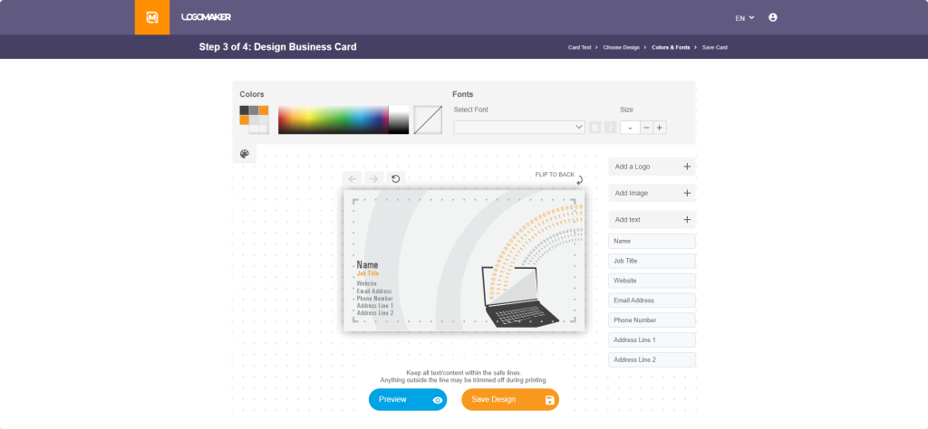
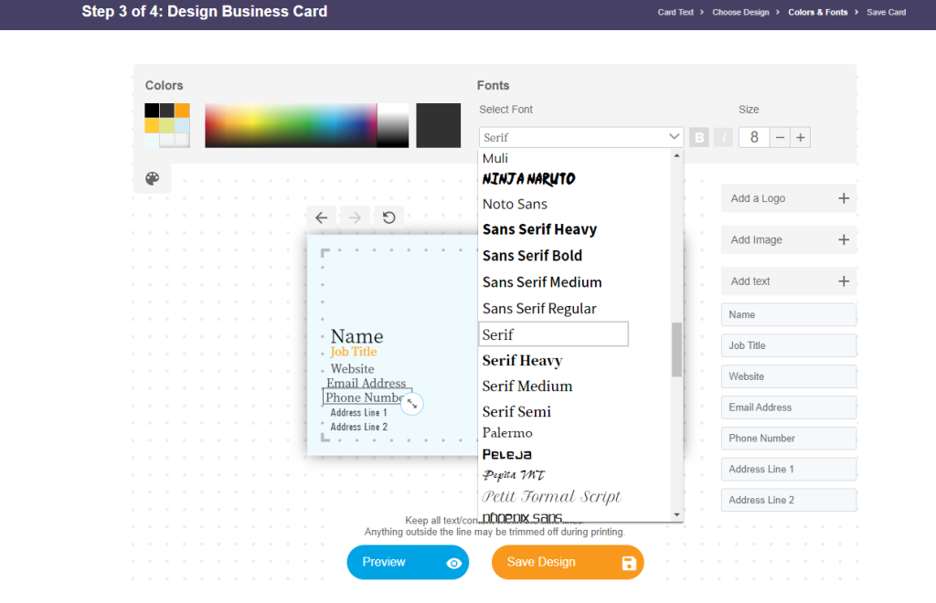
Click on the template you like to start customizing it in our in-browser editor. In the editor, you’ll be able to play around with the different elements and make it perfect for your business.

3. Pay attention to typography
Typography is a crucial element of business card design that often goes overlooked.
Typography is the technique of arranging type (letters, numbers, and symbols) to achieve both visual appeal and legibility.
One goal of typography on a business card is to ensure that all the important information, such as your name, title, and contact details, is easily readable.
Choose fonts that are clear, legible, and appropriately sized, and avoid using overly decorative or complex fonts that may be difficult to read, especially when printed on a small scale.
For the font size, balance between making your text large enough to read comfortably and maintaining a clean, uncluttered layout.
Generally, your name should be the most prominent text on the card, followed by your title or position and contact information. Use a hierarchy of font sizes to guide the reader’s eye and emphasize the most critical details.
Your font choices should also align with your brand’s personality and industry. Different font styles evoke various emotions and convey specific traits.
For example, a classic serif font like Times New Roman or Georgia communicates traditionalism, sophistication, and reliability, making them well-suited for established, professional industries such as law or finance.

A modern sans-serif font like Arial or Helvetica conveys a sense of simplicity, clarity, and innovation. It’s ideal for tech startups or creative agencies.
When selecting fonts, consider the overall visual harmony of your business card design. Choose fonts that complement each other and work well with your chosen color scheme and graphic elements.
Limit yourself to no more than two or three different fonts to maintain a cohesive and polished look.
Expert Tip: Use a single font family with different weights and styles to create visual interest and hierarchy. For example:
- Use a bold weight for your name
- A medium weight for your title
- A regular weight for your contact information
This creates a sense of consistency while still providing visual variety.
Title examples for your business card as an owner
Choosing the right title for your business card is an important decision.
A title influences how you’re perceived and significantly impacts the initial impression you leave.
Studies in organizational psychology suggest that job titles can affect the holder’s identity, job satisfaction, and even the perception of their roles by others. This underlines the importance of selecting a title that accurately reflects your role and contributions.
However, coming up with titles can be a bit tricky.
For example, say you’re a solo business owner running an e-commerce business. What title do you write on your business card?
Do you go with the straightforward “Owner” or “Founder,” or do you opt for something more specific like “E-commerce Entrepreneur” or “Online Retail Specialist”? The rule is to choose a title that represents your ownership status and communicates your expertise and the value you bring to your customers.
Let’s say you’re a freelance graphic designer who has recently started your design studio. Instead of simply using “Freelance Designer” or “Owner,” use titles like “Creative Director” or “Lead Brand Strategist” to emphasize your creative leadership and the strategic value you offer clients.
If you’re in a larger organization with a more complex hierarchy, the title on your business card should reflect your level of responsibility and authority within the company.
For instance, if you’re the head of the marketing department in a multinational corporation, using a title like “Chief Marketing Officer” or “Vice President of Marketing” on your business card instantly conveys your seniority and strategic role within the organization.
If you’re a team leader or manager overseeing a specific project or division, opt for a title that highlights your leadership role and area of focus, such as “Product Development Manager” or “Customer Success Team Lead.”
This helps clearly define your position within the company and the value you bring to your team and the organization.
Tip: Strike a balance between accurately representing your role and responsibilities while also considering the impression you want to make on those who receive your business card.
Different owner titles comparison table
Here are examples of some traditional, creative, and industry-specific title examples you can use:
| Titles | Title Examples |
| Traditional Titles | FounderCEO (Chief Executive Officer)PresidentManaging DirectorManaging Partner |
| Creative Titles | Chief Visionary OfficerHead of Operations & InspirationLead StrategistFounder & Creative DirectorBrand Architect |
| Industry-Specific Titles | Interior Designer & PrincipalMarketing Consultant & StrategistFreelance Photographer & Owner |
| Emerging Tech Titles | AI Specialist & FounderBlockchain LeadCybersecurity Chief |
| Sustainability & Environment | Green Technology AdvocateEnvironmental Policy DeveloperEco-Friendly Products Innovator |
A title is a concise way to convey your value proposition and set the tone for future interactions.
So, selecting the right title can substantially affect how you’re perceived within your professional network.
Get your own business card today
You don’t need to hire a graphic designer or have prior design experience. You can design your business cards with our LogoMaker DIY tool and templates.
- Start by browsing our extensive collection of business card templates.
- Once you’ve selected a template, use our intuitive design tools to add your personal information, such as your name, title, and contact details.
- When you’re happy with your design, click “save the design.” For only $14.95, you’ll get this template as a PDF download. To get the front and back of the card, you’ll only need to add $8.
It’s that simple. With LogoMaker, you can create a unique and professional business card in just a few clicks.
If you already have your own design, you can upload it using our upload tool and get affordable printing with our professional printing services.
Also, if you still need to get a logo, you can use our logo maker tool to create one that captures the essence of your brand.
Simply choose your industry and then input your business name. Our AI tool will generate logo designs tailored to your business.
From there, you can customize your favorite design by adjusting the font, colors, and layout until it perfectly represents your brand.
Looking to see what you can do with LogoMaker’s AI logo creation? Start creating your new business card and logo today. No payment required until you’re 100% satisfied with the results.
What to put on a business card as owner: frequently asked questions
What title do you put on a business card as an owner?
The title you put on your business card as an owner depends on your role within the company and the message you want to convey. Some common titles for business owners include:
- Founder
- CEO (Chief Executive Officer)
- President
- Owner
- Principal
Consider your company’s size, industry, and the level of formality you want to maintain when choosing a title. In some cases, using a more specific title that highlights your expertise, such as “Creative Director” or “Lead Engineer,” can be more effective than a generic “Owner” title.
Should you put “Owner” on a business card?
This depends on your personal preference and the image you want to project.
Using “Owner” can be appropriate and straightforward if you own a small business or startup. However, as your company grows, transition to a more specific title that reflects your responsibilities.
Also, some industries, such as creative fields or consulting, favor more descriptive or creative titles.
What do you call someone who owns a business?
Common titles include Owner, Founder, CEO (Chief Executive Officer), President, Principal, Proprietor, and Managing Director or Managing Partner. The most appropriate title will depend on the owner’s specific role, responsibilities, and personal preferences, as well as the norms within their industry.


