When you’re designing a logo, selecting the right typeface is one of the most important decisions you’ll make.
A typeface can convey your brand’s personality, enhance readability, and create a timeless appeal for your logo.
With so many typeface options available, it can be overwhelming to choose the best one for your brand. Here are some suggestions on the best typeface for a logo and some advice on how you can select the right one.
What is a typeface?
A typeface is a set of characters, including letters, numbers, and symbols, that share a common design. It’s the overall style of a font family, which can include various weights, widths, and styles.
Typefaces play a crucial role in logo design as they can significantly impact how your brand is perceived by your target audience. The right typeface can make your logo memorable, legible, and visually appealing.
Typeface vs fonts: Understanding the difference
The terms “typeface” and “font” are often used interchangeably, but they refer to different aspects of typography. A typeface is a set of characters, including letters, numbers, and symbols, designed with a consistent visual style.
Think of a typeface as the overall design or family, such as Times New Roman, Arial, or Helvetica. Within each typeface, there are various fonts, which are specific styles or variations of the typeface. Fonts encompass different weights (bold, regular, light), styles (italic, oblique), and sizes.
For example, Times New Roman is a typeface, while Times New Roman Bold, Times New Roman Italic, and Times New Roman Bold Italic are individual fonts within that typeface.
What are the most popular typefaces for logos?
Some of the most popular typefaces for logos include:
1. Helvetica
A versatile and widely recognized sans-serif font, Helvetica is known for its clean and neutral design. Its simplicity and readability make it suitable for both corporate and creative ventures, as seen in logos like American Airlines and Jeep.
- Helvetica communicates: Clarity, neutrality, and professionalism.
- Ideal for: Corporate branding, advertising, signage, and any application requiring a clean, modern aesthetic.
2. Futura
A geometric sans-serif font, Futura embodies a futuristic and forward-thinking spirit. Its clean lines and bold shapes make it a great choice for modern brands, tech startups, and companies aiming to convey innovation and progress, such as Nike and Hulu.
- Futura communicates: Innovation, modernity, and progress.
- Ideal for: Technology companies, startups, modern brands, and any business looking to emphasize a forward-thinking approach.
3. Garamond
An elegant and timeless serif font, Garamond’s old-style charm and delicate letterforms make it a popular choice for brands that want to convey sophistication and refinement. Notable examples include the logos of Abercrombie & Fitch and Dior.
- Garamond communicates: Sophistication, elegance, and tradition.
- Ideal for: Luxury brands, editorial publications, fashion industry, and any brand aiming to convey a sense of refinement and timelessness.
4. Proxima Nova
A modern sans-serif font optimized for web use, Proxima Nova is highly legible and versatile. Its clean lines and geometric shapes make it a favorite among digital brands and startups, as seen in the logos of Spotify and Mashable.
- Proxima Nova communicates: Modernity, versatility, and clarity.
- Ideal for: Digital media, technology startups, web design, and any brand that prioritizes legibility and a contemporary look.
5. Bodoni
Bodoni is a serif font characterized by its high contrast between thick and thin strokes, and its geometric shapes. It exudes elegance and sophistication, making it a favorite for fashion and luxury brands, as seen in the logos of Vogue and Calvin Klein.
- Bodoni communicates: Elegance, sophistication, and modernity.
- Ideal for: Fashion brands, luxury goods, high-end editorial, and any business seeking a refined and stylish image.
6. Baskerville
Baskerville is a serif font known for its crisp edges, high contrast, and delicate curves. It blends traditional design with readability, making it perfect for literary works and prestigious brands, such as the logos of The New Yorker and Cambridge University Press.
- Baskerville communicates: Tradition, sophistication, and reliability.
- Ideal for: Editorial publications, academic institutions, luxury goods, and any brand emphasizing quality and heritage.
7. Montserrat
Montserrat is a geometric sans-serif typeface designed by Julieta Ulanovsky, drawing inspiration from the urban typography of Buenos Aires. With its clean lines, balanced proportions, and a blend of modern and vintage aesthetics, Montserrat is both versatile and visually appealing.
- Montserrat communicates: Modernity, professionalism, and approachability with a touch of timeless elegance.
- Ideal for: Companies in technology, advertising, creative fields, fashion, retail, corporate, and professional services where clarity and sophistication are essential.
When selecting a typeface for your logo, consider your brand’s personality, target audience, and industry. The typeface should align with your brand’s values and effectively communicate your message to your intended audience.
Test your chosen typeface in various contexts, such as on different backgrounds, in black and white, and at various sizes to ensure it maintains its impact and legibility across mediums.
5 tips for selecting the perfect typeface for your logo
Typefaces can genuinely make or break your brand image. Here are five tips on selecting the right typeface that can help you stand out from your competitors.
1. Understand the psychology of typefaces
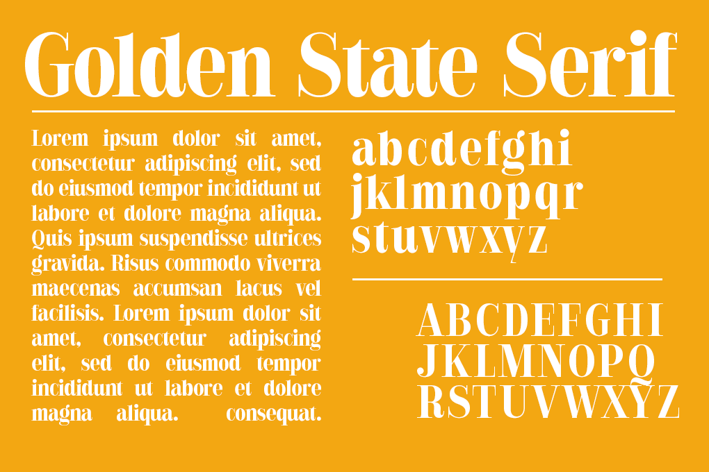
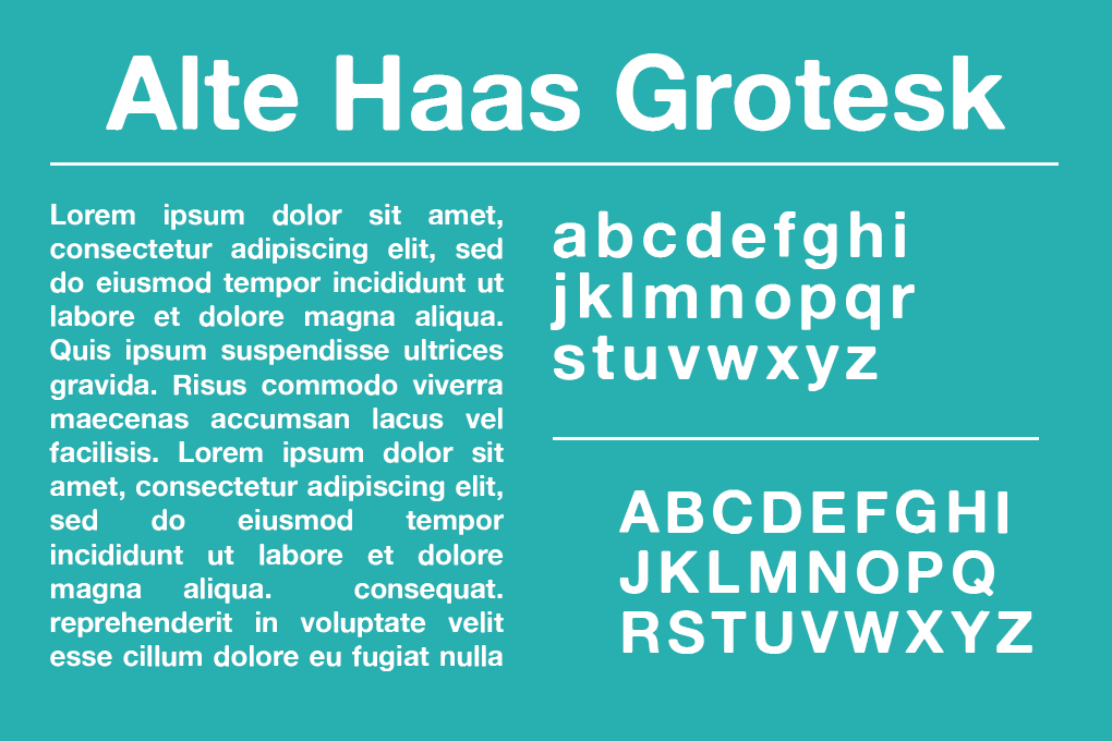
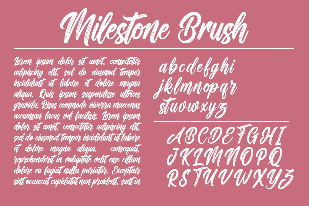
Different typeface categories evoke specific emotions and associations in the minds of your audience. Serif fonts, with their small lines or strokes at the ends of characters, convey tradition and reliability, making them suitable for brands that want to establish trust and credibility.
Sans-serif fonts, which lack these extra strokes, suggest modernity and innovation, ideal for tech companies, startups, and fashion brands. Script fonts, with their flowing and cursive-like letterforms, evoke elegance and creativity, perfect for luxury, fashion, and beauty brands.
2. Limit the number of typefaces
When designing your logo, use a maximum of two typefaces to maintain a clean and cohesive look. Avoid cluttering the design with too many fonts, as this can dilute your brand message and create visual confusion. If you decide to use two typefaces, ensure they complement each other while remaining visually distinct. For example, you can pair a bold sans-serif font for the brand name with a sleek serif font for the tagline, creating an attractive contrast.
3. Ensure readability at various sizes
Readability is paramount when selecting a typeface for your logo. Test the legibility of the typeface in different sizes to ensure your logo remains clear and recognizable when scaled up or down. Your logo will appear across various mediums, from business cards to billboards, so it’s crucial to choose a typeface that maintains its impact and readability in any context. Avoid using overly decorative or intricate typefaces that may compromise legibility, especially at smaller sizes.
4. Consider the medium
When choosing a typeface for your logo, consider the various mediums in which it will be used. Select a typeface that works well in both print and digital formats, ensuring your logo looks great on business cards, websites, and merchandise. Optimize your logo for different applications by testing it on various backgrounds, in black and white, and at different sizes. This will help you determine if the typeface is versatile enough to represent your brand effectively across all platforms.
5. Reflect your brand’s unique identity
Your logo is the visual representation of your brand, so the typeface you choose should capture your brand’s essence and set you apart from competitors. Select a typeface that aligns with your brand’s personality, values, and target audience. Avoid overused or generic typefaces that lack distinctiveness, as they may fail to create a memorable impression. Instead, opt for a typeface that is both timeless and unique, helping to establish a strong and recognizable brand identity that resonates with your audience.
Benefits of choosing the right typeface for your logo
Choosing the right typeface can give you an edge by making your logo stand out and more appealing. Choosing the right typeface for a logo has the following advantages.
Conveys brand personality
The typeface you select for your logo plays a significant role in conveying your brand’s personality. Each typeface has its own unique characteristics and can evoke specific emotions or associations in the minds of your target audience.
For example, a serif typeface like Garamond can convey a sense of tradition, elegance, and reliability, making it suitable for brands that want to establish trust and credibility. On the other hand, a sans-serif typeface like Futura can communicate a modern, innovative, and forward-thinking brand image.
When choosing a typeface, consider your brand’s values, mission, and overall image. The typeface should align with and reinforce these elements, helping to create a cohesive and memorable brand identity.
Enhances readability
Readability is a key factor in logo design. Your logo should be easily recognizable and legible across various mediums, from business cards to billboards, and in different sizes.
Choosing a typeface that prioritizes readability ensures that your logo remains clear and easy to read, even in challenging contexts. This is particularly important for logos that will be used in small sizes, such as on mobile devices or promotional items like pens or keychains.
When evaluating typefaces for readability, consider factors such as the letterforms’ clarity, the spacing between characters, and the overall simplicity of the design. Avoid using overly decorative or intricate typefaces that may compromise legibility.
Timeless appeal
A well-designed logo should stand the test of time. Choosing a typeface with a timeless appeal helps ensure that your logo remains relevant and impactful for years to come, reducing the need for frequent rebranding efforts.
While it may be tempting to follow the latest design trends or choose a trendy typeface, these choices can quickly become outdated, making your logo appear old-fashioned or irrelevant.
Instead, opt for classic and versatile typefaces that have proven their longevity. Typefaces like Helvetica, Garamond, and Baskerville have been used successfully for decades and continue to be popular choices for logo design.
By selecting a timeless typeface, you invest in your brand’s future, creating a logo that can grow and evolve with your business without losing its core identity.
Can different typefaces work together in a logo?
Using different typefaces together in your logo can be a powerful design choice. You can create a well-balanced and harmonious design by combining fonts from different categories, such as pairing a bold sans-serif font for the brand name with a sleek serif font for the tagline.
When combining fonts, make sure they complement each other and don’t clash or distract from the overall message you want to convey.
Here are some considerations for making different fonts work together in your logo:
- Harmony: Ensure that the selected fonts harmonize well with each other. Aim for a cohesive and unified look, even if the fonts belong to different categories. The combination should feel intentional and purposeful, rather than random.
- Contrast: Strive for a balance of contrast between the fonts. Pairing a bold font with a more delicate one or a script font with a clean sans-serif can create a visually interesting and dynamic logo.
- Hierarchy: Use different fonts to establish a hierarchy in your logo design. The main brand name can be displayed in a distinct font that captures attention, while additional text or taglines can use a more subdued font to provide supporting information.
- Readability: While experimenting with font combinations, remember that readability should not be compromised. Make sure that the fonts are clear and easy to read, even at smaller sizes.
- Simplicity: Avoid using too many fonts in one logo, as it can lead to a cluttered and confusing design. Stick to one or two complementary fonts to maintain a clean and professional appearance.
Testing your logo typeface
Before finalizing your logo design, it’s important to test your chosen typeface in various contexts to ensure that it is legible, versatile, and effective. Here are some key things to consider when testing your logo typeface:
- Scalability: Your logo should be legible and recognizable at various sizes, from small business cards to large billboards. Test your typeface at different scales to ensure that it remains clear and readable.
- Color: Your logo should work well in both color and black and white. Test your typeface in different color combinations and in monochrome to ensure that it remains effective and recognizable.
- Background: Your logo should be legible and effective on various backgrounds, from white paper to dark or patterned surfaces. Test your typeface on different backgrounds to ensure that it remains clear and readable.
- Context: Your logo will be used in various contexts, from digital to print media. Test your typeface in different contexts to ensure that it remains effective and appropriate.
Avoid these common logo typeface mistakes
When choosing a typeface for your logo, there are some common mistakes that you should avoid to ensure that your design is effective and professional. Here are some key things to keep in mind:
- Overused fonts: Avoid using overused or generic fonts like Comic Sans or Papyrus, as these can make your logo look unprofessional and unoriginal. Instead, choose a typeface that is unique and appropriate for your brand.
- Illegible fonts: Avoid using overly decorative or ornate fonts that are difficult to read, especially in small sizes. Your logo should be legible and recognizable at a glance.
- Mismatched fonts: If you are using more than one font in your logo, make sure that they complement each other and create a cohesive visual identity. Avoid using fonts that clash or compete with each other.
- Inappropriate fonts: Make sure that your chosen typeface is appropriate for your industry and target audience. Avoid using fonts that are too casual or playful for a serious or professional brand, or fonts that are too formal or traditional for a youthful or innovative brand.
- Inconsistent use: Once you have chosen a typeface for your logo, use it consistently across all your branding materials. Avoid using different fonts or variations of the same font, as this can create visual confusion and dilute your brand identity.
By avoiding these common mistakes and choosing a typeface that is appropriate, legible, and consistent, you can create a logo that effectively represents your brand and communicates your unique personality and values.
Final thoughts
The best typeface for your logo ultimately depends on your brand identity, target audience, and industry. There is no one-size-fits-all solution, as each brand has unique characteristics and goals.
To find the perfect typeface for your logo, experiment with different options and evaluate how they align with your brand’s personality and values. Consider the emotions and associations each typeface evokes and whether they resonate with your target audience.
Popular logo fonts can serve as a great starting point for your exploration. These tried-and-true typefaces have been successfully used by many brands across various industries. However, don’t limit yourself to these options alone.
Choosing the right typeface for your logo is crucial for effectively conveying your brand’s identity and ensuring readability across various mediums. If you’re struggling picking out the right one, LogoMaker can help.
Our intuitive platform offers an easy-to-use AI logo designer that can create customized logos for your business that are going to look professional and portray just the right brand image you’re looking to develop.
Before starting the generation process, LogoMaker is going to ask you for typefaces that you like and create logos based on that with dozens of variations. Putting practically and design aesthetics first, LogoMaker’s template options make sure that you walk away with a logo you’re 100% happy with.
Sign up with LogoMaker today to create the perfect logo. No payment required until you’re happy with the design.
Best typeface for logo: Frequently asked questions
Can I change the typeface of my logo later?
Yes, you can change the typeface of your logo later, but it’s important to do so carefully to maintain brand consistency. Rebranding efforts should be well-planned and communicated to your audience to avoid confusion and maintain brand recognition.
Is it better to use a custom typeface for my logo?
A custom typeface can make your logo more unique and tailored to your brand, but it may require more resources and time to develop. If you have the budget and want a distinctive look, a custom typeface can be a great option. Otherwise, many high-quality, pre-designed typefaces can also effectively represent your brand.
Are there specific typefaces recommended for certain industries?
While there are no hard and fast rules, certain typefaces are commonly associated with specific industries. For example, modern and sleek typefaces are often used in technology and fashion, while traditional and serif typefaces are popular in the legal and financial sectors. It’s important to choose a typeface that aligns with industry norms and your brand’s unique identity.
Can I use multiple typefaces in my logo?
Yes, you can use multiple typefaces in your logo, but it should be done carefully to maintain a cohesive and professional look. Typically, combining a primary and secondary typeface can add visual interest and hierarchy to your logo.
