Do you want your business to be the next Apple or Nike? Perhaps you’d settle on becoming larger than Amazon? Hold on, before you decide to buy that private jet, 250-yard swimming pool, or zoo the size of California—let’s take the first step.
We’re talking about the humble logo. You see, just recently, it’s taken on a new life because a static logo design doesn’t capture the attention like it used to. To be part of the modern business trend, you now need an animated logo. But LogoMaker is here to help you with that.
We not only tell you what a logo is but also the background of the modern logo, together with how to animate a logo easily. And we do it in the time it takes to drink a cappuccino.
- What Is a Logo?
- Modern Logo Design: The Ingredients
- What Is Graphic Design?
- Why Use an Animated Logo?
- Static Images vs. Animated Logos
- Logo Animation: The Pros & the Cons
- How to Make Your Logo Look Great
- Visual Elements: Putting Together an Animated Logo
- Where Should I Put My Animated Logo?
Blog Highlights
- What is a logo: In plain English, we explain what a logo actually is and do so using a simple metaphor so that it can be understood in just a few sentences.
- What is graphic design: We cover what makes graphic design give people so much inspiration and how you can layer a design from scratch.
- How to make your logo look great: With easy-to-understand instructions, we help you to understand style and show you that you don’t need a million-dollar tool to create it.
What Is a Logo?
Let’s start simply. Imagine a logo being a sign above a store that says Bakery. The store sign tells everyone what your business does, but it doesn’t convey your brand or intent. That’s because the sign needs something visual. How about a picture of a cinnamon roll, together with some chocolate muffins, and a large cup of coffee?

Let’s make the sign color too. Now, we have a visual representation of what the business is and the products it provides. To complete the sign, we need to add something to give the store a distinctive brand. We’ll start with some typography that symbolizes a friendly place: Silverlake is a new contemporary font and would work perfectly for a bakery.
We now have a logo: A recognizable and visual symbol that raises awareness of the business.
“Business fascinates me. It’s very creative.”
Ridley Scott, Graphic Designer and Movie Director
Modern Logo Design: The Ingredients

To understand the business of modern logo design, we need to talk about the background elements that come together to make a brand stand out. We’re talking specifically about:
- Colour Palettes
- Shapes and Styles
- Typography
Colour Palettes
A sharp or muted color can easily catch the eyes of passing or scrolling customers. For a general understanding of how colors create a vibrant showcase that can drag potential buyers to a business, we’re going to suggest you look into color theory.
Color theory is an explanation of how colors work together to provoke emotions in the people looking at them. Here are 3 colors and the effects they can have on us:
- Green: A calming color often used in hospitals.
- Orange: A vibrant color that can trigger optimism.
- Red: Can represent passionate feelings.
Shapes & Styles
In terms of logo design history, we could take a look at the ancient Egyptian hieroglyphic system of writing. As far back as 3000 B.C., the Egyptians developed hieroglyphs by carving symbols into stone. The symbols used an inspired system of symbolic and phonetic writing.
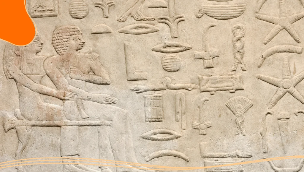
The hieroglyphs could also be used to show real-world items, which would have been very handy for Egyptian stores. Even today, in Shanghai, customers from other municipalities communicate with store owners by drawing the Hanzi character—from the Chinese logographic writing system—onto their hands to communicate what item they would like to buy.

In 1971, a corporate artist called Terry Heckler used the Greek myth of sirens to design the logo for the Starbucks coffee chain. The logo’s branding is now so well known that it contains no text.
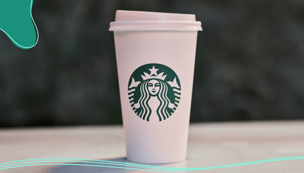
So far, you can see that the humble logo design has been developing for quite some time.
Typography
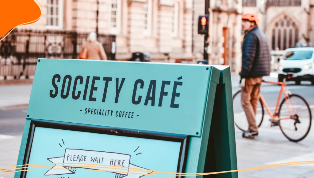
Earlier, we talked about giving our bakery the Silverlake font to make it friendly. The font is one aspect of what is known as typography.
Great, but What Is Typography, & What Does It Have to Do With Modern Logo Design?
Good question. In a nutshell, typography is the way text is placed to make your message clear and to offer a layout that appeals to potential customers. Think of typography as the coffee, while the fonts are the sugar, and the color palettes are the different syrups like caramel or hazelnut.
- Typography: The arrangement of your text.
- Fonts: The visual qualities of the text such as bold and italic.
- Color Palette: Adding colors to make a design attractive.

You can begin to see that a modern logo is a design made from a composition that should communicate the message of a brand.
What Is Graphic Design?
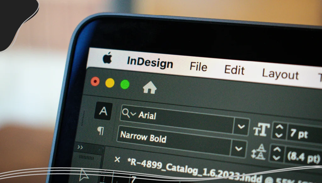
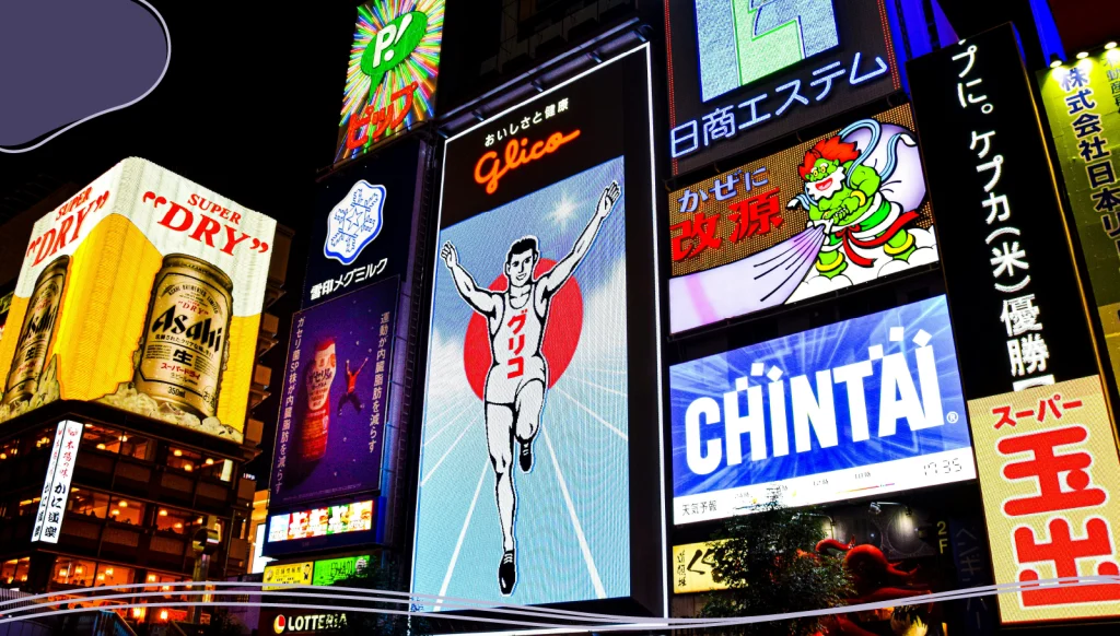
Graphic design includes typography, which we’ve talked about, together with photography, illustrations, and iconography. As we said about logos, graphic design is a visual concoction that delivers a message. This is why animation for graphic designers is such a great combination. The brilliant thing about graphic design is that it is everywhere; next time you visit the city, be sure to take a good look around.
“There are more people in the world who make things than there are people who think of things to make.”
Syd Mead, American Commercial Designer, Illustrator, and Industrial Designer
Why Use an Animated Logo?
In the last two decades, we’ve seen major advancements in the use of the Internet and smartphones. With the increased competition in trying to capture people’s attention, moving images are often used to be eye-catching and addictive—just like the early fairground rides such as the carousel.

If you’re wondering why it would be worth animating a logo, consider that the animation used can also be short—TikTok’s videos often run for between 21 to 34 seconds. So, you don’t need the budget of an epic Hollywood movie.
Static Images vs. Animated Logos
We know that our static logo is good for our brand and for catching the eye of potential customers. Why would we want to animate it? Well, there are a number of benefits, including offering customers a storytelling vision that makes use of sound and a layer of colorful moving images, almost like a vibrant street parade.
Suppose you’ve often wondered how to animate a logo. In that case, we can start by saying that a combination of elements such as subtle movements, animations, and a good idea can bring your website to life and create inspiration to make your brand stick in the visitor’s memory.
Logo Animation: The Pros & the Cons
So, you want to improve your modern logo design? Before considering investing your time in logo animation, why not look at the pros and cons of doing so?
The Pros:
- Engaging: A good animated logo can jump out of the screen and easily catch the viewer’s attention.
- Tells a story: With a good color palette and great font, an animated logo creates a narrative with sound and vision.
- Appeals to emotions: Using color theory, an animated logo appeals to the viewer’s feelings.
The Cons:
- Annoying: Some visitors will find an animated logo distracting.
- Tone: Some websites may find that a new animated logo does not appeal to their customer base.
- Hardware: Some animations in the logo may not be suited to the customer’s devices.
How to Make Your Logo Look Great
We recommend you start by creating a distinctive logo that brings your business to life. One of the best ways to do this is with a free logo maker. Allow us to recommend LogoMaker.
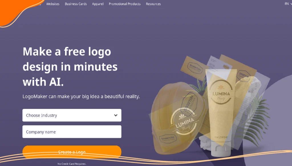
Suppose you don’t already have a logo for your business or website. In that case, LogoMaker helps you to create a modern and free logo. LogoMaker helps you to do this in 3 easy steps:
- You enter your company, brand, or team name by simply entering the name of your brand or business into our handy logo generator.
- You can then browse the 1000s of logo designs we have. There is even the option to choose a logo template that can be customized with the LogoMaker app.
- Following steps 1 and 2, you can then have fun editing your layout, fonts, colors, and more!
Also, be sure to check our website regularly, where we offer special deals, including Black Friday offers.
7 Quick Tips to Make Your Logo Look Great
Here’s LogoMaker’s list of 7 easy to remember tips to create a fantastic logo:
- Leave some empty space around your logo: Don’t overcrowd your sign or banner; allow the viewer some white space to take in your design, which is best placed in the center of your sign.
- Don’t throw in the kitchen sink: Remember the logo Starbucks uses, the one with no text? Keep it simple so your logo is easy on the eye and lasting in the memory. Modern logo design is best when crystal clear to read and look at.
- Choose colors that soothe: Use light shades and opt for no more than 3 colors if you can. As an experiment, look at popular Smartphone apps—how many colors are they using?
- Think appealing shape: If this is your first logo, consider using an easily recognizable shape like a box or circle that your text will sit in.
- Think timeless and evergreen: When researching, try to include something that will appeal to audiences fifty years from now. We suggest coffee and a chocolate muffin. No, make that 2 chocolate muffins.
- Have patience: Don’t rush out a logo without putting it to one side for a day or two. Stephen King leaves his manuscripts to one side for 2 months just to gain some objectivity. Try doing the same.
- When building your way up to creating an animated logo: Do some research. Why not try a Google search for 7 animated logos to inspire your logo design and take free lessons from the best.
“You will learn most things by looking, but reading gives understanding. Reading will make you free.”
Paul Rand, American Art Director and Graphic Designer
Visual Elements: Putting Together an Animated Logo
With the increasing availability of AI-Powered tools and free templates, creating a logo design that you can animate is easier than ever. Maybe you’re wondering how to animate a logo successfully?
First, we recommend you perfect your logo and plan out on paper how your logo should come to life. For instance, what type of animation styles do you like? Do you want to create a simple line drawing or add more style with cutting-edge graphics? Also, do you have a budget in mind, or do you need to find a free tool?

How to Produce an Animated Logo with an AI-Powered Tool
With the rise of AI-Powered tools, using animations in branding, such as logos, has become a lot easier. With most AI software based in the Cloud, tools to create animations for download have become more accessible and also very intuitive.
To help you on your way to animate your logo, LogoMaker is pleased to provide you with a list of AI-Powered tools that are helpful to use and also free! If you wish, you can also see these tools in action with a YouTube video by Dr Alex Young. For now, here are:
7 AI Tools to Help You Create an Animated Logo
Where Should I Put My Animated Logo?
After you download your animated logo in a file, you can use the digital file to revamp your website header logo. Also, you can create different animated logos and use them in everything from landing pages to a thank you page for your bakery.
In Summary: Are Animated Logos the Future?
If you feel an animated logo will enhance your website and make it stand out, you’d be right to think about your brand story being told with a style that suits a digital business. With AI-Powered tools the creation of an animated logo has never been easier. You also have the power to download and edit the content you create on Cloud-based platforms.
Here’s our advice: As the modern Internet audience is beginning to feel saturated with Internet ads—please keep the end-user experience in mind. Keep your animated logos short and to the point. We recommend creating branding guidelines to decide how your logo should be presented to the public.
Animation for graphic designers doesn’t have to cost the earth. And please don’t forget that your friends over at LogoMaker can create fast and free logo designs for your business. So, grab a cinnamon roll and a large coffee, and please reach out and talk to us now.
