The term “less is more” first appeared in an 1855 poem by English writer Robert Browning. In the poem, Browning is writing from the perspective of a painter who is complaining to his wife that all of his peers try and fail to match his level of technical proficiency. While the other painters don’t have the same skill level, they’re able to express more emotion with less, leading the main character to conclude that “less is more.”
Browning’s poem teaches us a valuable lesson that is particularly relevant when designing logos. A logo is a simple image that is meant to be a visual representation of a business. If you try and cram in too many design elements into your logo, it will look disorganizated and clumsy. A minimalist design approach will allow you to make a bigger impact with fewer frills—less is more.
In this article, we’ll go over the basics of minimalist logo design, the benefits of using a minimalist logo, how to create a minimalist logo, and some examples of famous minimalist logos you can use for inspiration.
- What is a Minimalist Logo?
- Principles of Minimalist Logo Design
- Why You Should Use a Minimalist Logo Design
- Benefits of a Minimalist Logo
- Designing a Minimalist Logo
- Examples of Amazing Minimalist Logo Ideas
What Ιs a Minimalist Logo?
A minimalist logo strips away any unnecessary embellishments to create a mark that is just as impactful as an intricate design. However, don’t confuse minimalism with a plain or unfinished look. Minimalist logos offer a lot of dept of meaning and can be incredibly powerful marketing tools. By keeping your design simple yet striking, you make your logo more memorable to your customer base.

Principles of Minimalist Logo Design
Just because a minimalistic logo has fewer design features than a detailed logo doesn’t mean that it’s easier to create. In fact, it can be quite difficult to distill your company’s brand identity down into one simple image. Here are the principles of minimalist logo design that you should keep in mind when designing your own minimalist logo.
1. Keep It Simple
This is by far the most important design element when designing a minimalist logo. Luckily, logos naturally lend themselves to minimalism because you have such a small space to work with. If you try and pack in too many details, your design will get convoluted and difficult to understand.
When you’re designing a minimalist logo, focus on the bare essentials to make a bigger impact.
For example, if you’re designing a new logo for a fitness studio, you can create a simple silhouette of a person striking an athletic position, embuing your logo with a sense of movement and action. By using a simple figure with no identifiable features, you allow any potential client to picture themselves partaking in the activity.
Flat logo design (two-dimensional design with no perspective added) is another popular way you can keep a minimalist profile. In recent years, many popular companies have embraced flat logo designs to give their logos a more modern and streamlined feel.
2. Use Clean Geometric Shapes
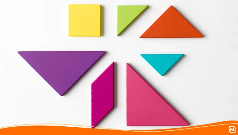
As opposed to more illustrative approaches, minimal logos tend to keep shapes neat and proportional. For a simple logo that is proportional, graphic designers often use basic shapes like rectangles, triangles, and ellipses. Stick to 45- or 90-degree angles to give your logo a clean and elegant look.
That being said, a minimalist logo can also have curves, but you should always try to impart symmetry and proportionality to your designs. You can use rules like the golden ratio to create compositions that are naturally pleasing to the eye.
3. Make The Most of Your Negative Space
With a relatively small canvas to work with, using negative space appropriately is crucial to ensuring your logo is impactful and aesthetically pleasing. Don’t try to use up every last bit of room you have when designing your logo. To achieve a minimal logo feel, you have to pay as much attention to the empty spaces as you do to the spaces that you fill up.
4. Ensure Your Typography Fits Your Brand
Choosing the right typography can make or break your minimalist logo. Even if your logo is an image with no text, most brands will include a wordmark or lettermark as part of the logo package. Most minimal logos use a sans serif font, as serifs tend to add detail and give the logo a more traditional look. It’s important to develop a typography that fits with your brand’s unique identity. Experiment with different fonts and formats until you find something that works best for you.
5. Pay Attention to Your Lines
Thin and thick lines play a pivotal role in minimalist logos. They provide structure, separate elements, and can also lead the viewer’s eye. The strategic use of lines can create a sense of movement, dynamism, or direction in a logo.
If you need help designing your own minimalist logo, you can use LogoMaker’s full suite of logo design services and choose from our extensive library of over 10,000 logo templates.

Why You Should Use a Minimalist Logo Design
Creating a bold, minimalist logo can be one of the best things you can do to improve your brand’s recognition and elevate your business to new heights. Whether you’re running a restaurant, a construction business, or even a hair salon, a minimalist logo is supremely versatile and is a great choice for businesses in any industry.
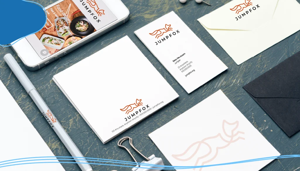
Minimal logo design doesn’t rely on intricate details to be effective; their effectiveness stems from the strength of the design alone. Because these types of Minimalistic logos typically use simple shapes and monochromatic color palettes, they translate well across multiple mediums and sizes. From a business card to a brochure, a brand or company logo should read clearly. The less detailed your design, the more quickly your audience will recognize it.
Benefits of a Minimalist Logo
Minimalist logos are eye-catching, memorable, and make a significant impact on the audience. Here are some of the main benefits of having a minimalist logo.
- Scaling: They’re easy to use with smaller screens, such as mobile phones and tablets.
- Brand recognition: Minimal logos can help a brand stand out in a crowded market and create a strong brand identity.
- Memorable: Minimalist designs distill the brand’s identity into a succinct and memorable visual, making it easier for consumers to recall and identify.
- Timeless: While logo design trends come and go, minimalist logos possess an enduring aesthetic appeal.
Designing a Minimalist Logo
Even though a minimalist logo features fewer elements than other more complicated logos, the design process is very similar. Here are the steps for making a fantastic minimalist logo.
Research
Start your research by diving into your brand’s industry, history, values, and audience. Understand the competition and look for unique attributes that differentiate your brand from the field. Learning about your target audience will also help you decide the kind of logo you want to make.
Brainstorming & Inspiration
Once you’re certain you know your brand inside and out, it’s time to come up with some logo ideas. Think creatively about translating the brand’s identity into a visual symbol. Consider what colors, typography, and imagery best represent the brand’s values and personality.
For example, if you are designing a logo for a makeup brand, you might want to use bold colors with softer shapes, as opposed to a construction company logo that might use more subtle colors with sharp angles.
Designing The Logo
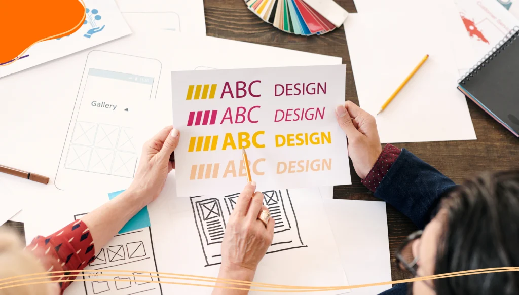
Begin by sketching out potential designs. Start with the broad strokes to build a basic (but memorable) silhouette, then gradually add defining details. Sketching by hand can help creative thinking and lead to more unique designs.
To make the design process easier, you can use LogoMaker’s AI-powered logo maker tool to craft a stunning minimalist logo that perfectly describes your brand identity in just minutes.

Feedback & Revisions
Gathering feedback from stakeholders, potential customers, and design peers is crucial to ensuring your logo is getting the response that it should. Use their input to revise and improve your logo. Don’t be afraid to tinker with your design and make changes. Making alterations to your logo design is far easier during the earlier stages of the design process.
When embracing minimalist design, one of the best things you can do is look at your logo and take away any features or other design elements that don’t need to be there. Your minimalist logo should be able to stand alone.
Finalizing
Once the design is perfected, prepare it for various applications (digital, print, large scale, small scale) and create a logo style guide to ensure consistent usage across different platforms.
Common Mistakes to Avoid
While minimalism champions simplicity, designing a great minimal logo can often be quite challenging. Here are a few common mistakes that you should avoid when designing your own minimalist logo.
- Doing too much: Avoid packing too many details into your logo design.
- Overcomplicating tour design: Don’t use too many colors or complicated shapes.
- Neglecting scalability: Keep your logo design simple and scalable for different screen sizes.
- Not doing revisions: Make sure to edit your logo based on the feedback you receive.
Examples of Amazing Minimalist Logo Ideas
In recent years, minimalist design has become very popular among many famous brands. A minimalist logo can help make your company’s logo seem distinct while linking your brand to ideas of luxury, elegance, and professionalism.
Here is a collection of some great minimalist logos to help inspire you.
Apple
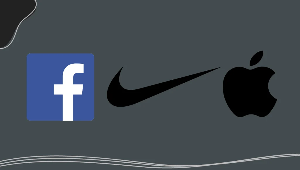
Designed by Rob Janoff, the Apple logo you see now has a bite to it. Janoff said that this was to make the fruit more distinct, lessening the likelihood of other people looking at it as another fruit. The bold and flat logo goes hand in hand with the brand’s ultra-minimalist philosophy.
The Facebook logo has a very straightforward, minimalist design using a shade of blue that has become synonymous with the tech giant. It also uses a lowercase typography, which is done by many tech brands such as Amazon and Beats.
Nike
Perhaps the most famous minimalist logo is the Nike swoosh. This logo is a great example of a company developing a fantastic logo without spending a ton of money. Carolyn Davidson created the logo in 1971 for just $35.
Conclusion
A minimalist logo design can be a powerful tool for impactful branding. By following the principles of minimalist logo design and avoiding common mistakes, you can create a simple yet memorable logo that stands out in a crowded market. Embrace minimalism and use the best practices for logo design to create a logo that conveys your brand’s personality and message.

Frequently Asked Questions
What is a minimalist logo?
A Minimalist logo focuses on simplicity, using clean lines, basic shapes, and limited colors to create a visually impactful and timeless logo. It avoids excessive details and clutter, delivering a design that’s both memorable and functional.
Why is “less is more” important in logo design?
By stripping away unnecessary elements, the design ensures the brand’s identity remains strong across various platforms and sizes. Simplicity often leads to better memorability and a more professional look.
Is a minimalist logo suitable for all types of businesses?
Yes, a minimalist logo can work for nearly any industry, whether you’re in tech, fashion, healthcare, or food services.
Do minimalist logos limit creativity?
Not at all! Minimalism challenges designers to be more creative by distilling ideas to their essence. This approach often leads to innovative and clever design solutions that communicate a lot with very little.
Are minimalist logos always black and white?
While many minimalist logos use black and white for their timeless appeal, they’re not limited to those colors. Minimalism embraces thoughtful color choices that enhance the brand’s personality without overwhelming the design.
Can an existing logo be simplified into a minimalist design?
Yes, many brands choose to redesign their logos to embrace minimalism. This process involves removing unnecessary elements, refining shapes, and focusing on the core aspects of the logo to better align with modern design trends and brand evolution.
