UPDATE: Since writing this post, we’ve changed our thinking a bit about the color red and its ability to stimulate appetite. We don’t believe it.
Aside from choosing a name for your business, the most important element of your logo may be its color. There’s more to color than looking good (or bad). Color affects the subconscious in ways that are hard to detect. In fact, customers may change their behavior because of the colors they see—and not even know it!
What colors are best for your logo? There are no best colors, just the color that is best for communicating your brand’s meaning.
Here’s a brief overview of what a few of the most popular colors can represent and why you might want to consider them when you design a logo.
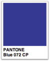 Blue
Blue
Ask someone what their favorite color is and the majority will tell you blue. Blue is calming and cool. It represents tradition, authority, protection, and unity. Seeing blue relaxes the nervous system and can reduce blood pressure, pulse and respiration. Negative associations include depression (feeling blue), cold, and offensive (swear a blue streak).
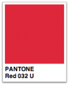 Red
Red
Red is the color of energy, leadership, passion, and confidence. It excites and calls attention to itself (one reason it is used for break lights, stop signs, and fire hydrants). In contrast to blue, red increases blood pressure, pulse, and respiration. It can also increase hunger (which may be why red is so common in eateries). Negatively, red can signal danger, blood, and sex (red light district).
 Green
Green
Green is associated with nature, growth, and health. It’s a vital color that’s often used to signal wellness and social reform. And, at least in the states, it’s the color of money. Green is a great color to use if your product is natural or healthy or has other strong associations with vitality. On the other hand, green can signal illness, rotting food, and jealousy (green with envy).
 Black
Black
Black is the color of elegance, mystery, sophistication, and often signals wealth. It’s a very conservative color (the most popular choice for business suits) and pairs nicely with and accents most other colors. But black also has a downside, it signals evil, darkness, and death.
Which color is right for your logo?
Again, it depends on what your brand needs to communicate. Blue is just right for a big company like IBM, which wants to be associated with tradition and trust. Red works well for leadership brands like Coca-Cola and Marriott. While green helps tell the right story about brands like Starbucks and Budget Rent-Car. First determine what your brand is about, then choose colors that most easily communicate that to your customers.

