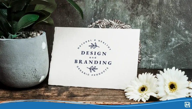
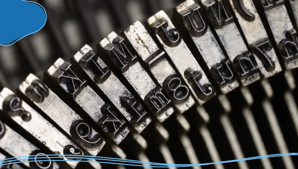
You might think that typography boils down to picking a font and calling it a day, but you’d be wrong. Typography is much more than that— it’s the expert technique of arranging type to make written language legible, readable, and appealing when displayed.
Paul Rand was an American art director and graphic designer who created some of the most famous logos of all time. He was also a master of experimental typography, using eccentric typography in many of his designs, including ones for the Ford Motor Company, American Express, and NeXT Computers.
Rand understood that typography is a creative playground where letters, shapes, and designs meet to create unforgettable brand experiences. His feelings about the importance of typography can be summed up in this one simple quote: “Typography is an art. Good typography is Art.”
In this article, we’ll explore how experimental typography shapes brand identity, recognition, and overall style. We’ll also review some examples of famous brands that have used experimental typography to reach new creative heights.
- What Is Experimental Typography?
- Why Typography Matters in Branding
- How to Choose the Right Typography for Your Brand
- Characteristics of a Good Brand Font
- Font Options for Branding
- Implementing Experimental Typography
- Examples of Effective Brand Typography

What Is Experimental Typography?
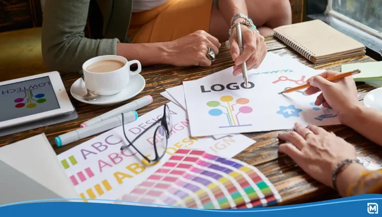
Before we explore the depths of experimental typography, we should go over what traditional typography is and what rules govern it. Simply put, typography is the art of text design. But in addition to the artistic component, typography comes with laws and rules that help the reader easily scan and understand a written text.
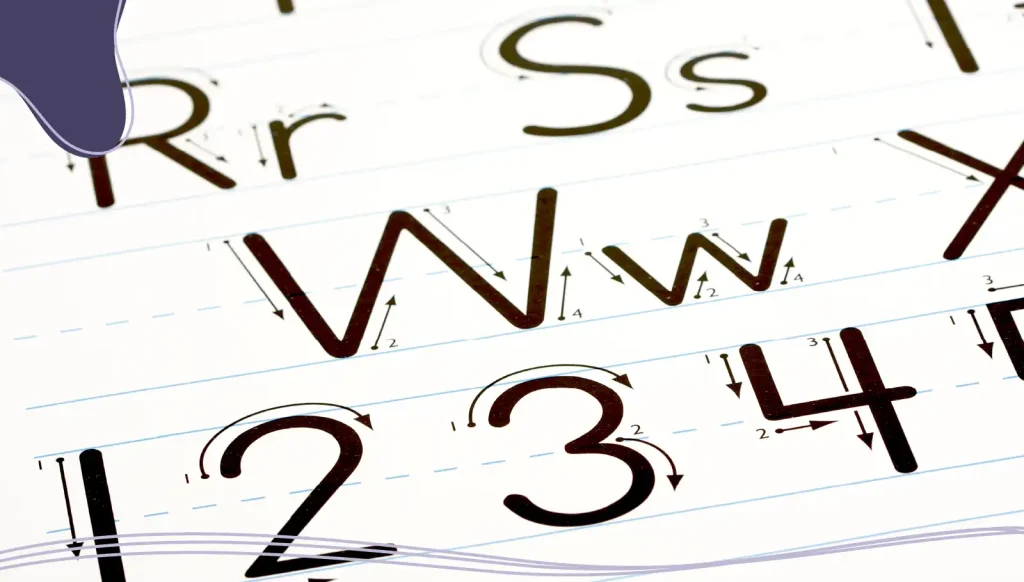
An important part of typography is typeface. A typeface is a set of characters, including letters, numbers, and symbols, that share a common design. It’s the overall style of a font family, which can include various weights, widths, and styles.
Typography Rules
While there is no “right” way to develop your typography, there are a few commonly used rules that can help ensure your text is clear and readable.
- Don’t use more than 3 typefaces: Blending too many different typefaces can make your design seem cluttered and unorganized.
- Stick to standard fonts: Handwritten and heavily decorative fonts can feel dated and are often difficult to read. Don’t be afraid to use standard and familiar fonts.
- Use left alignment: Left alignment is suitable in most cases, as it is convenient to read and familiar to the eye.
- Follow the rule of proximity: Objects located close to each other are perceived as connected.
- Create a visual hierarchy: The design of headings and text bodies should follow a set order. The text should be structured to define a title and a heading at different levels.
Breaking the Rules
Once you learn the rules of traditional typography, you can start breaking them. Experimental typography pushes the boundaries of traditional typographic rules. It’s about exploring new possibilities in letterform shapes, spacing, and arrangements to create something unique and eye-catching. Think of it as the rebellious cousin of sans serif fonts and script fonts — it breaks conventions but with purpose.
In branding, experimental typography gives brands a distinct voice and a memorable edge. Whether through custom typefaces, proprietary fonts, or bold display fonts, this approach can help brands stand out in a sea of sameness.

Why Typography Matters in Branding
Typography impacts how people perceive your brand, from its tone to its trustworthiness. Your typeface and font style play a crucial role in communicating your brand voice.
Take Ferrari, for example. Their use of sleek, custom typography reflects speed, luxury, and innovation. Similarly, a playful children’s toy company like Toys “R” Us uses a rounded, bubbly script font to evoke fun and creativity. Toys “R” Us also made an ingenious typography decision by including a backwards R in their branding, mimicking how a child occasionally gets their letters mixed up.
The fonts you choose should communicate your brand’s personality, evoke emotions, and make your message more impactful. Selecting the right typography will help establish a cohesive visual identity that resonates with your audience.
How Typography Impacts Your Brand
Typography’s impact on your brand is immense, which is why companies are willing to make substantial financial investments to make sure they get it right. If you want to bring in some of the best typeface designers in the world to work on your typography, they could charge you between $100,000–250,000.
While most companies won’t invest that much money into a custom brand typeface, it’s an important marketing factor that should not be overlooked. Here are some of the ways typography can impact your business.
1. Brand Recognition
A good brand font is instantly recognizable. Custom typography ensures that your brand stands out, even at a glance. Think Coca-Cola’s script font or Google’s sans serif logo — they’re unforgettable because they’re unique.
2. Brand Personality
Typography helps convey your brand personality. Is your brand bold and daring? Try a chunky display font. Sophisticated and timeless? Opt for serif fonts. The right typography can amplify your brand voice and connect with your audience on an emotional level.
3. Visual Interest
Experimental typography adds a layer of visual interest that keeps your audience engaged. By playing with letterform shapes, multiple typefaces, and typographic design systems, you can create captivating designs that reflect your brand’s essence.
Brand Typography & Brand Identity
Your brand typography should match your overall brand identity. While experimental typography can work for some brands, it might not be right for others. For example, a contractor construction company looking to present itself as professional and dependable might not be a good fit for experimental typography.
When designing brand typography and other brand elements, always keep your overall brand image in mind.
The Role of Custom Typography
Custom typography is a game-changer for brands that want to make a lasting impression. A custom typeface or proprietary font can:
- Strengthen brand consistency across all visual elements.
- Set your brand apart from competitors.
- Create a cohesive brand style that resonates with your audience.
While designing a custom typeface may require an investment, the payoff in brand recognition and loyalty is worth it.
LogoMaker‘s AI-powered suite of marketing tools makes it easy for you to choose your own typeface to make your brand stand out. With our affordable prices and easy-to-use interface, you can create logos, websites, and other promotional products in just minutes!


How to Choose the Right Typography for Your Brand
Your brand’s typography is like a fingerprint; it will be unique to each business. We’ll discuss some things to consider when designing your typography to ensure it matches your company’s mission.
Understanding Your Brand Voice & Personality
As we mentioned before, understanding your brand is imperative when deciding on a typography. After all, how do you expect to accurately deliver your brand’s message to your audience when you don’t know what that message is?
Ask yourself: Is your brand playful, professional, or edgy? Your font choice should reflect this. Fonts and typography, much like other brand components, must be aligned with your brand’s personality.
Think About Your Audience
Choose fonts that resonate with your target demographic. If you’re trying to appeal to a younger audience, using an experimental typography that deviates from the norm might be the perfect way to catch their attention and let them know that you’re a progressive business that promotes trying new things.
Test Across Platforms
One downside of using experimental typography is that you may not be sure if your audience can read the text clearly. When playing around with experimental typography, ensure your typography works on different platforms and devices, from websites to mobile apps.
Characteristics of a Good Brand Font
Quality can often be subjective when it comes to typography, typeface, and font. For instance, the font Papyrus has become a punching bag for graphic designers who believe it doesn’t present a professional tone. That didn’t stop James Cameron from using Papyrus as the title font for his 2009 blockbuster film Avatar, which went on to be one of the highest-grossing films of all time.
Any font can be great if used in the correct context, but here are a few things that you should take into consideration when choosing a font:
- Alignment with brand identity: The font (or combination of fonts) should reflect your brand’s personality, values, and positioning. Whether your brand is modern and innovative, traditional and reliable, or creative and playful, the font’s characteristics should match the intended brand image.
- Distinctiveness: A good brand font should stand out clearly and be easily recognizable. Its individual features can help people remember and identify your brand.
- Readability: Above all, your brand font must be easy to read. It should be legible on all media, in different sizes, and on all types of backgrounds.
- Versatility: The font you choose should work well in different applications, on different devices, and on different screen sizes. Consider its ability to be used in different weights and styles.
- Timelessness: A good brand font is timeless; avoid fonts that can quickly become outdated.
- Accessibility: Make sure the fonts you choose meet accessibility standards so that your content is accessible to all users, including people with visual impairments.
Font Options for Branding
When it comes to selecting fonts, there are a couple of options that you can go with.
Free Fonts vs Paid Fonts
There’s a wide selection of open-source fonts, which can be a cost-effective option for startups or small businesses. Open-source fonts are fonts that are licensed in a way where anyone can use them for any purpose, and has access and ability to modify and distribute those fonts.
Paid fonts offer a wider range of possibilities and often feature higher quality and more styles and weights. Whereas anyone can create open-sourced fonts, paid fonts are usually created by professional typographers and designers who understand good design, legibility and usability.
Custom Fonts for Unique Branding
Custom fonts take your branding to the next level because they are designed specifically for your brand identity. A unique typeface turns your text into a brand signature and conveys your brand personality and tone of voice.
Best Practices for Typography in Brand Guidelines
Once you’ve chosen your fonts, the next step is to establish a system that makes it easy for current and future members of your marketing team to replicate. This font hierarchy should be part of your comprehensive branding kit and include clear and relevant case examples.
Choose a dominant font for headlines and a complementary font for body text. Pair fonts that provide contrast but complement each other.
Implementing Experimental Typography
A typographic design system ensures consistent use of fonts across various platforms, from websites to mobile apps to product packaging. This is particularly important when implementing experimental typography because you need to depict your creative vision to your team accurately.
- Choosing fonts: Even if you’re using experimental typography, you should still select a primary font that aligns with your brand’s identity. Incorporate multiple typefaces to add variety but ensure they complement each other.
- Consider accessibility: Experimental fonts may be difficult to read. Find a balance to ensure your typography is visually stimulating yet still legible.
- Develop a brand style guide: Include guidelines for font usage, such as when to use primary typefaces versus secondary ones. Specify font sizes, weights, and letter spacing for consistent branding.
- Work with type designers: Collaborate with type designers to create custom fonts that reflect your brand’s unique characteristics. Invest in a proprietary font to ensure exclusivity.
Understanding the Costs & Benefits
The most common typefaces non-designers encounter are the free fonts installed on most computers. Choosing a brand typeface that is not widely used will involve licensing costs, which can be a one-time payment or an ongoing subscription. Before making the final decision, test some brand typeface options with your audience.
Examples of Effective Brand Typography
Strong typography can help a brand become truly iconic. We’ll review a few brands that have used typography to elevate themselves and stand out among their peers.
1. Nike
Nike’s brand typography relies heavily on bold sans serif fonts that exude strength and confidence. The company’s consistent use of the typeface across all platforms, from ads to mobile devices, reinforces its stance as a leader in sportswear.
2. Apple
During his time at Reed College, Apple founder Steve Jobs audited a calligraphy class. Jobs was captivated by the artistry of the letterforms, the nuances of spacing, and the rich history behind different typefaces.
So, it’s no surprise that Apple’s custom typography is a masterclass in brand consistency. Their use of sleek, minimalist fonts reflects their brand personality — innovative, modern, and user-focused.
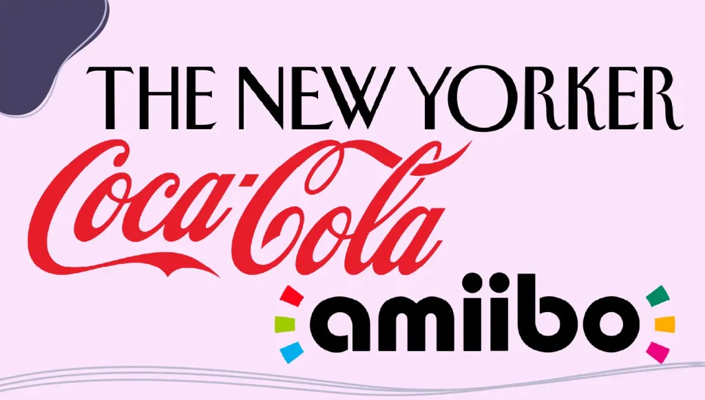
3. Coca-Cola
While pharmacist John Stith Pemberton is the official creator of Coca-Cola, his partner Frank Mason Robinson is responsible for the famous typeface that has made its way around the world.
Robinson came up with the idea of creating a logo based on the Spencerian script. This flowing writing style was widely used in the US for formal correspondence before the adoption of the typewriter.
The script font is a prime example of how a brand can own a typeface. It’s instantly recognizable, reinforcing the brand’s heritage and global appeal.
4. The New Yorker
The 100-year-old historic magazine has one of the most distinctive fonts in journalism and print media. Its clean NY Irvin font is simple and only slightly quirky, providing uniqueness and enticing readers into consuming equally one-of-a-kind content.
5. Amiibo
This might seem like a peculiar addition to the list, but the Nintendo toys-to-live figurine brand has a logo inspired by the Bauhaus movement. Bauhaus fonts feature clean, geometric letterform shapes. This approach is perfect for brands that value simplicity and functionality.
Conclusion
Experimental typography is more than just a design trend; it’s a powerful tool for building a memorable brand identity. By choosing the right typefaces, exploring custom typography, and maintaining consistency across platforms, you can create a brand that stands out and resonates with your audience.
If you are looking to develop a new typography for your business or looking to give your current business an update, LogoMaker‘s suite of branding tools can help you create amazing fonts, logos, and even full websites with no prior experience necessary. Start today!

FREQUENTLY ASKED QUESTIONS
What is the difference between serif and sans-serif fonts?
Serif fonts have small lines or embellishments at the ends of their characters, making them appear classic and traditional. Sans serif fonts lack these embellishments, giving them a modern and clean look.
Can I use free fonts for my brand?
Yes, free fonts can be a great option, especially for startups. However, always check the font license to ensure it’s suitable for commercial use.
What are open-source fonts?
Open-source fonts are freely available for anyone to use, modify, and distribute. They’re an excellent choice for brands that value flexibility and cost-effectiveness.
How do I create a custom typeface?
Work with a professional type designer or font foundry to develop a custom typeface that aligns with your brand’s identity and values.
Why is consistent typography important?
Consistent typography ensures that your brand looks cohesive across various platforms and devices, strengthening brand recognition and trust.
How many typefaces should a brand use?
Most brands stick to one primary typeface and one or two secondary typefaces to maintain simplicity and avoid visual clutter.
What role does typography play in mobile apps?
Typography in mobile apps ensures readability and user engagement. Fonts should be clear and legible on small screens, adapting well to multiple sizes and devices.
Are script fonts good for body text?
Script fonts are typically not recommended for body text due to their decorative nature. They work best for headlines, logos, or accent elements.
Can I mix different typefaces in my brand?
Yes, mixing typefaces can create visual interest. However, ensure the fonts complement each other and maintain a cohesive brand style.
What are font foundries?
Font foundries are companies or individuals that design and distribute fonts. Working with a reputable foundry ensures high-quality fonts and proper licensing.