Are you looking for a contractor construction logo that reflects your company’s values and services? A well-designed logo can help your business stand out in a competitive market and attract potential clients.
Contractor construction logos are visual representations of your brand identity. They often include symbols, typography, and colors that convey your company’s strengths and reliability.
In this article, we’ll explore what makes an effective contractor construction logo and provide examples to inspire your own design.
Key elements of effective contractor construction logos
When designing a logo for your contractor construction business, consider these key elements to create a strong and memorable visual identity:
Relevant symbols
Construction logos often feature symbols that represent the industry, such as tools, equipment, or buildings. These symbols help potential clients immediately recognize the nature of your business. For example, a logo featuring a hammer, a saw, or a blueprint can effectively communicate your company’s services.
Strong typography
The font you choose for your logo plays a significant role in conveying your brand’s personality and values. Bold, clear fonts are popular choices for contractor construction logos, as they suggest strength, professionalism, and reliability. Sans-serif fonts like Helvetica, Arial, or Futura are often used for their clean and modern appearance.
Appropriate color palette
The colors you select for your logo should reflect the construction industry and your company’s unique identity. Common color choices include yellow, orange, blue, and green. Yellow and orange are often associated with safety and visibility, while blue and green can convey trust, stability, and growth. Consider using a combination of colors that complement each other and create a visually appealing design.
Versatile design
Your contractor construction logo should be versatile enough to work well across various media, from business cards and letterheads to vehicle wraps and signage. A simple, scalable design ensures that your logo remains recognizable and legible, regardless of the size or medium. Avoid overly complex designs with too many elements or intricate details that may not translate well when scaled down or printed on different materials.
8 creative contractor construction logo ideas
Here are some creative logo design ideas for various types of contractor construction businesses.
1. Architectural masterpieces
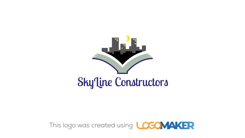
SkyLine Constructors’ logo features a city skyline emerging from an open book, symbolizing knowledge and architectural excellence. The use of gray and yellow highlights the urban landscape, while the book represents the foundation of architectural knowledge. The elegant, serif font adds a touch of sophistication, aligning with the company’s focus on creating iconic structures. The logo effectively communicates the company’s dedication to architectural mastery and innovation.
Why it’s good
- Symbolism: The city skyline and open book represent knowledge and architectural excellence.
- Elegance: The serif font and sophisticated design convey professionalism.
- Visual appeal: The gray and yellow color scheme creates a striking and memorable logo.
2. Futuristic construction
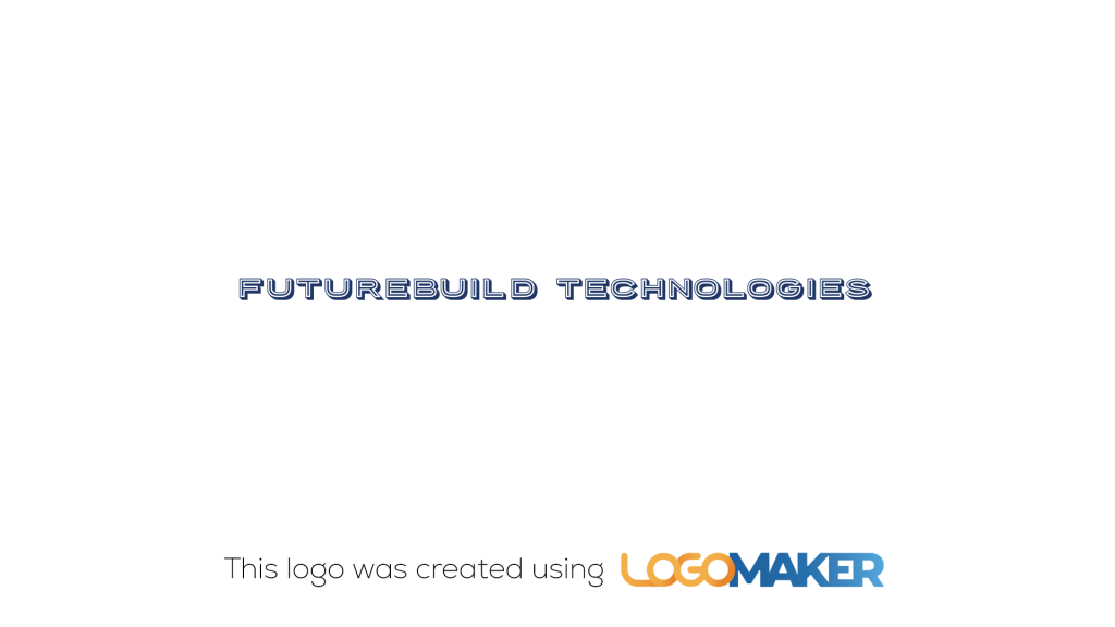
FutureBuild Technologies’ logo features a sleek, modern navy blue font, symbolizing innovation and advanced construction technology. The minimalist design focuses on the company’s forward-thinking approach, with clean lines and a contemporary look. The use of navy blue conveys professionalism and reliability, essential qualities for a tech-driven construction company. The logo’s simplicity and modernity effectively represent the company’s commitment to futuristic building solutions.
Why it’s good
- Innovation: The sleek, modern font conveys a sense of forward-thinking and advanced technology.
- Professionalism: The navy blue color emphasizes reliability and professionalism.
- Modernity: The clean lines and minimalist design create a contemporary look.
3. Vintage craftsmanship
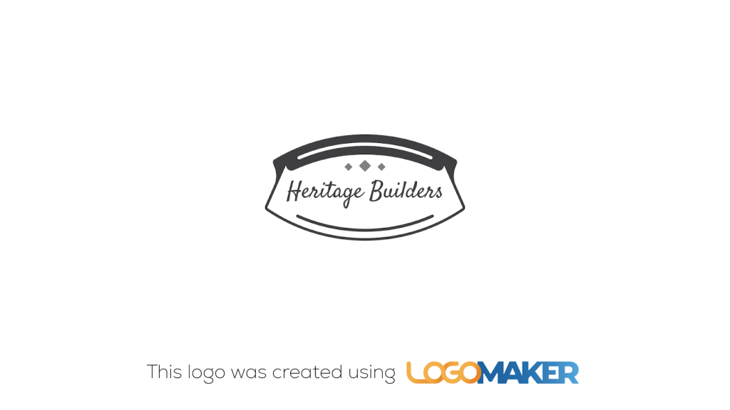
Heritage Builders’ logo features a vintage-inspired design with a classic font and traditional emblem. The black and gray color scheme gives it a timeless and elegant look, reflecting the company’s focus on traditional craftsmanship and quality. The oval frame and decorative elements add a touch of nostalgia, emphasizing the company’s dedication to heritage building techniques. The logo effectively communicates the company’s values of quality and tradition.
Why it’s good
- Timelessness: The vintage design and classic font create a timeless appeal.
- Quality: The traditional emblem emphasizes craftsmanship and quality.
- Elegance: The black and gray color scheme adds a touch of sophistication.
4. Nature-inspired
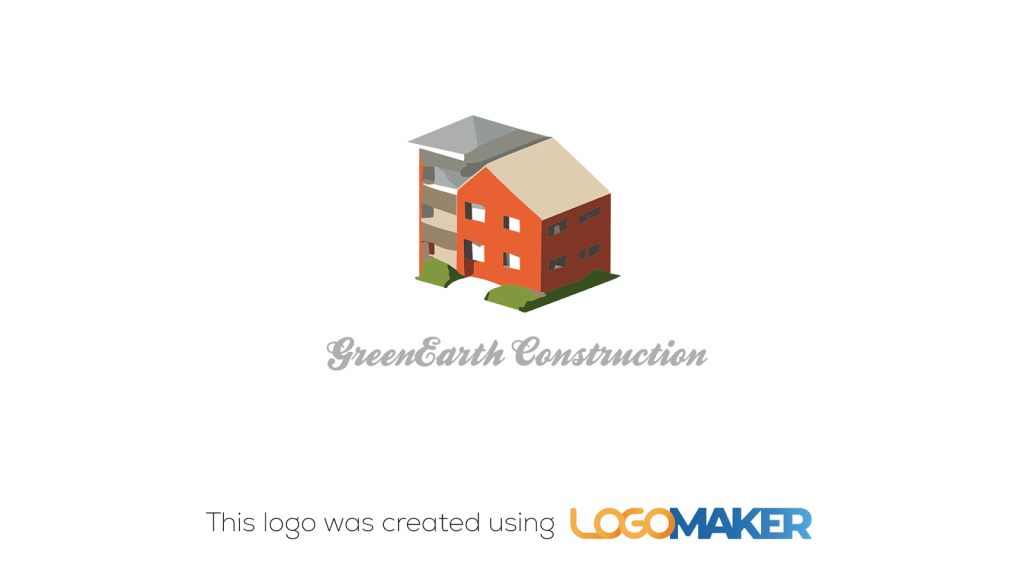
GreenEarth Construction’s logo features a modern building surrounded by greenery, symbolizing eco-friendly and sustainable construction practices. The use of earthy colors like green and brown reinforces the company’s commitment to the environment. The clean lines and geometric shapes give the logo a contemporary look, while the natural elements emphasize sustainability. The elegant, gray font adds a touch of sophistication, aligning with the company’s green building initiatives.
Why it’s good
- Sustainability: The greenery and earthy colors highlight eco-friendly practices.
- Modernity: The clean lines and geometric shapes convey a contemporary feel.
- Professionalism: The elegant font and sophisticated design reflect the company’s values.
5. Artistic expression
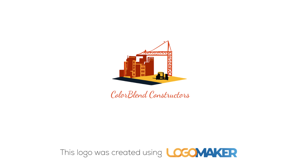
ColorBlend Constructors’ logo features vibrant colors and is an artistic representation of a construction site. The use of red, yellow, and blue creates a visually stimulating and creative logo, reflecting the company’s innovative approach to construction. The crane and buildings are depicted in a hand-drawn style, adding a unique and personal touch. The elegant, cursive font complements the artistic elements, reinforcing the creative identity of the company.
Why it’s good
- Creativity: The vibrant colors and hand-drawn style convey innovation and creativity.
- Uniqueness: The artistic representation makes the logo stand out.
- Visual appeal: The bold colors and elegant font create a visually attractive design.
6. Minimalist design
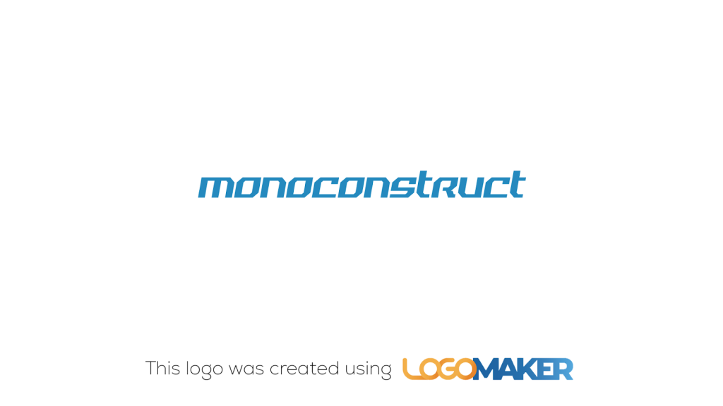
Monoconstruct’s logo features a sleek, modern blue font, embodying the essence of minimalist design. The simplicity of the text-only design highlights the company’s focus on clean, straightforward construction solutions. The use of blue conveys trust and reliability, essential qualities in the construction industry. The minimalist approach ensures that the logo is easily recognizable and versatile for various branding applications.
Why it’s good
- Simplicity: The clean, text-only design is straightforward and memorable.
- Trust: The use of blue conveys reliability and professionalism.
- Versatility: The minimalist design is adaptable for various branding uses.
7. Bold and dynamic
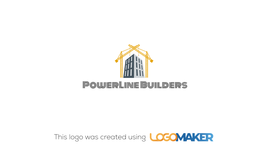
PowerLine Builders’ logo features a towering building flanked by two cranes, symbolizing strength and dynamic construction capabilities. The cranes in golden yellow add a sense of energy and movement, emphasizing the company’s bold approach to construction. The building in the center represents the core of their work – creating robust and towering structures. The bold, black font underscores the company’s powerful and dynamic nature, creating a strong visual impact that aligns with their brand identity.
Why it’s good
- Dynamism: The cranes and building convey a sense of movement and strength.
- Boldness: The bold font and strong imagery create a powerful visual impact.
- Symbolism: The cranes and building effectively represent the company’s construction capabilities.
8. Geometric precision
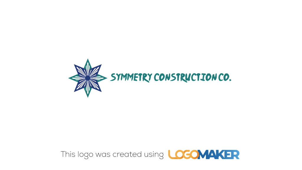
Symmetry Construction Co.’s logo features a geometric star with symmetrical patterns in blue and teal, symbolizing precision and balance. The design captures the essence of geometric precision, which aligns with the company’s focus on accuracy and meticulous craftsmanship. The combination of sharp lines and harmonious colors conveys a sense of stability and reliability. The bold, modern font complements the intricate star design, making it visually appealing and professional. The logo effectively communicates the company’s dedication to precise and high-quality construction work.
Why it’s good
- Professionalism: The geometric design and modern font convey a sense of professionalism and quality.
- Symbolism: The symmetrical star effectively represents precision and meticulous craftsmanship.
- Visual appeal: The harmonious color scheme and sharp lines make the logo visually striking and memorable.
Benefits of a well-designed contractor construction logo
A well-designed contractor construction logo offers several advantages that can help your business succeed in a competitive market. Let’s explore the key benefits of investing in a professional logo for your construction company.
Builds brand recognition
A distinctive logo helps customers easily identify and remember your company. When you consistently use your logo across various platforms, such as your website, business cards, and marketing materials, you create a cohesive brand identity that sticks in people’s minds. Over time, your logo becomes synonymous with your business, making it easier for potential clients to recognize and recall your services when they need them.
Conveys professionalism
A polished logo demonstrates your commitment to quality and attention to detail. In the construction industry, professionalism is paramount, as clients entrust you with significant investments in their properties. A well-designed logo showcases your dedication to delivering high-quality work and can help instill confidence in your company’s abilities. By presenting a professional image through your logo, you signal to potential clients that you take your business seriously and strive for excellence in every project.
Sets you apart from competitors
A unique logo helps differentiate your business from others in the construction industry. With numerous contractors vying for clients’ attention, having a distinctive logo can make your company stand out from the crowd. By incorporating elements that reflect your company’s values, specialties, or unique selling points, you can create a logo that sets you apart and captures the attention of your target audience. A memorable logo can be the deciding factor when a potential client is choosing between your company and a competitor.
Fosters trust and credibility
A well-designed logo can help establish your company as a reliable and trustworthy choice for construction services. When your logo appears professional and well-crafted, it suggests that your business is competent, organized, and attentive to detail.
Clients are more likely to trust a company with a polished logo, as it indicates that you invest in your brand and take pride in your work. By consistently using your logo across all touchpoints, you reinforce your company’s credibility and build trust with your target audience.
How to create a contractor construction logo
Creating a contractor construction logo that effectively represents your brand requires careful consideration and a strategic approach. Follow these steps to design a logo that captures your company’s essence and resonates with your target audience.
Define your brand identity
Before diving into the design process, take the time to define your brand identity. This involves determining your company’s core values, mission statement, and unique selling points. As you saw above in the logo ideas, the idea and the brand behind the company must be reflected through the logo itself.
Ask yourself what sets your business apart from competitors and what message you want to convey to potential clients. Understanding your brand identity will guide your logo design choices and ensure that your visual identity aligns with your overall brand strategy.
Gather inspiration
To spark creativity and identify design elements that resonate with your brand, research competitor logos and gather inspiration from various sources. Look for logos within the construction industry and beyond, noting the use of symbols, typography, and color palettes that effectively communicate the desired message.
Create a mood board or collection of images that capture the aesthetic and feel you want to achieve with your own logo.
Choose appropriate symbols and typography
Based on your brand identity and the inspiration you’ve gathered, select symbols and fonts that reflect your company’s services and values. For contractor construction logos, common symbols include tools, equipment, buildings, and geometric shapes that convey strength and reliability.
When choosing typography, opt for fonts that are legible, professional, and consistent with your brand personality. Sans-serif fonts are popular choices for their clean and modern appearance.
Experiment with color palettes
Color plays a significant role in evoking emotions and creating associations with your brand. Experiment with different color combinations that align with your brand identity and the construction industry.
Yellow, orange, blue, and green are common choices, as they can convey safety, visibility, trust, and growth. Consider using a limited color palette to ensure your logo remains versatile and easily recognizable across various applications.
Refine and finalize your design
Once you have a draft of your logo, seek feedback from colleagues, friends, and potential clients. Use their input to refine your design, making adjustments to improve clarity, legibility, and overall impact.
Ensure that your final logo looks great across various applications, from business cards and letterheads to vehicle wraps and signage. Test your logo in different sizes and formats to confirm its versatility and effectiveness.
For more inspiration, explore these creative logo ideas that can help guide your design process. Remember, a well-crafted contractor construction logo is an investment in your brand’s future, helping you establish a strong visual identity that sets you apart from the competition and attracts your ideal clients.
What makes a contractor construction logo effective?
An effective contractor construction logo should be simple and memorable, making it easy for potential clients to recognize and recall your brand. The design should incorporate relevant symbols and typography that reflect the construction industry and your company’s unique qualities.
Choosing an appropriate color palette is also key to creating a strong visual identity. Colors like yellow, orange, blue, and green are commonly used in construction logos, as they convey safety, visibility, trust, and growth. However, it’s important to select colors that not only align with industry standards but also set your logo apart from competitors.
Versatility is another crucial aspect of an effective contractor construction logo. Your logo should look great across various media, from business cards and letterheads to vehicle wraps and signage. A simple, scalable design ensures that your logo remains legible and recognizable, regardless of the size or medium.
To create a truly effective contractor construction logo, consider exploring building and construction logo ideas for inspiration. These examples can help you identify design elements that resonate with your brand and target audience, ultimately guiding you toward a logo that effectively represents your business and stands out in the competitive construction market.

How can a strong contractor construction logo help your business succeed?
A well-designed contractor construction logo can be a powerful tool in helping your business thrive in a competitive market. It serves as the visual foundation of your brand, communicating your company’s values, professionalism, and reliability to potential clients.
A strong logo attracts attention and makes your business memorable. When a potential client sees your logo, they should immediately associate it with the high-quality services you provide. This instant recognition helps your company stand out from competitors and increases brand recall.
Ultimately, a well-crafted contractor construction logo is an investment in your company’s future success. It helps you attract new clients, establish a strong brand identity, and build long-lasting relationships with your target audience.
If you’re looking to create a modern, professional, and engaging logo for your construction business, LogoMaker can help you out. LogoMaker is an AI-powered logo designing tool that is capable of creating dozens of variations of your logo just based on your brand name and industry.
If you’re looking to create a logo with minimal graphic design experience, LogoMaker provides an easy and efficient way to design a standout logo that captures your brand’s identity.
Sign up with LogoMaker today and start creating your logo for free. No payment is required till you’re satisfied with your design.
Contractor construction logo ideas: Frequently asked questions
Are there specific logo design elements recommended for construction logos?
Yes, construction logos often incorporate design elements such as tools, buildings, and machinery. Strong, bold fonts and colors like blue, black, and orange are commonly used to convey strength, reliability, and professionalism.
How can I make my construction logo stand out?
To make your construction logo stand out, focus on simplicity, strong visual elements, and unique design features that reflect your business’s values and services. Ensure your logo is versatile and works well in both print and digital formats.
What file formats should I have for my construction logo?
It is important to have your construction logo in multiple file formats, including PNG, JPG, and vector formats such as SVG or EPS. This ensures that your logo maintains its quality across different media and uses.
How much does it typically cost to design a construction logo?
The cost of designing a construction logo can vary widely. Using LogoMaker is extremely cost-efficient. If you go for the manual logo designer route, hiring them can cost anywhere from a few hundred to a few thousand dollars.