Whether you are writing a new blog post, working on a new company logo or even the wider branding style of your company, there are certain unspoken rules about fonts that can and cannot be used.
There are an unfathomable number of fonts and typefaces in the world, and yet time and time again people fall back on the same standard font ideas for their company branding.
Do you want to stand out from the crowd? Do you want your logo and branding to grab people’s attention rather than fade away into generic obscurity? Well, keep reading to learn about all the overused fonts you need to avoid.
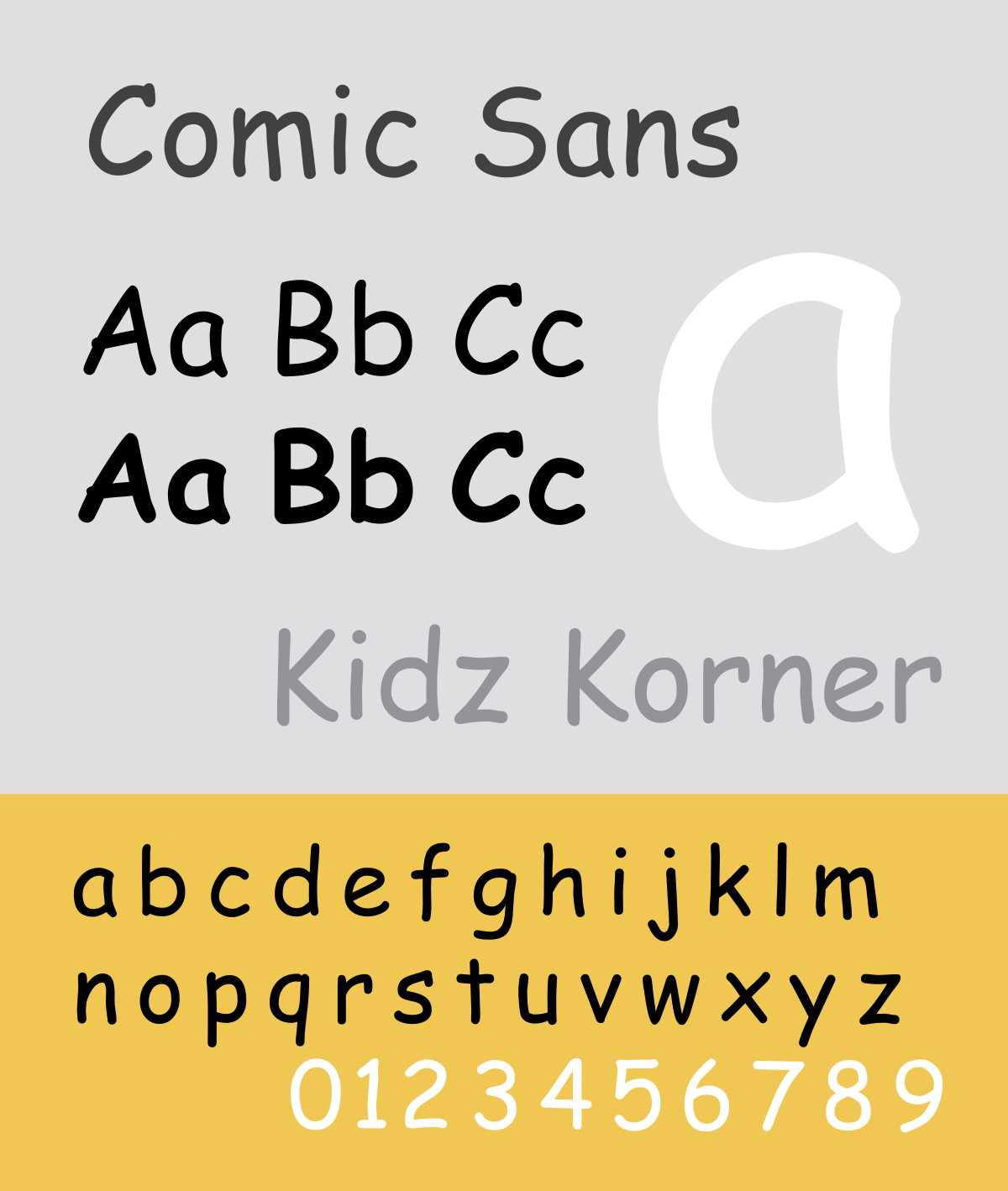
1. Comic Sans
A common font that is not only overused, but also utterly childish. Comic Sans has no place in a professional working environment. The only exception to this rule would be if your business was one that catered for children, but even then, there are better fonts out there that achieve the desired effect.
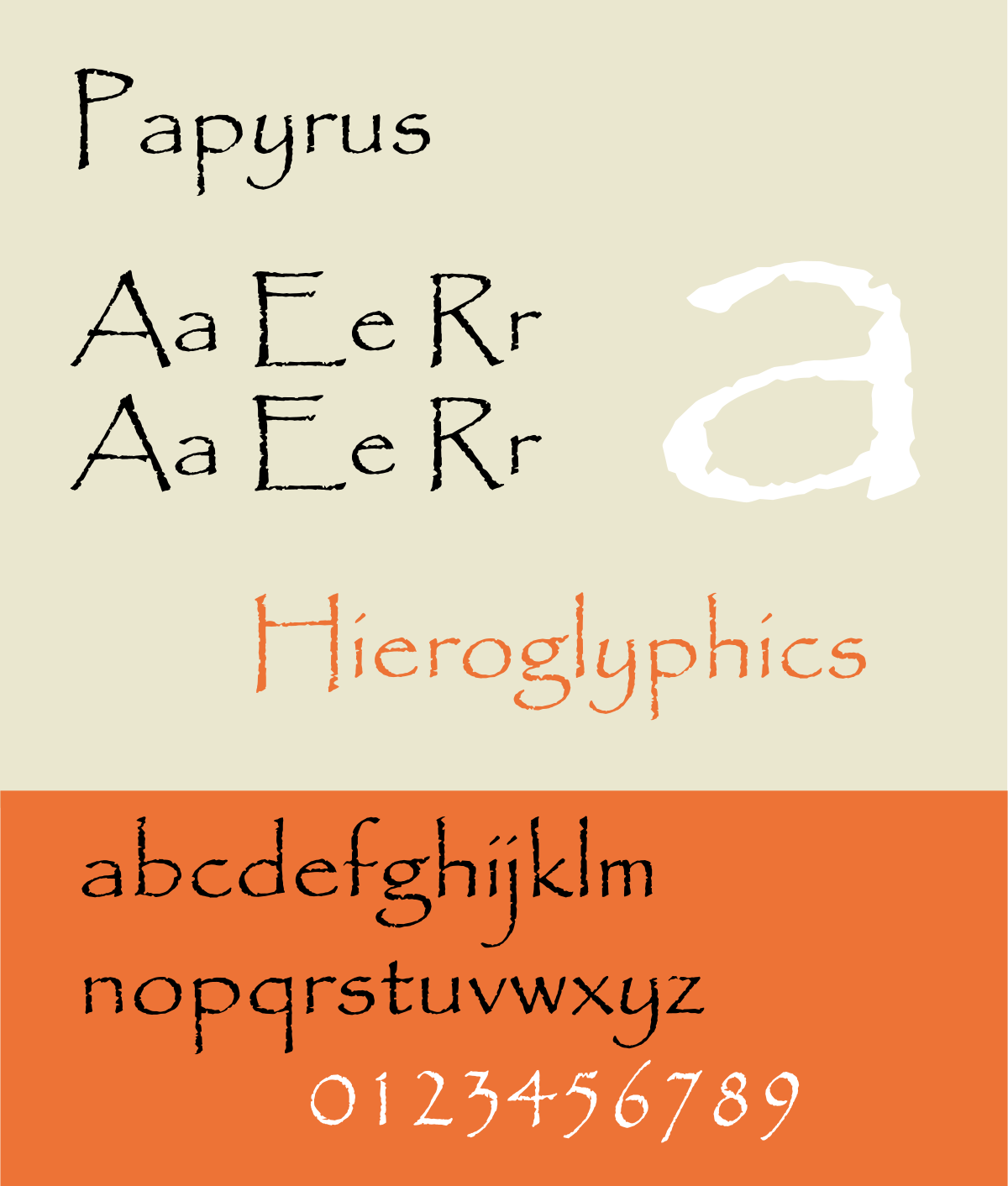
2. Papyrus
An older font that has survived from the early ’80s, it has been so widely used that the well-designed or not, good intentions or not, any effect the font used to have has been thoroughly washed away.
During its life, it had its uses and was certainly effective, but in 2019 it is finally time to put Papyrus down for good.
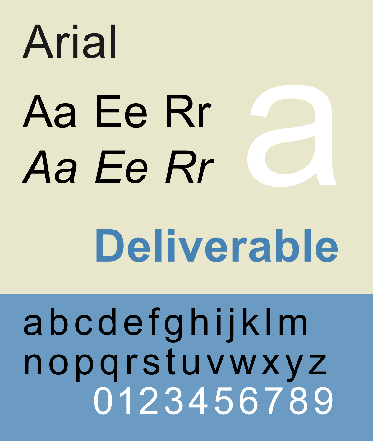
3. Arial
The default font for many years post Windows 3.1, it this fact alone should be evidence enough as to why Arial is one of the most hated fonts. A free alternative to a slightly better model (also on this list), Arial became the go-to standard for everything from posters to billboards and for that reason alone it is now a font to be avoided.
4. Times New Roman
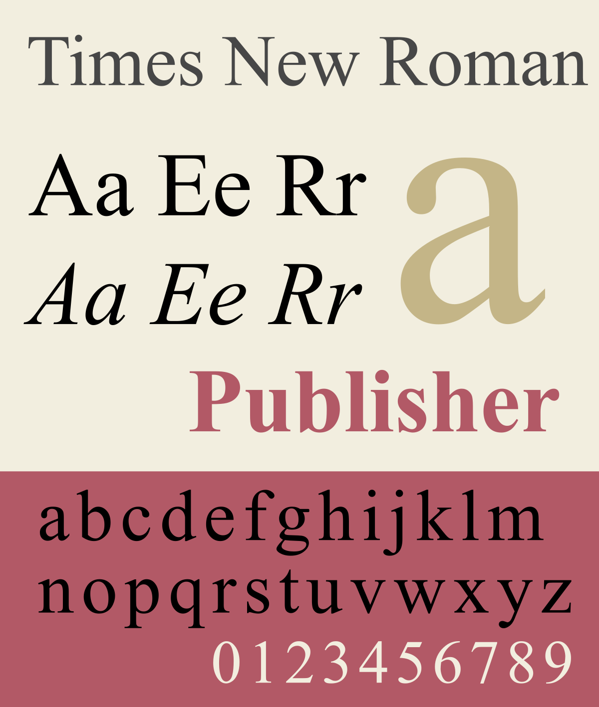
When talking about overused fonts, Times New Roman needs to be raised. Originally created in 1929 for the Times, the British newspaper, it became the new default font for Microsoft and has since then been overused in every walk of life.
Hard to read and overused is a bad combination for the lazy and disinclined. Move away from the defaults, there is so much more out there.
5. Courier New
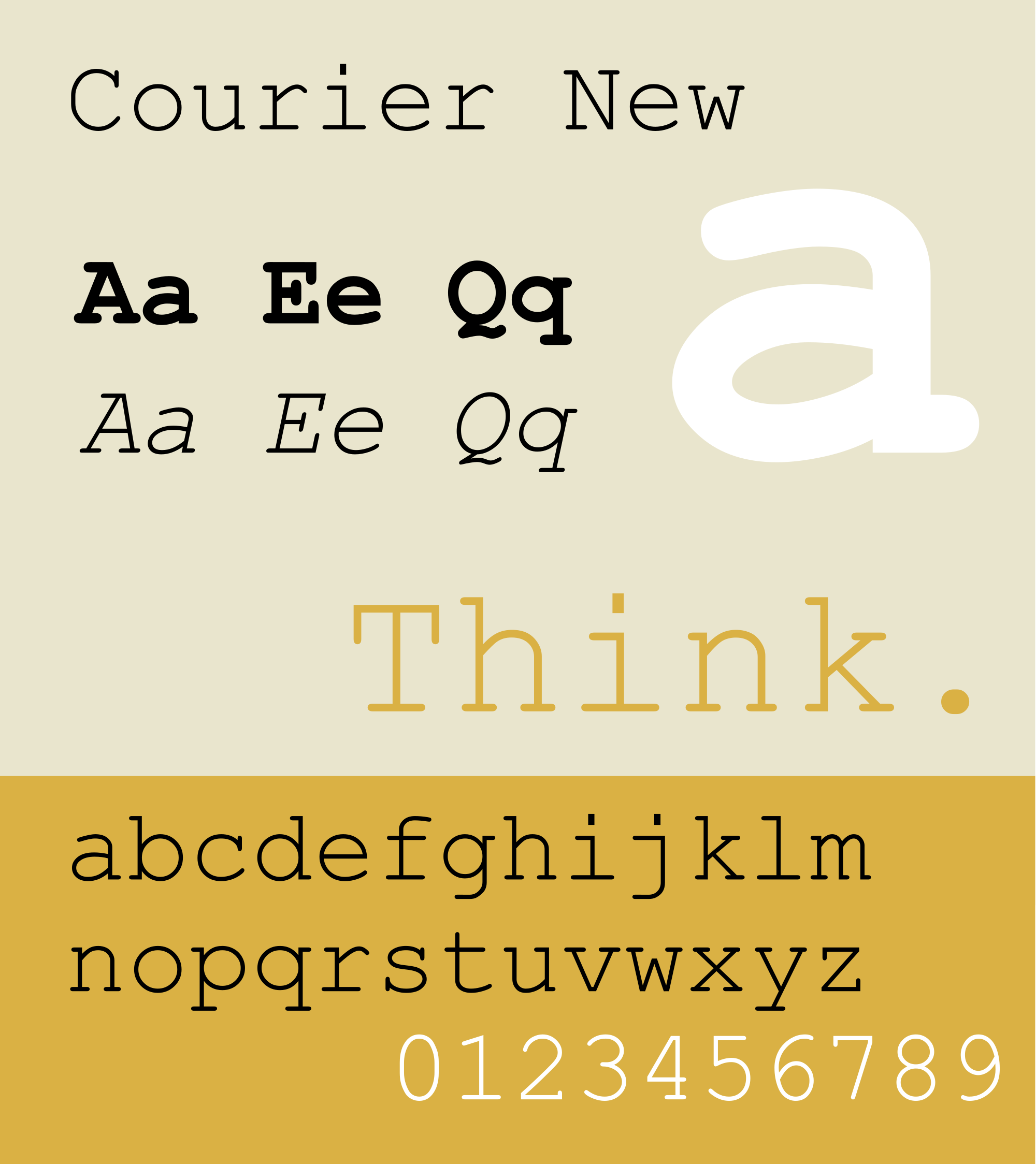
While Courier New is not one of the most hated fonts in the world, it is one that has seen its glory days and needs putting out to pasture.
While it has its place in the world, especially for use in film scripts, its poorly measured lettering make Courier the scourge of designers the world over, making it a font to be avoided wherever possible.
6. Kristen ITC
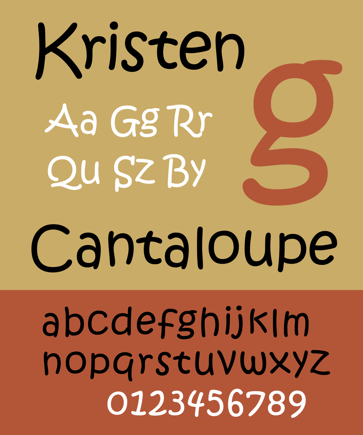
Another font that is for the juvenile crowd. Well suited for classroom signs for pre-schoolers, it is fun but impractical in the business world.
You would not want your logo reading like it was made for, or written by, a toddler. The curved style of the words also makes it difficult to space the letters in an effective manner.
7. Vivaldi
A nice font at first glance, Vivaldi is one that gets worse the longer you look at it. Script fonts are always troublesome when it comes to ease of reading, but Vivaldi is an especially tricky fellow given that it is only a half script, meaning the letters are not made up of a single flow of ink.
The spacing of the letters is not ideal, and messing with this only seems to make it worse. Whatever you do, don’t write in all caps, because that just creates an illegible mess.
Whether you are creating wedding invitations or just want your business card to look fancy, stop scrolling before you reach the latter part of the alphabet, because Vivaldi is not for you.
8. Helvetica
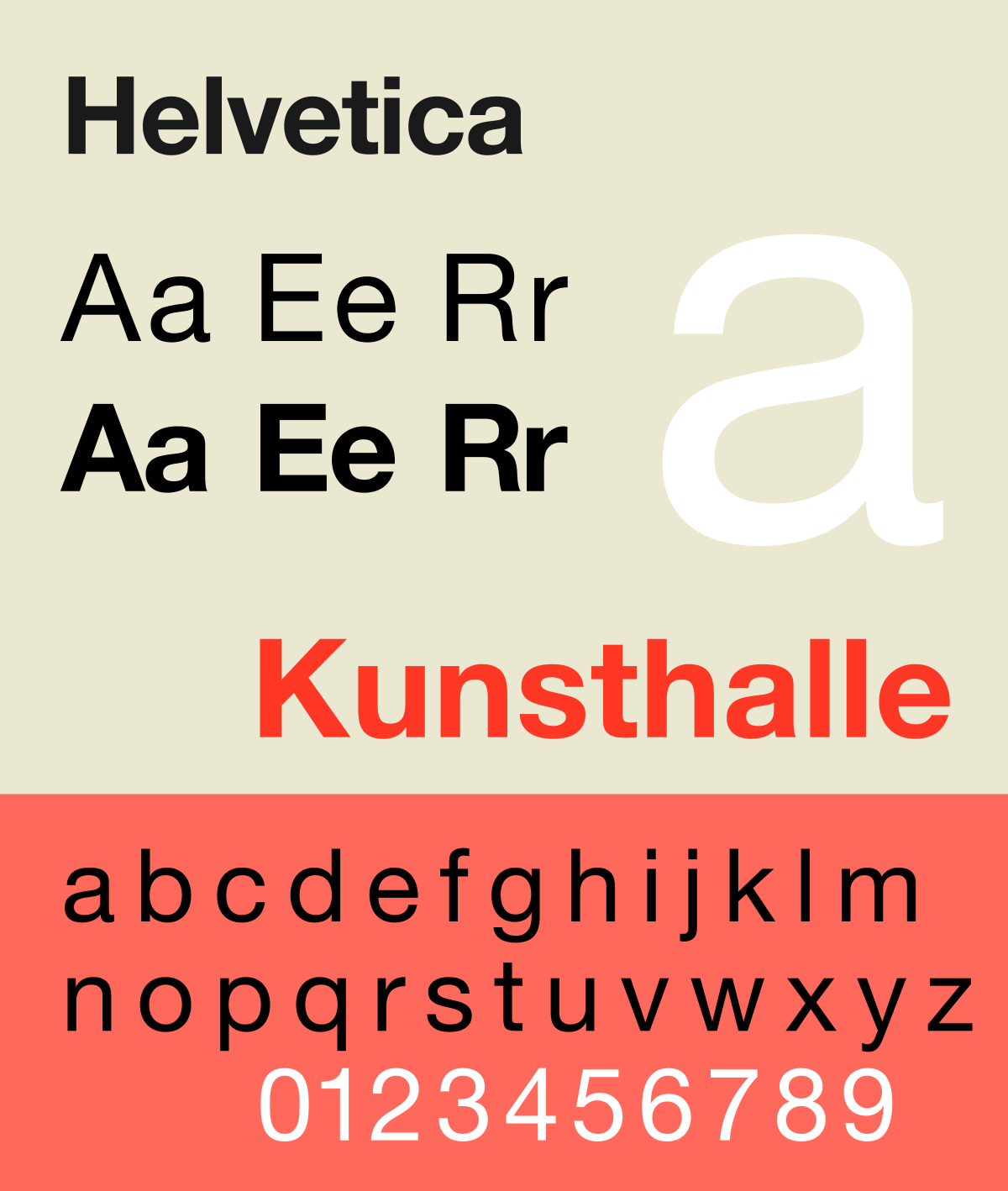
Helvetica is a good font. There is no denying that. Created back in the 1950s it has been used to good effect by some of the largest companies the world over.
Why is it on this list of worst fonts?
Well, it is precisely its overuse and association with such big brands that make it a poor choice in today’s world of font drive creativity. There are so many choices at your fingertips, using Helvetica comes across as a timid approach trying to hitch a lift on others success.
9. Impact
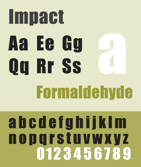
Another good font that has served its purpose in years gone by, Impact is no longer the force it was. Too generic and too narrow in its final design to make any lasting impression on the world, it is a weak choice for usage in an environment where your goal is to stand out and grab people’s attention.
Not the worst font in the world, it firmly falls into the category of overused fonts, and any designer worth his salt will have a dozen better alternatives you could choose from.
10. Viner Hand
Viner Hand is another one of the overused fonts that has lost any and all impact it once had. It looks nice and is based on a real handwriting style, but beyond that, its oversaturation in youth-focused areas has made it a font to be avoided.
While not the worst font on the list, there are better choices out there. Take your time and pick one that is going to help your logo and marketing material stand out rather than blend in.
Avoiding Overused Fonts Will Help Your Brand Make an Impression
From logos to marketing the font you choose will say a lot about your brand. A lot of people may not give the correct or appropriate amount of thought into this and will end us choosing an overused font and damage themselves without ever knowing why.
Yet, font choice should always be a key consideration when thinking about your brand. Not only do you need to choose one that fits your business and the sector you are in, but you need to make sure you avoid all of the common options.
Put some serious thought into your fonts and build a brand that is stylish and stands out from the crowd for all of the right reasons. Don’t freat, you don’t need to do this alone. We are here to help.
Get in touch today and work together with our designers to create the perfect logo for your business.
