Whether you own a travel agency, tourist service, hotel, or other business that provides services to travelers, the best way to tell others about your company is by creating and displaying your logo. A business logo is a focal point for your brand; it’s what customers identify with first and foremost.
For travel-related companies, logos should be displayed clearly across all marketing materials both online and offline. Creating a travel logo from scratch is a difficult endeavor however, which is why our free logo maker recommends doing some competitor research and gathering some helpful design tips before getting started. Below are a few design hacks that professional logo designers use when they create travel logos for agencies and hotels.
How to make a travel logo
Step 1: Decide on a logo style. Traveling is always an exciting adventure for individuals, so creating a logo that sparks excitement and joy for customers is the ultimate goal. Any logo design that alludes to a faraway foreign destination is sure to be a big winner — and that design all comes from the style of logo you choose. There are dozens of different logo styles to choose from, but the most popular amongst travel agencies, airlines, and tourist services involve a mix of a logo icon and text. A few logo styles that have these two elements include: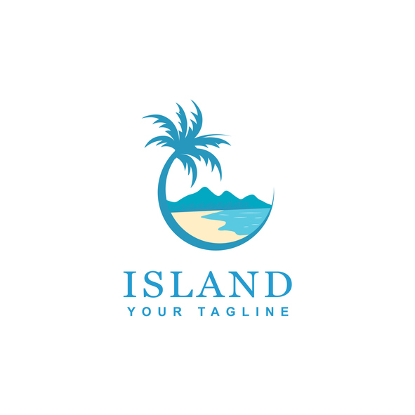
- Badge or emblem logos
- Monogram logos
- Abstract logo marks
- Combination mark logos
Step 2. Choose a logo icon. Travel logo designs will commonly use icons associated with the industry. Airlines will often use airplanes, birds, or anything that symbolizes flight or movement. American Airlines, for example, uses an eagle for their travel logo icon, Expedia uses an airplane, and Continental Airlines uses a globe. Tour buses or walking tour companies will often design a logo that depicts a certain unique quality about the city or town they are in. Think skylines, monuments, memorials, waterways, historical figures, and other elements. Travel agencies may use globes, palm trees, mountains, location pins, compasses, or other map symbols.
Whatever logo icon you choose for your travel company, make sure that it will look good at any size and on any background. Try to envision your travel logo design on your website, social media pages, and promotional products. It’s important to ensure that your logo can be scaled down to any size without compromising on design details. During the design process, create enough space between lines and letters so that they’re legible from a distance.
Step 3. Choose a font. Travel companies usually stay on the more conservative side when it comes to font styles and instead focus their logo design attention on the icon portion. When choosing a font style for a travel logo, opt for something bold, minimalist, and all capital lettering. You want to make sure your travel company stands out against your competitors while also coming across as a serious and professional business. Clean typefaces will send a message that you provide services to customers from all over the country or world. A few travel font styles to look into include:
Step 4. Choose font and icon colors. Now for the fun part: selecting a color scheme for your travel logo! Travel is an exciting endeavor, so colors that spur excitement, intrigue, and adventure should be considered. Choosing a color scheme for your brand will help make your future marketing efforts more successful — and that all starts with the colors in your travel logo. A few popular color schemes for travel logos include:
- Red, blue, and white
- Yellow, purple, and white
- Dark blue, yellow, and gray
- Red, yellow, and white
- Bluegreen, purple, and white
- Deep purple, light gray, and black
If you’re using a free logo maker to design your logo, then chances are you will be able to play around with different colors until you find the perfect ones for your design. If you are set on a particular color scheme, you should test how each color looks on various elements of your logo, such as the text, the icon, or portions of the icon. For example, the name of your travel business may not stand out if the font is yellow, but making the airplane icon yellow against a circular blue background will be plenty noticeable to customers.
