Surfboard Island is an online retailer specializing in…you guessed it, surfboards. They offer high quality brand surfboards and surf gear from all over the world. The site offers detailed search options and an awesome ‘board recommender’ page that enables each customer to find the perfect surfboard.
In a note of full disclosure, when I first saw a logo for a surf company I have to admit I was pretty excited having grown up surfing on the beaches of Southern California. But, more importantly, we were impressed with how well designed the logo was which is why we are spotlighting it. Congratulations and great job Jonny.
How to Create a Surfboard Logo
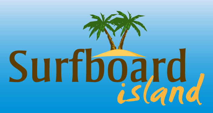
With a company name like Surfboard Island, you probably want an icon of a surfboard or an island, or maybe both. In this case, an icon from Logomaker captured the island theme well. The island image was then complemented by a brilliant use of font and color to build the rest of his logo.
The whole point of a logo is help people remember your company name. In this case, the word Surfboard, which is and should be the focus of the logo, is rendered in a rich chocolate brown and positioned right in the center of the logo to grab the attention of the viewer.
The word Island is rendered in a handwritten brush typeface which gives the entire logo more personality. By coloring the word Island in sandy brown and coloring the word Surfboard in a dark brown an island of sorts is created. When I look at the words, the tall vertical lines of the word Surfboard almost look like trees or surfboards stemming from out of a hill of sand.
Overall the logo is memorable, captures the right theme and message and was created for less than $50 using Logomaker (to retrieve print ready files from Logomaker, it’s $49).


