One of the most usual logo design mistakes that we’ll be discussing is creating an illustration rather than a logo. A perfect example of this mistake is Apple’s initial logo design that featured Isaac Newton under an apple tree.
The image was well-designed, but it was more of an illustration and not a logo. The company quickly pivoted to now world-famous apple with a bite taken out, which better represents the brand’s dedication to simplicity, innovation, and elegance.
In this article, we’ll go over more common mistakes and pitfalls that you should try to avoid when designing your own custom logo. Hopefully, we can help you design the perfect logo that is captivating and has the elements to help it stand the test of time.
- Things to Consider When Designing a Successful Logo
- Mistakes to Avoid When Designing Your Own Logo
- 1. Overcomplicating the Design
- 2. Ignoring Scalability
- 3. Following Trends Too Closely
- 4. Choosing Inappropriate Colors
- 5. Relying Too Much on Stock Elements
- 6. Overlooking Font Selection
- 7. Not Considering Cultural Differences
- 8. Neglecting Versatility
- 9. Not Getting Feedback on Your Logo Design
- 10. Failing to Align the Logo with the Brand Identity
- 11. Not Showing Your Logo Enough
- 12. Copying Another Logo
- 13. Lacking Symbolic Significance
- 14. Creating an Illustration Instead of a Logo
- 15. Failing to Seek Professional Help
Things to Consider When Designing a Successful Logo
Before we dive into the mistakes you should avoid, we’ll go over some of the basics of logo design to make sure you’re getting off on the right foot.
Understand Your Brand Identity
Studies show that the human brain processes images around 60,000 times faster than text, so having an eye-catching logo with strong imagery will be more convincing at drawing in new customers than any amount of text.
Your logo will be your company’s calling card to the rest of the world. It’s usually one of the first visuals that clients see when they encounter your company, and making a good first impression is incredibly important.
How to Determine Brand Identity
In order for your logo to accurately represent your brand, first, you need to know what your brand identity is. Building your brand will depend on a variety of things, such as your industry, your ideal client base, and your company’s future goals.
Here are some things you can do to determine your branding identity:
- Define your brand’s mission, values, and personality.
- Consider your target audience and how you want them to perceive your brand.
- Develop a unique value proposition to differentiate your brand from competitors.
Seek Inspiration
Once you have determined your brand identity, you can start designing your logo to help present that identity to the world. Building a business logo from scratch can be difficult, so research your competitors and analyze their logos to identify elements you like and determine how your logo can stand out.
Logo ideas can come from anywhere and everywhere, so keep your eyes open. Penguin Books’ famous logo was designed by Edward Young, an employee at the company, who sketched the initial design of the logo at the London Zoo in the 1930s.
If you’re having trouble getting inspiration, you can use LogoMaker’s full suite of logo design services and choose from our extensive library of over 10,000 logo templates.

Decide on Your Logo Style
You should choose a logo style that reconstructs your brand’s personality and industry, such as modern, minimalist, or classic. Consider the tone you want to convey with your logo. If you’re creating a logo for a dog walking service, you might want to have a more playful logo with a colorful animal theme. If you’re crafting a logo for a construction company, you’d want to give a sense of strength and certainty.
Different Logo Styles
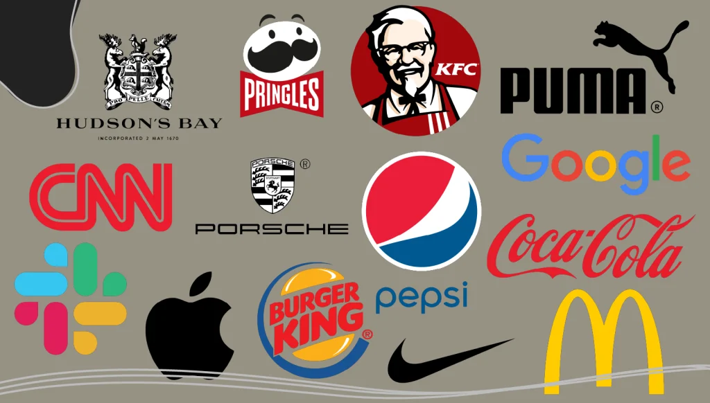
Here are some of the most common types of logos you can choose from:
- Wordmarks: a logo made up of text only, examples include Coca-Cola and Google.
- Letterforms: a logo made up of a single letter or initials, examples include IBM, CNN, and McDonalds.
- Symbol logos: a logo made up of a symbol or icon, examples include Apple, Nike, and Starbucks.
- Mascot logos: a logo that features a recognizable character, examples include KFC and Pringles.
- Abstract logos: a logo comprised of abstract shapes and lines, examples include Pepsi and Slack.
- Emblem logos: a logo with images and text in a badge or crest, examples include Porshe and Hudson’s Bay.
- Combination mark: a logo made up of a symbol or icon, examples include Burger King and Puma.
Mistakes to Avoid When Designing Your Own Logo
While there is no wrong or right way to design a professional logo, there are some common mistakes that many logo designers make. We’ll go over the most common mistakes that people make when designing a new logo so that you can avoid them when designing a logo of your own.
1. Overcomplicating the Design
One of the most common mistakes when designing custom logos is cramming in too many elements. It’s tempting to include every symbol, color, and font that feels relevant, but simplicity is often more powerful.
A cluttered design can confuse viewers and may not translate well across different media, especially on smaller screens. Complex logos can look heavy on the eyes, and they’re much harder to remember.
Think about the logos that you resonate with most and ask yourself- how many different elements do these logo designs use? Your answer will likely be under three, as the most successful professional logos are usually the most simple ones.
Tip: Focus on a clean, simple design that’s easy to recognize at a glance.
2. Ignoring Scalability
Logos appear on everything from business cards to billboards. If your logo doesn’t scale well, it risks looking fuzzy, cluttered, or completely unrecognizable. A strong logo should maintain its clarity and impact, whether it’s blown up on a banner or shrunk to the size of a pencil eraser.
The Significance of Vector Files in Logo Design
Vector files are images that are built by mathematical formulas that establish points on a grid. Raster files are composed of colored blocks called pixels.
Since vectors are based on formulas, a vector image can scale at high resolution to virtually unlimited sizes. If you have a business logo saved in a vector format, it can be resized to fit on a billboard or reduced to be printed on a business card.
We highly recommend that you save your business logo files as a vector file to help with scaling.
3. Following Trends Too Closely
Looking at the latest logo design trends is useful when you’re seeking inspiration for your own logo design. However, if you’re too influenced by current design trends, you risk creating something that feels dated in just a few years. Design choices that feel “in” now may look out of place in a short time, leading to costly rebranding efforts down the line.
One of the most famous examples of a company being over-reliant on trends is Gap. In 2010, Gap decided to redesign their 20-year logo and incorporate some trendy new design elements. The redesign was met with a massive outcry from their customers, and Gap was forced to bring back the original logo design, but it would end up costing them millions of dollars in the process.
Be Careful When Using Trends in Your Logo Design
Trends tend to turn into cliches over the years, and the last association you want people to have with your business is that it’s outdated. This isn’t to say that you should avoid trends altogether; there are certainly logo design trends that will help your logo stand out and make a unique mark on the world.
Be mindful of what logo trends are a flash in the pan and which trends have legitimate staying power. You want your company logo to be unique and timeless. If your logo looks the same as a hundred other logos that were designed around the same time, it will be almost impossible to stand out.
Tip: Draw inspiration from trends, but don’t let them dictate your entire design.
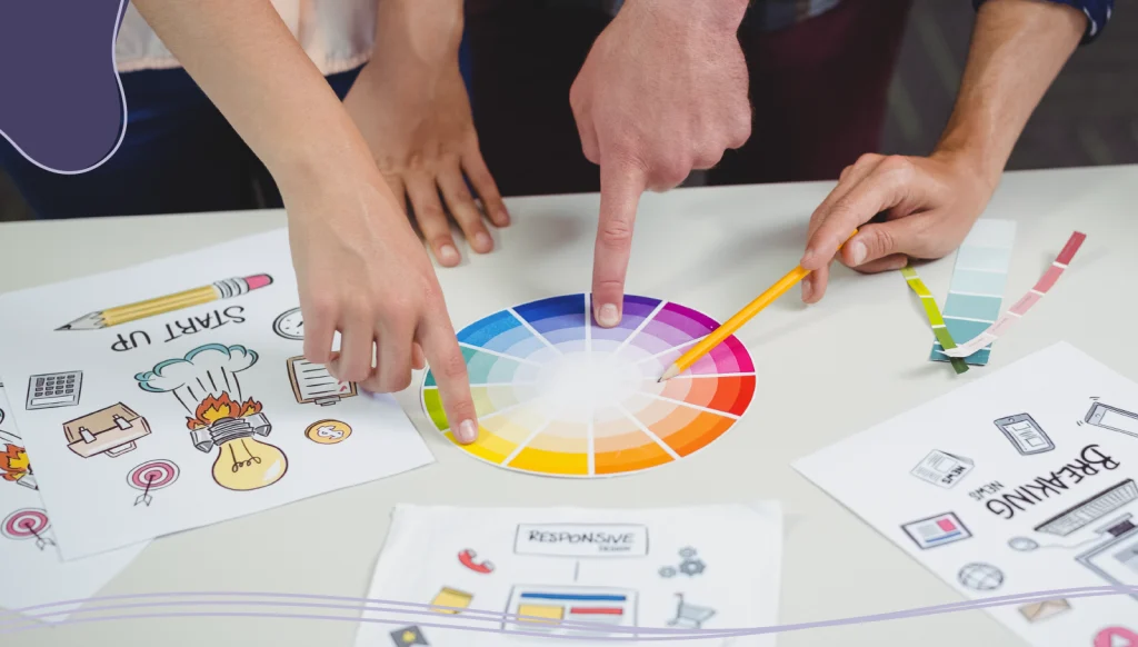
4. Choosing Inappropriate Colors
Colors affect people in different ways. By understanding the science of color, and by applying it to your logo in a creative way, color can actually increase brand recognition by up to 80%.
Selecting colors that clash with your brand’s personality or industry can send the wrong message. For instance, bright, playful colors may not convey professionalism if you’re in a serious industry like finance or law. You should research color psychology and think about how your colors align with your brand values.
Don’t Use Too Many Colors in Your Logo Design
Going back to the topic of simplicity, you should avoid using too many different colors in your logo design. By using a limited color palette, you can ensure that your logo is clear and easily recognizable. A logo with ten different colors will be far less memorable than a logo with one or two.
The most iconic logos of all time follow this rule, as most of them use only one or two colors. According to Zippia, 95% of the world’s leading brands use 2 colours in their logo. This is in order to keep the logo looking clean and uncluttered.
5. Relying Too Much on Stock Elements
Using stock icons and clipart can be tempting when trying to design a logo quickly or on a budget. However, these elements often lack originality and make your logo look generic. If customers see your logo and feel like they’ve seen it before, it may be hard to differentiate your brand from others.
Invest in custom logo elements tailored to your brand. A professional designer can create unique symbols, icons, or typography that will help your logo stand out.
If you’re operating on a strict budget, take advantage of LogoMaker’s affordable logo design tools that can help you create professional logos in just minutes without having to rely on stock images.

6. Overlooking Font Selection
Choosing the right logo font is just as important as choosing the right icon or symbol. The wrong font can clash with your brand’s tone or make your logo hard to read. For example, overly ornate fonts can be tough to read at smaller sizes, while excessively playful fonts can look unprofessional in a corporate setting.
You should choose a font that aligns with your brand’s voice and test its readability at different sizes. Combining fonts can be effective, but limit it to one or two complementary fonts for balance.
Avoid Using Too Many Fonts
Using too many fonts in your logo design creates the same kind of problems as using too many colors. If you are using several different typefaces, your clients won’t be able to connect any one font to your brand. Seeing too many at once causes confusion and will make your logo look cluttered and messy.
Using a maximum of two fonts of different weights is standard practice. Restricting the number of fonts to this number greatly improves the legibility of a logo design and improves brand recognition.
7. Not Considering Cultural Differences
If you’re creating a logo for an international audience, it’s crucial to be mindful of cultural implications. Colors, symbols, and even shapes can hold different meanings across cultures. A design that feels perfectly appropriate in one region might be confusing—or even offensive—in another.
Avoid using certain colors that may have negative connotations in different cultures. For example, in Western cultures, white is often associated with purity and weddings, but in Asian cultures, it’s the color of mourning.
Tip: Research cultural associations if you plan to reach a global audience. This step ensures that when you design a logo, it appeals to a broader audience and avoids unintentional misinterpretations.
8. Neglecting Versatility
Your logo will appear across various formats, from websites to merchandise. Logos that rely heavily on intricate details or gradients can lose their appeal when they’re adapted to different media. A logo that looks fantastic on a webpage might not work as well on a printed T-shirt. The last thing you want is for your company name and logo to look stretched out or misshapen.
Creating a versatile logo design is essential for adapting to different mediums and contexts. Your logo should be adaptable to different backgrounds, sizes, and color variations without losing its unique brand identity.
Consider how your logo will appear in digital and print media, as well as in grayscale or black-and-white formats. By designing a versatile logo, you ensure that it can seamlessly integrate into different marketing materials and maintain its impact and recognition.
Tip: Aim for versatility by designing a logo that looks equally good in both digital and print formats. Create a version of your logo that works well in black and white to keep it adaptable across diverse applications.
9. Not Getting Feedback on Your Logo Design
One of the biggest mistakes in logo design is skipping the feedback phase. Without feedback, you might miss out on important insights about how others perceive your logo. Getting feedback from colleagues, customers, or focus groups can reveal potential issues or improvements you hadn’t considered.
Once you receive feedback on your logo, you should be ready to incorporate suggestions into your logo design. Iterating and improving your logo designs based on feedback will ensure that the design resonates with your customers.
Tip: Test your logo with different people to see if it communicates your intended message. Gather feedback and be open to revisions based on constructive critiques.
10. Failing to Align the Logo with the Brand Identity
A logo is an extension of your brand’s identity, but if the two don’t align, customers may feel disconnected. For instance, if you’re a tech company with a futuristic edge, a vintage-style logo may feel out of place. Your logo should resonate with your brand’s mission, values, and audience.
Take the time to clarify your brand’s personality and message before you design your logo. A well-aligned logo reflects your brand’s true identity and creates a stronger connection with your audience.
11. Not Showing Your Logo Enough
On average, a person needs to see your professional logo 5 to 7 times before they will remember your brand.
In order for people to recognize your logo, they have to see it a lot. This might seem like straightforward advice, but you should be putting your logo on business cards, pamphlets, brochures, and all other marketing materials and branded assets.
When you create a unique logo, people have no connection with it the very first time they see the icon, but as they see it more and more, they will start connecting that logo with the visual identity of your company.
This is especially important for small business owners who are trying to get their professional looking logos seen by as many people as possible to build brand recognition.
12. Copying Another Logo
One of the most significant mistakes to avoid when creating an effective logo is not copying an existing one. Of course, you can draw inspiration from some trending logos when designing yours; however, do not copy them; it would be plagiarism.
In addition to damaging your brand’s credibility, copying an existing logo will show your lack of professionalism and authenticity. Moreover, copying a logo could mean that you are infringing on copyrighted materials and it might lead to legal issues down the road.
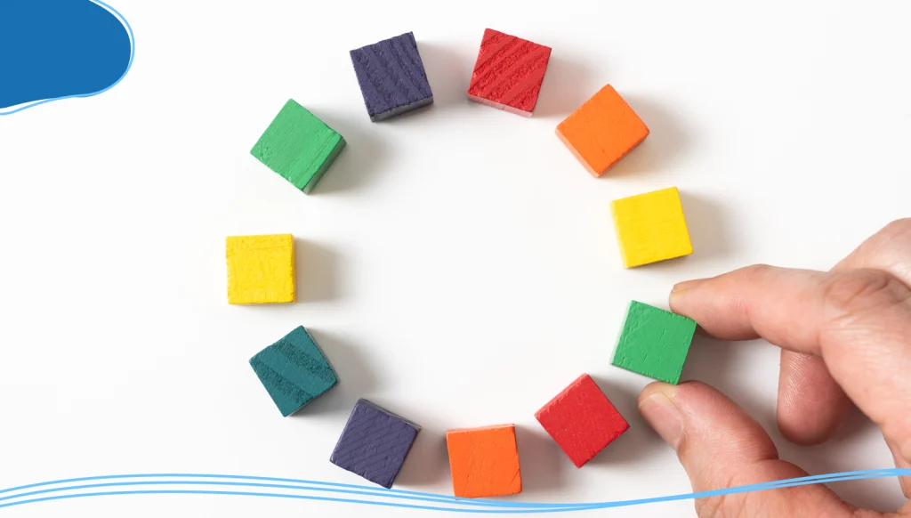
13. Lacking Symbolic Significance
Your logo creation process should result in a logo design that has symbolic significance. If you decide to design a logo with a symbol that is either generic or has no relation to your brand, you will lose the audiences who don’t identify with the symbols or, even worse, forget what you represent.
Set aside time to get ideas and research logo symbols that can bring your brand story to light. Make sure that the symbols you use are related to the services that you provide. If you go with a more abstract approach to your logo design, incorporate other elements in your branding efforts to ensure that customers are not confused.
14. Creating an Illustration Instead of a Logo
As we discussed in the intro, this is a trap that is easy to fall into and where many logos go wrong. Sometimes during the logo design process, the designer forgets the primary purpose of a logo: to identify, not to tell a story or illustrate a particular aspect of a business.
While good logo designs can still utilize an illustrative style, if it strays into explaining or promoting something, it loses the power of an identifying mark.
15. Failing to Seek Professional Help
Navigating the convolutions of logo design can become demanding, especially for those without graphic design experience. It’s important to seek professional logo design help when you need assistance in bringing your designs to life.
Use Logo Maker To Design A Logo Perfect for Your Business
LogoMaker is an AI-powered logo maker tool that simplifies the process of creating professional, unique logos for businesses and individuals.
With LogoMaker, you can craft a stunning logo that perfectly describes your brand identity in just minutes — no design experience is necessary. Our logo creator tools come with thousands of professionally designed templates that make designing the perfect logo as easy as possible.
By focusing solely on logo creation, LogoMaker offers a streamlined, user-friendly alternative to general-purpose design tools.
Conclusion
Crafting the perfect logo to express your company’s unique brand identity takes a lot of work. By avoiding these common logo design mistakes mentioned in the article, you can create a logo that will stand the test of time.
Remember, a great logo isn’t just visually appealing; it’s also a powerful tool that communicates your brand’s values and leaves a lasting impression. Keep these tips in mind to design a truly memorable custom logo.

Frequently Asked Questions
Why is it important to keep a logo design simple?
A simple logo is easier for people to recognize and remember. Simple designs are also more versatile, scaling well across different platforms and sizes without losing impact or clarity.
How can I make sure my logo is scalable?
To ensure scalability, design your logo in vector format, which allows it to remain clear and sharp at any size. Test it in various sizes—from small icons to large banners—to see if the details hold up.
Should I follow current design trends when creating a logo?
While trends can provide inspiration, following them too closely can make your logo look dated as styles change. Aim for a timeless design that aligns with your brand’s core values to avoid frequent redesigns.
What colors should I use in my logo?
Choose colors that reflect your brand’s personality and values. Research color psychology to understand how different colors influence emotions, and limit the palette to ensure your logo works in black and white as well.
Is it okay to use stock icons or clipart in my logo?
Using stock elements can make your logo feel generic and less unique. To stand out, invest in custom elements that are tailored to your brand’s identity.
How do I choose the right font for my logo?
Select a font that aligns with your brand’s tone. For instance, a modern sans-serif font may work for tech brands, while classic serif fonts may suit more traditional industries. Ensure the font remains readable at different sizes.
Why is feedback important in logo design?
Feedback provides insights into how others perceive your logo, helping you identify potential improvements. Constructive feedback can highlight issues that you may not notice on your own, leading to a stronger final design.
How can I make sure my logo appeals to a global audience?
Research cultural associations related to colors, symbols, and shapes if your brand targets a diverse or international audience. This helps avoid unintended meanings that may affect how your logo is perceived in different cultures.
What should I do if my brand’s identity changes over time?
If your brand evolves, consider updating your logo to reflect those changes. Subtle tweaks to align with a refreshed identity can keep your logo relevant while preserving brand recognition.
What are the costs involved in designing a custom logo?
Costs vary depending on whether you hire a professional designer or design it yourself. While DIY options are budget-friendly, investing in a designer can ensure a unique, high-quality logo that aligns with your brand’s goals.

