When it comes to designing a logo, choosing the right font is one of the most important decisions you’ll make. The font you select will play a significant role in how your audience perceives your brand.
But with so many font options available, it can be overwhelming to decide which one is the best fit for your logo. That’s why we’ve put together this guide to help you navigate the world of logo fonts and make an informed decision.
In this article, we’ll explore the best fonts for logos, including examples of popular logo fonts across various categories. By the end, you’ll have a better understanding of how to choose a font that effectively represents your brand and resonates with your target audience.
What are the best fonts for logos?
The best fonts for logos are those that align with your brand personality, are legible across various sizes and mediums, and help you stand out from your competitors.
While there’s no one-size-fits-all answer, certain font categories have proven to be effective in logo design.
Examples of popular logo fonts
Serif fonts like Garamond and Bodoni are often associated with tradition, sophistication, and reliability. These fonts feature small lines or flourishes at the ends of each letter, giving them a classic and timeless appearance. Brands in industries such as fashion, finance, and publishing often use serif fonts in their logos.
Sans-serif fonts like Helvetica and Futura have a clean, modern look that makes them versatile and easy to read. These fonts lack the extra flourishes of serif fonts, resulting in a sleek and minimalistic appearance. Sans-serif fonts are popular among brands in the technology, healthcare, and automotive industries.
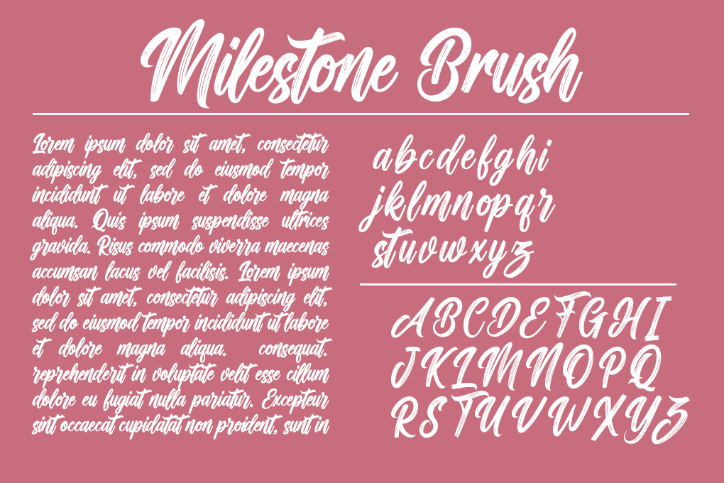
Script fonts like Brush Script and Lobster add a touch of elegance and personality to a logo. These fonts mimic handwriting, giving them a more artistic and creative feel. Script fonts are often used by brands in the beauty, food, and lifestyle industries to convey a sense of sophistication and creativity.
Display fonts like Impact and Cooper Black are designed to grab attention and make a bold statement. These fonts are often used for headlines, posters, and logos that need to stand out. Display fonts can be more decorative and unique, making them a good choice for brands that want to differentiate themselves from competitors.
Types of logo fonts
When selecting a font for your logo, it’s helpful to understand the main categories of fonts and the characteristics they embody. Each type of font has its own personality and can evoke specific emotions or associations in the minds of your audience.
Serif fonts
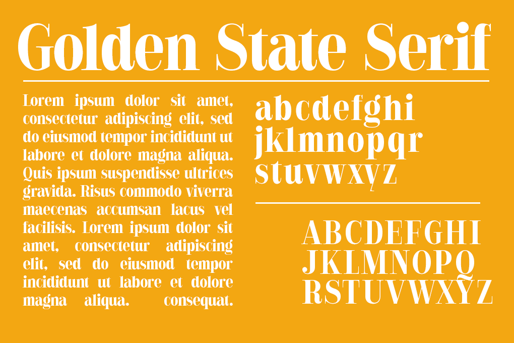
Serif fonts are characterized by the small lines or flourishes at the ends of each letter, known as serifs. These fonts have a traditional and timeless feel, making them a popular choice for brands that want to convey stability, trustworthiness, and sophistication. Examples of well-known serif fonts include Times New Roman, Georgia, and Baskerville.
Brands in industries such as law, finance, and publishing often use serif fonts in their logos to establish a sense of credibility and professionalism. The classic appearance of serif fonts can help create a logo that stands the test of time and remains recognizable for years to come.
Sans-serif fonts
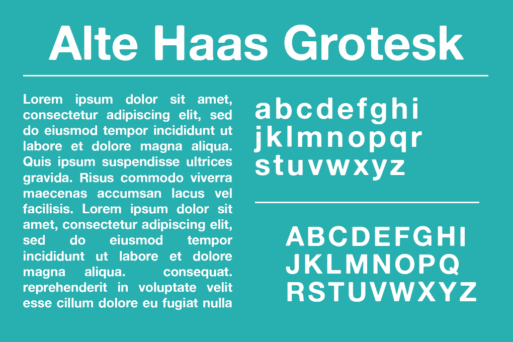
Sans-serif fonts, as the name suggests, lack the extra strokes or serifs at the ends of letters. These fonts have a modern, clean, and minimalistic appearance, making them highly versatile and easy to read across various sizes and mediums. Popular sans-serif fonts include Arial, Helvetica, and Gotham.
The simplicity of sans-serif fonts makes them a popular choice for brands in the technology, healthcare, and automotive industries. They can effectively communicate a sense of innovation, efficiency, and clarity. Sans-serif fonts are also well-suited for digital platforms, as they remain legible even at small sizes on screens.
Script fonts
Script fonts mimic handwriting and add a touch of elegance, sophistication, and personality to a logo. These fonts often feature flowing, connected letters and can range from formal calligraphy to more casual, brush-like styles. Well-known script fonts include Brush Script, Lucida Calligraphy, and Lobster.
Brands in the beauty, food, and lifestyle industries frequently use script fonts to create a sense of luxury, creativity, and individuality. However, it’s important to ensure that the chosen script font remains legible when scaled down, as the intricate details of some script fonts can become difficult to read at smaller sizes.
Display fonts
Display fonts are designed to make a bold statement and grab attention. These fonts are often more decorative, unique, and eye-catching than other font categories. They can feature unusual shapes, exaggerated proportions, or stylized elements. Examples of popular display fonts include Impact, Cooper Black, and Bauhaus.
Brands that want to stand out from the competition and create a memorable visual identity often use display fonts in their logos. These fonts are particularly effective for businesses in the entertainment, fashion, and creative industries.
However, it’s crucial to strike a balance between originality and legibility when using display fonts, ensuring that your logo remains recognizable and easy to read.
Benefits of choosing the right logo font
The right logo can have a significant impact on how your customers perceive your brand. With the right logo, you can increase the effectiveness of your brand’s message, attach a positive connotation to the meaning of your logo, and more!
Here are the major benefits of choosing the right logo font.
Reflects your brand personality
The font you choose for your logo plays a significant role in conveying your brand’s personality and values. Each font has its own unique characteristics and can evoke specific emotions or associations in the minds of your audience.
For example, a serif font like Times New Roman may communicate tradition, reliability, and sophistication, making it well-suited for brands in industries such as law or finance. On the other hand, a sans-serif font like Helvetica can convey modernity, simplicity, and efficiency, making it a popular choice for technology and healthcare brands.
Script fonts, such as Brush Script or Lobster, add a touch of elegance, creativity, and personality to your logo. These fonts are often used by brands in the beauty, food, and lifestyle industries to create a sense of luxury and individuality.
Display fonts, like Impact or Cooper Black, are designed to make a bold statement and grab attention. They are particularly effective for businesses in the entertainment, fashion, and creative industries that want to stand out from the competition.
Enhances readability
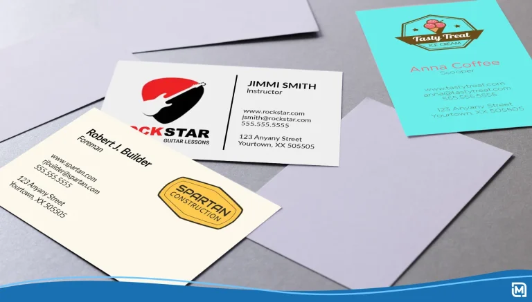
Choosing a font that is easy to read is essential for ensuring that your logo remains recognizable and effective across various sizes and mediums. Legibility is particularly important when your logo appears on small items like business cards or in digital formats where screen sizes may vary.
Sans-serif fonts are often favored for their readability, as their clean lines and lack of extra flourishes make them easy to decipher, even at small sizes. Serif fonts can also be legible, but it’s important to choose one with clear, distinct letterforms that remain recognizable when scaled down.
When selecting a script or display font for your logo, pay close attention to the font’s legibility at different sizes. Some intricate or decorative fonts may look great at larger sizes but become difficult to read when reduced. In these cases, consider using the font for the primary part of your logo and pairing it with a more legible font for any accompanying text or taglines.
Sets you apart from competitors
In a crowded marketplace, having a logo that stands out from your competitors is essential. One way to differentiate your brand is by choosing a unique font that aligns with your brand personality and target audience.
While it may be tempting to use a popular or trendy font, opting for a less commonly used font can help your logo stand out and create a more memorable visual identity. However, be sure to strike a balance between originality and readability, as an overly complex or difficult-to-read font can hinder your logo’s effectiveness.
Consider your industry and target audience when selecting a font that will set you apart. A modern, sleek sans-serif font may be effective for a technology startup, while a classic serif font could help a luxury brand convey sophistication and timelessness.
Ultimately, the right font for your logo is one that effectively represents your brand personality, remains legible across various applications, and helps you stand out in a competitive market.
How many fonts should you use in a logo?
When designing a logo, it’s best to stick to a maximum of two fonts. Using too many fonts can make your logo look cluttered and unprofessional, diluting your brand message and confusing your audience.
If you choose to use two fonts, consider pairing a primary font with a secondary font for contrast and visual interest. The primary font should be the dominant one, used for the main text or company name, while the secondary font can be used for taglines, slogans, or supporting text.
When selecting fonts to pair, look for complementary styles that create a balanced and harmonious look. For example, you might pair a bold, modern sans-serif font with a more delicate script font, or a classic serif font with a clean, simple sans-serif.
Remember, the goal is to create a cohesive and memorable logo that effectively represents your brand. Limiting yourself to one or two well-chosen fonts will help you achieve this while maintaining a professional and polished appearance.
How to combine fonts in your logo
When using multiple fonts in your logo, it’s important to ensure they complement each other and create a cohesive design. Here are some tips for combining fonts effectively:
Pair a serif with a sans-serif
Combining a serif font with a sans-serif font is a classic and effective approach to creating contrast and visual interest in your logo. The serif font can be used for the primary text or company name, while the sans-serif font can be used for secondary text or taglines. This pairing helps establish a hierarchy and makes your logo more readable.
For example, you might use a timeless serif font like Garamond for your business name and pair it with a clean, modern sans-serif font like Helvetica for your tagline. This combination communicates both tradition and innovation, making it suitable for a wide range of industries.
Script font for the business name and sans-serif for the tagline
Pairing a script font with a simple sans-serif font is another effective way to create contrast and visual appeal in your logo. The script font can be used for your business name, adding a touch of elegance and personality, while the sans-serif font can be used for your tagline, ensuring readability and clarity.
When using a script font, choose one that is legible and not overly complex. Pair it with a clean, straightforward sans-serif font to balance the design and ensure your logo remains easy to read across various sizes and mediums.
Combine fonts from the same family for consistency
If you want to create a logo with a cohesive and harmonious appearance, consider using fonts from the same family. Many font families include both serif and sans-serif variations, as well as different weights and styles, allowing you to create contrast and hierarchy while maintaining a consistent look and feel.
For example, the Montserrat font family includes both serif and sans-serif versions, as well as multiple weights ranging from thin to black. By using fonts from this family, you can create a logo that feels unified and professional, with the flexibility to emphasize certain elements through font weight and style.
When combining fonts from the same family, be sure to choose variations that are distinct enough to create visual interest and hierarchy while still maintaining a cohesive overall design.
How to choose the best font for your logo
Choosing the best font for your logo is a key decision that can significantly impact your brand’s overall identity and perception. Here are some factors to consider when selecting a font for your logo.
Consider your brand personality
Your logo font should align with your brand’s values, style, and personality. Think about the emotions and associations you want your brand to evoke. For example, a serif font may convey tradition and sophistication, while a sans-serif font may communicate modernity and simplicity. Choose a font that effectively represents your brand’s unique identity.
Prioritize legibility
Legibility is paramount when it comes to logo design. Your font should be easy to read at various sizes, from large billboards to small business cards. Avoid overly decorative or intricate fonts that may become difficult to decipher when scaled down. Opt for fonts with clear, distinct letterforms to ensure your logo remains recognizable across different mediums.
Think about scalability
In addition to legibility, consider how your chosen font will look at different sizes. Some fonts may appear striking at large sizes but lose their impact when reduced. Test your font at various scales to ensure it maintains its visual appeal and readability. A versatile font that looks good, both large and small, will serve your logo well across a range of applications.
Connect with your target audience
Your logo font should resonate with your target audience and effectively communicate your brand message. Consider your ideal customer’s demographics, preferences, and expectations when selecting a font. A font that appeals to your target audience will help create a stronger emotional connection and increase brand recognition.
Remember, the right font for your logo is one that encapsulates your brand personality, maintains legibility across sizes, and resonates with your target audience. Take the time to experiment with different font options and evaluate them in the context of your overall brand identity. With careful consideration and attention to detail, you can choose a font that will make your logo stand out and leave a lasting impression on your audience.
10 Creative font ideas for your logo
When designing your logo, thinking outside the box with your font choices can help you create a unique and memorable visual identity. Here are some creative font ideas to inspire your logo design.
Combine a handwritten font with a clean sans-serif
Pairing a handwritten font with a clean sans-serif can create an interesting contrast in your logo. The handwritten font adds a personal touch and a sense of creativity, while the sans-serif font ensures legibility and balances the overall design. This combination works well for brands that want to convey a blend of artistry and professionalism.
Use a bold, geometric font for a modern look
Bold, geometric fonts can give your logo a contemporary and cutting-edge appearance. These fonts often feature strong lines, sharp angles, and clean shapes, making them ideal for brands in industries such as technology, architecture, or fashion. When using a geometric font, keep the rest of your logo design simple to let the font take center stage.
Pair a vintage-inspired script with a classic serif
Combining a vintage-inspired script font with a classic serif can create a logo that exudes sophistication and timelessness. The script font adds a touch of elegance and nostalgia, while the serif font provides stability and tradition. This pairing is particularly effective for brands in the luxury, hospitality, or food and beverage industries.
These ten creative font ideas can help you think beyond the typical font choices and create a logo that truly stands out. Experiment with different font combinations and styles to find the perfect fit for your brand personality and target audience.
When selecting fonts for your logo, always prioritize legibility and scalability. Your font choices should remain readable across various sizes and mediums, from business cards to billboards. Test your font combinations at different scales to ensure they maintain their visual impact and clarity.
Remember, your logo font is a crucial element of your brand identity. It should effectively communicate your brand message, resonate with your target audience, and set you apart from competitors. Don’t be afraid to explore unconventional font pairings and styles to create a logo that truly represents your unique brand personality.
Final opinion – What is the best font for your business logo?
The best font for your business logo ultimately depends on your brand identity and target audience. Your font choice should align with your brand’s personality, values, and the emotions you want to evoke in your customers.
For example, if you run a law firm or financial institution, a classic serif font like Garamond or Baskerville can convey professionalism, reliability, and tradition. On the other hand, if you own a tech startup or a modern boutique, a sleek sans-serif font like Helvetica or Futura might better represent your brand’s innovative and forward-thinking nature.
In addition to your logo, your font choice should be consistent across all your branding materials, including your website, social media profiles, and marketing collateral. Consistent font usage helps create a cohesive and recognizable brand identity, making it easier for your target audience to remember and connect with your business.
As you develop your brand identity, consider how to build a social media brand that resonates with your target audience. Your font choice plays a significant role in how your brand is perceived on social media platforms, so make sure it aligns with your overall brand personality and effectively communicates your message.
Ultimately, the best font for your business logo is one that encapsulates your brand identity, resonates with your target audience, and sets you apart from competitors. Take the time to experiment with different font options, test them across various applications, and gather feedback from your team and potential customers.
With careful consideration and attention to detail, you can select a font that will make your business logo memorable, impactful, and representative of your unique brand personality.
Selecting the best font for your logo is crucial for conveying your brand’s identity and ensuring readability across platforms. LogoMaker offers an intuitive platform to help you create a professional logo that aligns with your brand’s personality.
If you’re looking to generate a logo using AI in just a few minutes, LogoMaker can help you out. With designs customized specifically for your industry, our logo maker can generate various renditions of your logo with varying fonts quickly. We’ll also show you the logo on various business assets like t-shirts, websites, and business cards.
With a free account, you’ll get full access to the LogoMaker suite of features and you’ll only have to pay for your logo once you’re fully satisfied with the design.
Best fonts for logos: Frequently asked questions
Are there any fonts I should avoid for logo design?
It’s best to avoid overly decorative or complex fonts that may be difficult to read, especially in smaller sizes. Additionally, steer clear of fonts that are overly trendy, as they may quickly become outdated. Our LogoMaker tool offers a selection of timeless and versatile fonts that are ideal for logo design.
How can I test different fonts for my logo?
Our LogoMaker tool allows you to easily test different fonts by entering your text and exploring various font options. You can see how each font looks in real time, customize its size, spacing, and color, and make adjustments until you find the perfect fit for your logo.
Will my logo be unique if I use common fonts?
Yes, even with common fonts, your logo can be unique by customizing the font style, color, layout, and additional design elements. Our LogoMaker tool provides numerous customization options to ensure your logo stands out and accurately represents your brand.
How do I ensure my logo is scalable with the chosen font?
To ensure scalability, choose a font that remains legible and clear at various sizes. Our LogoMaker tool allows you to preview your logo at different scales to ensure it looks great on everything from business cards to billboards.