Is there a one-size-fits-all measurement for business cards, or do the perfect dimensions vary depending on your industry and goals?
The standard business card size of 3.5″ x 2″ has been a staple for decades, but is it the best choice for everyone?
This tried-and-true size is widely accepted and easily fits into wallets and card holders, but it’s not always the most effective option.
In this guide, we’ll explore the various business card sizes available and provide tips for choosing the right dimensions for your needs.
Key takeaways
- The standard business card size of 3.5″ x 2″ is the most common, but various sizes are available, including square (2″ x 2″), rounded (3.5″ x 2″ with rounded corners), folded (3.5″ x 4″), and slim (1.5″ x 3.5″) cards.
- The perfect business card size depends on your industry, brand personality, and how your clients will likely store and use your card.
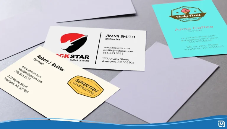
- When designing a business card, incorporate a unique logo, relevant contact information, and your brand colors to create a memorable impression.
- Utilize both sides of the business card to maximize the available space and share additional information or design elements.
- Invest in quality materials for your business cards, as the feel and durability of the card significantly impact how potential clients perceive your brand.
What size is a business card?
A standard business card size is 3.5 inches wide and 2 inches tall (85mm x 55mm). This size is widely recognized and fits well in wallets and cardholders.
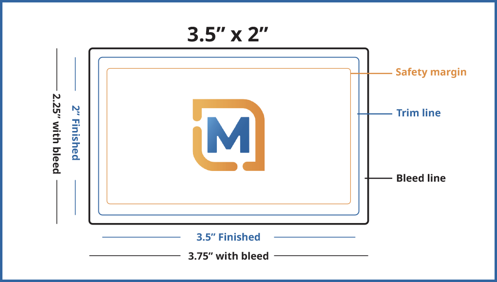
However, there is some flexibility. Some business cards may be slightly smaller or larger.
Occasionally, you might encounter business cards in unique shapes or sizes, like square or rounded corners, but these are less common and may stand out more.
Square business cards, for example, offer a unique and modern aesthetic. They may not fit as easily into standard cardholders, but they are eye-catching and memorable.
Similarly, rounded corners add a subtle sophistication to a standard-sized card.
The perfect size for your business card depends on several factors. Consider your brand personality—do you want a classic, professional look or a bolder, more attention-grabbing design?
Also, consider how your clients will likely store and use your card.
The right size should balance making an impact and ensuring everyday practicality.
Business card sizes
Now that you have a general understanding of the range of business card sizes available let’s dive into the specifics of each option and the things to include in each business card.
Note that while the standard size remains the most popular choice, alternative sizes can help you stand out and make a lasting impression.
| Type of Business Card | Size (inches) | Size (millimeters) | Common Use |
| Standard | 3.5″ x 2″ | 88.9mm x 50.8mm | The universal choice for all industries. Offers a traditional, professional look. |
| Square | 2″ x 2″ | 50.8mm x 50.8mm | Favored in creative fields where a unique format helps businesses stand out. |
| Rounded | 3.5″ x 2″ | 88.9mm x 50.8mm | It’s the same as the standard but softens the standard rectangle, adding a modern and approachable feel to any design. |
| Folded | 3.5″ x 4″ (folded) | 88.9mm x 101.6mm (folded) | Provides additional space for appointment reminders, product information, loyalty programs, or expanded design elements. |
| Slim | 1.5” x 3.5” | 38.1mm x 88.9mm | Ideal for minimalist designs, creating a sleek and distinctive impression. |
With LogoMaker, you can easily design a custom business card that incorporates your unique logo and aligns with your chosen size.
Whether you opt for a standard 3.5″ x 2″ card or a bold, square 2″ x 2″ design, LogoMaker’s versatile platform supports various sizes and designs.
Standard: 3.5″ x 2″
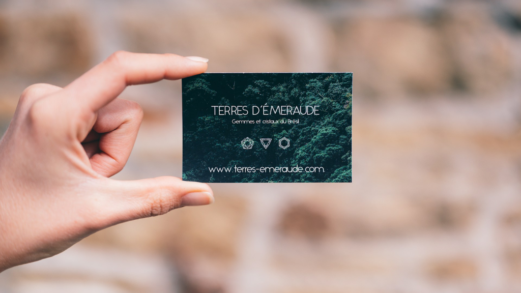
The standard business card size has been the go-to choice for professionals across industries for decades.
This size perfectly balances compactness and provides enough space to include essential contact information.
At 3.5″ x 2″, these cards are compact enough to easily fit into wallets, purses, and standard card holders without causing any inconvenience to the recipient and fitting snugly in yours.
This standard size is also universally accepted and recognized. So, whether you’re attending a local networking event or an international conference, you can be confident that your contacts will easily understand and accept your business card.
Also, due to its widespread use, printing standard-sized business cards is often the most affordable option — many printers offer competitive pricing for this popular format.
Square: 2″ x 2″
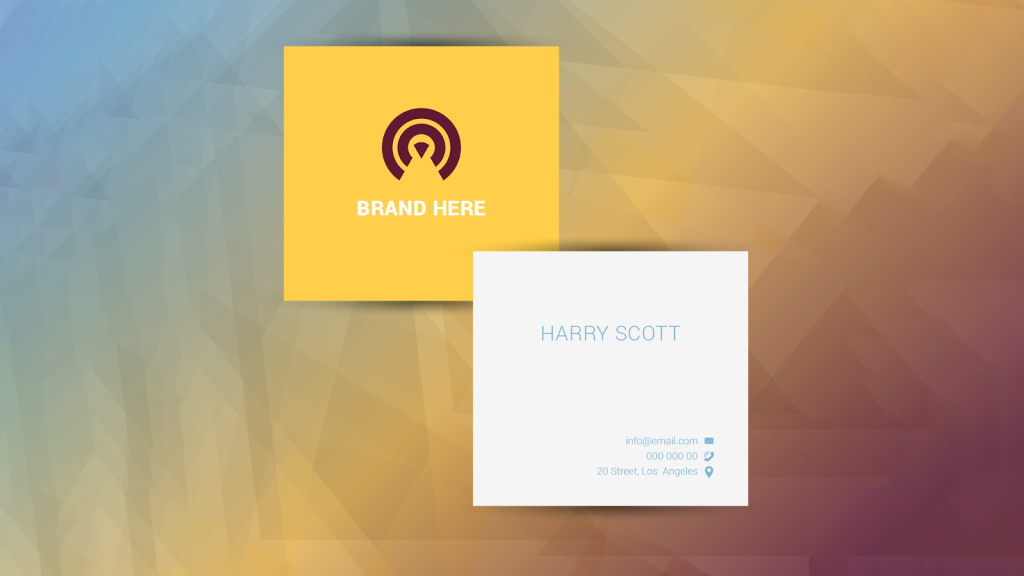
These compact, eye-catching cards offer a modern and stylish alternative to the traditional rectangular format.
The unique shape of square business cards immediately sets them apart from the standard size. They capture the attention of potential clients and contacts.
This distinctive format communicates creativity, innovation, and a willingness to think outside the box — highly valued qualities in many contemporary business settings.
Professionals who might benefit from using square business cards include:
- A freelance graphic designer showcasing their bold, minimalist design style
- A wedding photographer featuring a stunning, square-cropped image from their portfolio
- A fashion boutique owner presenting a chic, avant-garde design that reflects their brand’s aesthetic
- A tech startup founder conveying a sense of innovation and forward-thinking through a sleek, modern square card design
However, when designing a square business card, this format presents unique challenges and opportunities.
The compact size of 2″ x 2″ requires a strategic approach to layout and content, ensuring that all essential information is included without sacrificing readability or visual impact.
One effective strategy is to use both sides of the card. It allows for more creative freedom and the inclusion of additional information or design elements.
Pro Tip: If you’re drawn to the square format but are concerned about practicality, use the rounded corner cards. They provide a similar modern feel while retaining compatibility with most wallets and cardholders.
Rounded: 3.5″ x 2″
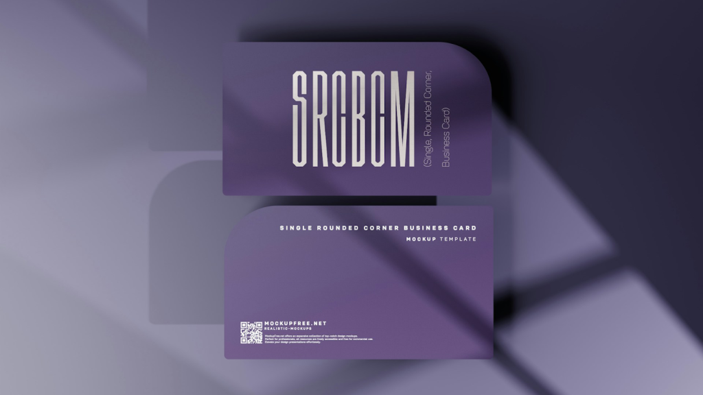
By incorporating rounded corners, rounded cards combine the familiarity and versatility of the standard size with a contemporary, visually appealing twist.
They convey a sense of attention to detail and elevated design compared to sharp rectangular corners.
The rounded corners also feel pleasant to the touch, making them memorable in a subtle way. They stand out from the standard sharp-edged cards.
You can benefit from using rounded cards if you are:
- A marketing consultant looking to convey a fresh, modern approach to your services
- A spa owner seeking to communicate a sense of relaxation and tranquility through your card design
- A non-profit organization aiming to create an inviting, approachable image for potential donors and volunteers
- A real estate agent looking to soften your professional image and build trust with potential clients
NOTE: While generally not as specialized as square cards, rounded corners might have a slight price premium compared to standard rectangles, depending on the printing service.
Also, the rounded corners may slightly reduce the available space for content.
Folded: 3.5″ x 4″
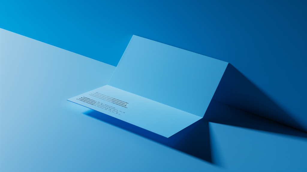
Folded business cards are like miniature brochures, doubling your available space.
With a folded card, you have four panels to work with. That’s four chances to make an impression, four spaces to tell your story.
You could use:
- One panel for your contact information
- Another for your logo and tagline
- The remaining two for a mini-portfolio, testimonials, or even a special offer
Folded cards also add a tactile, interactive element to your networking experience.
When someone receives your card, they can’t help but engage with it, unfolding it to reveal the hidden contents.
You can benefit from using folded cards if you are:
- Realtors: They can use one side to feature contact details, while the inside highlights a featured property with photos and descriptions.
- Event Planner: They can put contact information on the front, with a mini calendar for the current or upcoming month on the inside.
- Graphic Designer: Use the folded design to showcase different styles or project samples, inviting clients to explore further.
Remember: Folded cards might not fit every wallet, so consider practicality and creative potential. They’re ideal when additional information or design is NECESSARY to your target audience.
Slim: 1.5″ x 3.5″
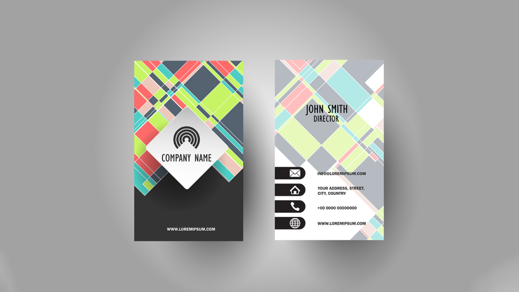
Sometimes, less is more. This minimalist format of slim-sized business cards offers a sophisticated and modern alternative to the traditional business card.
The minimalist appeal of slim cards is well-suited to professionals in industries that value precision, innovation, and forward-thinking.
Think tech startups, design firms, and modern, high-end brands.
When you opt for a slim card, you align yourself with these values and communicate a sense of sophistication and refinement.
The compact size also offers practical benefits. They fit easily into pockets, wallets, and card holders. And because they take up less space, you can carry more of them.
Of course, designing a slim card comes with some challenges. With limited space, you must carefully consider every element. There’s no room for clutter or unnecessary flourishes.
Tip: Slim cards demand careful design. Ensure your logo and contact information remain legible and impactful within the reduced space.
5 tips for creating your business card
Size matters, but it’s only half the story. A truly effective business card is about design and content that work in harmony.
In this section, we’ll teach you tips for creating a business card that effectively represents your brand.
1. Add a unique logo
Your logo is the face of your brand. Incorporating it into your business card design is essential for creating a strong, memorable impression.
A well-designed and responsive logo helps your card stand out and is a powerful tool for brand recognition and recall.
When adding your logo to your business card, consider its placement carefully. Generally, the logo should be prominently displayed, often in the upper portion of the card, to ensure maximum visibility.
However, the exact placement will depend on your card’s overall design and layout.
- For a standard 3.5″ x 2″ card, place your logo in the upper left or right corner. Leave enough space for your contact information and other design elements.
- For a square 2″ x 2″ card, center your logo to create a bold, symmetrical look that draws the eye.
Your logo size should also be large enough to be easily recognizable but not so large that it overwhelms the other elements on your card. A good rule of thumb is to make your logo about 1/3 the size of your card.
If you don’t have a logo, you can create one using LogoMaker in just under 5 minutes!
Simply choose your industry category and then enter the name of your brand or business. Our logo generator will generate thousands of logo designs. Choose one and customize it with your preferred colors and fonts.
You can then download your finished logo in PDF format, which is suitable for printing on your business card.
You can also design a business card with us. We have hundreds of business card templates from which you can choose. If you create a logo with LogoMaker, this logo is automatically added to the business card templates.
2. Add relevant contact information
You should include only the relevant contact information that potential clients or partners might need to reach you.
For example, if you have multiple phone numbers or email addresses, choose the ones most relevant to your professional life and that you check regularly.
Avoid cluttering your card with too many options. This will overwhelm the recipient and dilute the impact of your message.
When formatting this contact information, prioritize readability and clarity. Use a clean, easy-to-read font in a size that’s large enough to be easily scanned.
Use a hierarchy of information. That is your name and title in the largest font, followed by your company name and primary contact methods.
Don’t forget to double-check all your contact information for accuracy before sending your card to print.
3. Incorporate your brand colors
Color is a powerful tool for creating a strong, recognizable brand identity. Statistics show that colors influence up to 90% of initial impressions and 85% of shoppers’ purchase decisions.
So, your business card is a prime opportunity to leverage this psychological power of color.
Understand the emotions and associations evoked by your brand colors. Are they bold and energetic? Calming and trustworthy? Ensure your card design aligns with your desired brand messaging.
For example, if you’re a financial advisor looking to convey trust and stability, use a classic blue and gray color scheme.
Then, decide whether to use your brand colors as a bold background or for accents like text, borders, or graphics. Maintain sufficient contrast for readability.
However, don’t feel limited to only your primary brand colors. Explore lighter shades or darker tints to add depth and interest to your card design.

4. Utilize both sides
Every inch of space on your business card is valuable real estate.
Most people focus on the front of the card, but you can utilize the back side to share additional information with potential clients.
If you’re in a visual field like photography, design, or crafts, you can use the back to feature a sample image of your work. This will create an immediate impact and demonstrate your skills.
You can also use this space to share a fun fact about your business, include a QR code that links to your website or social media profiles, or even create a miniature version of your product packaging or menu.
5. Use quality materials
The feel of your business card in someone’s hand speaks volumes about your brand.
So, when selecting materials for your business card, look for the type of paper stock that best reflects your brand personality and industry.
- Go for heavier cardstocks that resist bending and communicate durability.
- Matte finishes offer a sophisticated look, while gloss adds a touch of shine. Opt for textured finishes like linen or embossed effects for a unique tactile experience.
- Look for recycled paper options or sustainable materials that align with your brand values and environmentally conscious clientele.
- Explore alternative materials like wood, metal, or transparent plastic for a standout card. However, the practicality of carrying it and the potential cost implications should be considered.
For example, an interior designer can use textured paper with a subtle metallic accent to mimic luxurious fabrics and finishes.
A tech company might opt for a sleek metal card to convey innovation.
As a general rule of thumb, 14 point cardstock is the recommended industry standard when it comes to business card paper quality.
If you can afford to get a 14-point cardstock or higher, you’re good to go.
What are the measurements of a business card? Frequently asked questions
What is the size of a business ID card?
A business ID is an identification card issued by a business or organization to its employees or members for identification and access purposes. These cards include personal information, a photo, and sometimes security features like barcodes or RFID chips.
The standard dimensions for a business ID card are based on ISO/IEC 7810:2019, which specifies 85.60 × 53.98 x 0,76 mm (3.370 × 2.125 in x 0.030 in) with an aspect ratio of 1.586.
What is the size of a business card in Word in CM?
The standard business card size in Word is 9.1cm x 5.5cm, which is equivalent to 3.583″ x 2.165″. To create a custom size, go to Layout > Size and change the Paper Size from A4 to Custom Size. You can then enter your desired dimensions.
What font size should I write on a business card?
For prominent text fields like your name or company name, use a font size between 10pt and 16pt to ensure visibility and readability.
Secondary text, like job titles, email addresses, or phone numbers, should be visible and legible but noticeably smaller than primary text, typically around 8pt or larger. Also, avoid using font sizes smaller than 8pt to maintain readability.
However, note that this is not cast in stone. The ideal font size depends on several factors, like the font itself, information hierarchy, and the overall design.
