The human brain processes visuals 60,000 times quicker than text, so your food truck logo is often the first and most impactful way to communicate your brand identity.
In this guide, we’ll explore some of the best food truck logo ideas across various niches to give you the inspiration and tools you need to design an eye-catching logo.
We’ll also show you how to use LogoMaker, a user-friendly platform for designing custom logos for your brand.
Key takeaways
- A well-designed food truck logo is crucial for attracting customers, establishing brand identity, and standing out in a competitive market.
- When designing a food truck logo, consider the specific cuisine and niche to create a targeted and effective visual identity. Incorporate colors, imagery, and typography that reflect the unique flavors, culture, and personality of the food truck’s offerings.
- Get inspiring logo ideas for various food truck niches. These ideas serve as a starting point for food truck owners to create a logo that represents their unique brand.
- LogoMaker is a user-friendly platform that you can use to design custom logos easily.
- When selecting colors for a food truck logo, consider the emotions and associations they evoke.
What makes a good food truck design?
A well-designed food truck logo will help you:
- Attract customers
- Establish your brand identity
- Stand out in a competitive market
So, what separates a forgettable logo from an iconic one? Here are the key ingredients of a great food truck logo design:
1. Visibility and clarity
A successful logo must be easily visible and recognizable from a distance, even when your truck is in motion or parked in a bustling street.
The logo should be legible and easy to read, even when scaled down to a small size or placed on various backgrounds.
2. Relevance and authenticity
Your food truck logo should reflect your brand’s unique personality, cuisine, and target audience. Remember that branding directly affects potential customers’ behavior.
It should communicate what sets your food truck apart and give potential customers a taste of what they can expect from your menu.
For example, if you specialize in tacos, you can include a stylized taco icon or a sombrero in your logo.
If your food truck is known for its farm-to-table ingredients, use imagery that suggests freshness and natural goodness.
3. Versatility and adaptability
A great food truck logo should be versatile enough for various mediums and applications.
You can use it on your truck wrap, restaurant menu board, website, and social media profiles.
Therefore, design an adaptable logo in various sizes, formats, and color schemes.
When designing, consider how the logo will look in digital and print formats.
- Will it be easily recognizable when printed on a small promotional item like a napkin or sticker?
- Will it maintain its impact when displayed on a large billboard or banner?
- Can it be easily modified or adapted for different purposes without losing its core identity?
Best food truck logos by niche
Each food niche has unique flavors, colors, and cultural associations. You can leverage these to create a logo.
So, as you browse these niche-specific logo ideas, consider incorporating elements that reflect your unique brand personality and style.
Use these ideas as a starting point and let your imagination run wild. Here are a few great logo ideas based on a variety of different cuisines.
1. Mexican food truck logo
When designing a Mexican food truck logo, incorporate elements representing Mexico’s vibrant and flavorful cuisine.
The most recognizable Mexican dish is the taco. Use a taco clipart or other popular Mexican food items like burritos, nachos, tamales, or chili peppers.
It’s a good idea to use your top-selling item, or at least the item that you think will be your main focus. These visuals immediately convey the type of cuisine your food truck specializes in.
Mexican cuisine is known for its bold and vibrant flavors. Your logo should reflect this through its color scheme. Utilize colors commonly associated with Mexican culture, such as fiery red, lush green, sunny yellow, and earthy brown.
You can also combine two to three colors to keep your design visually appealing and uncluttered.
2. BBQ food truck logo
A well-designed BBQ food truck logo evokes the irresistible aroma of slow-cooked meats and the charm of an authentic barbecue experience.
So, the first thing to do is to use visual elements that evoke the smoky, fiery essence of BBQ cooking. This includes images of flames, smoke, grills, or even charcoal.
Then, choose a typography style that reflects BBQ cuisine’s bold and rustic nature. Use a bold, slab-serif font or a hand-drawn typeface that mimics the look of brush strokes or chalk lettering.
When selecting colors, choose a palette that reflects the warm, earthy tones associated with barbecue. Deep reds, warm oranges, and rich browns evoke the smoky, caramelized flavors of grilled meats.
You can also incorporate black or charcoal gray accents to represent the char and smoke essential to authentic BBQ.
3. Burger food truck logo
Your goal here should be to create a visual identity that captures the delicious, satisfying, and mouthwatering appeal of your juicy burgers.
The main part of your logo should be a delicious-looking burger.
Use a stylized illustration or graphic representation of a burger. It should showcase the ingredients, such as:
- A juicy patty
- Fresh lettuce
- Ripe tomatoes
- Melted cheese
It’s tempting to include many elements to showcase the deliciousness of your burgers, but avoid it. Keep your logo clean and uncluttered.
Focus on one or two main elements, such as a burger illustration and your truck name, and use negative space to create a balanced and visually appealing composition.
4. Ice cream food truck logo

An ice cream logo should evoke happiness, indulgence, and childhood memories.
Elements like ice cream cones, popsicles, or smiling characters enhance the nostalgic and delightful aspect of the logo.
Choose a color scheme that reflects the sweet and inviting qualities of ice cream.
Pastels like pink, blue, mint green, and yellow convey sweetness and fun. For contrast, you can add pops of bolder colors like chocolate brown or cherry red.
Additional Tip: Consider using your ice cream truck itself as inspiration. If it’s particularly colorful or has a unique shape, incorporate elements into your logo for a cohesive brand identity.
5. Pizza food truck logo
Your logo should scream “PIZZA!” loud and clear. Use classic pizza elements like a slice with gooey cheese, savory toppings, or even a whole pie.
Don’t be afraid to get a little creative with your illustrations. Maybe your pizza has a quirky face or is riding a skateboard.
Use the classic Italian combo of red, white, and green for colors. These colors instantly evoke thoughts of fresh tomatoes, creamy mozzarella, and fragrant basil.
However, don’t feel limited by tradition. If your pizza truck has a unique theme or specialty and combines the classic Italian pizza with flavors from somewhere else, incorporate colors that reflect that.
Maybe you want to be known for your bold and spicy toppings, so use a fiery orange or yellow.
6. Coffee food truck logo
For a food truck that specializes in serving coffee, you’ll want a logo that captures the warmth, energy, and sophistication of your brews.
Feature a bold, graphic illustration of a steaming coffee cup, with stylized steam swirls forming a heart or a leaf shape to represent the love and care that goes into each cup. If you want to keep things simple, you could do a lot with just a subtle logo with coffee beans as well.
Use a rich, earthy color palette of browns, blacks, and creams to evoke your coffee beans’ deep, roasted flavors.
You can also use catchy, pun-based names, like “Bean There, Done That” or “Espresso Yourself.”
You can even include a playful visual element that riffs on the wordplay. For example, you could include a small cartoon coffee bean character “being there” or “doing that” or show an espresso cup “expressing itself” through latte art.
7. Seafood food truck logo
For this kind of logo, use a bold, graphic illustration of a sea creature that represents your specialty, like a lobster, crab, or fish.
Give it a playful, cartoonish style that shows off your truck’s fun, friendly vibe.
Use a color palette of blues, greens, and coral to evoke the fresh, lively hues of the ocean.
Also, think of bold, weathered letters with a slight tilt or curve to suggest the motion of the waves. You can even include a small anchor, porthole, or ship’s wheel icon to drive home the maritime theme.
8. Vegetarian/Vegan food truck logo
Focus on fresh, colorful vegetables, fruits, or iconic symbols like a single leaf or sprouting seed. These visually signal the nature of your cuisine.
For example, a stylized arrangement of carrots, broccoli, and a sliced bell pepper creates a vibrant focal point.
Your logo should be inviting, reflecting the positive vibe and accessibility of plant-based eating. Avoid designs that may seem overly preachy or exclusive.
Expert Tip: Instead of simply depicting vegetables or fruits, transform them into something unexpected. For example:
- A broccoli floret cleverly shaped into a chef’s hat
- Carrots arranged to form a friendly smile
- A stylized tomato with sunglasses and a straw sipping a smoothie
9. Asian Fusion Food Truck Logo
When designing an Asian food truck logo, use a blend of Asian cuisines with recognizable dishes or symbols, such as a stylized bowl of noodles, dumplings, sushi, or iconic spices. Sushi, especially, is one that clearly resonates with the Japanese culture so if that’s a highlight of your food truck, you should definitely put that on your logo.
Use bright colors or patterns inspired by various cultures.
For example, you can use:
- A bold dragon mascot holding chopsticks, representing the fiery and flavorful aspects of your fusion dishes.
- A playful mix of food items like a noodle bowl, a dumpling, and a sushi roll intertwined with a dynamic font.
- Use traditional patterns from different Asian cultures incorporated into your font or background.
10. Healthy Food Truck Logo

People often associate healthy foods with fresh ingredients, organic produce, natural flavors, low-fat content, balanced nutrition, and a focus on whole foods.
Additionally, they look for signs like vibrant colors, green imagery, clean and inviting design, and words like “healthy,” “organic,” “fresh,” and “nutritious.”
Start with a clean, crisp, and minimalist design that reflects the simple, unprocessed ingredients used in your dishes.
Opt for a color palette that features plenty of green. You can also incorporate other vibrant hues found in nature, like:
- The bright red of ripe tomatoes
- The sunny yellow of lemons
- The deep purple of beets
In addition, avoid overly decorative or heavy typefaces that might suggest indulgence or excess.
So, go for a clean, airy look that suggests the simplicity and purity of your ingredients.
How do you create the best food truck logo?
Designing some of the above food truck logos may seem hard, but with a tool like LogoMaker, you can design a logo that perfectly represents your brand.
Every single logo in this article was created with LogoMaker’s creative AI by someone with zero logo designing experience in just under 5 minutes.
In this section, we’ll walk you through how you can do the same and craft a top-tier food truck logo for your business.
1. Develop your concept
Before getting started with the design process, take some time to develop a clear concept for your food truck logo.
Consider your unique selling proposition, target audience, and the overall vibe you want to convey.
Jot down some keywords, imagery, taglines, colors, and ideas that capture the essence of your brand. Use these as a guide throughout the design process.
2. Choose a Style
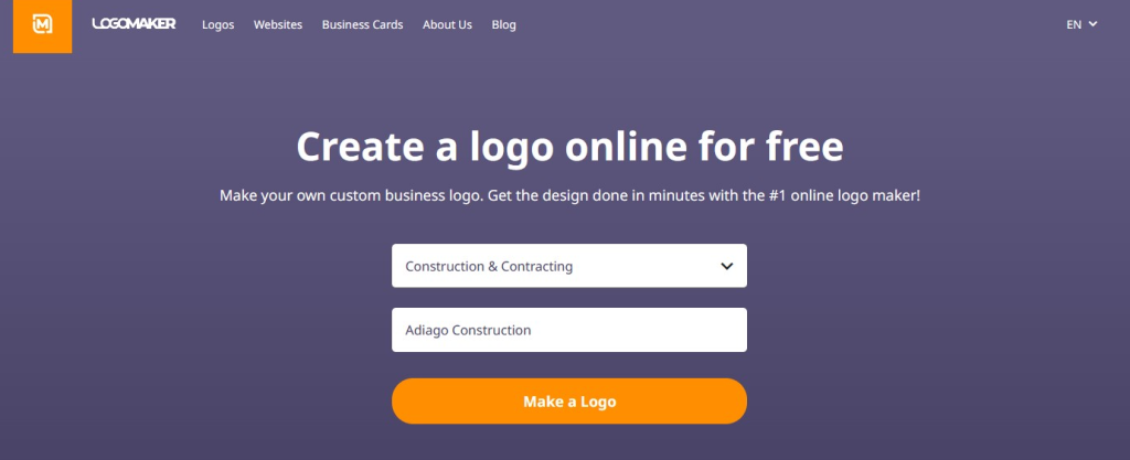
Once you have a solid concept in mind, head over to LogoMaker. Choose your industry, which in this case is going to be Food, Beverage & Restaurant, input your food truck’s name, and click “make a logo.”
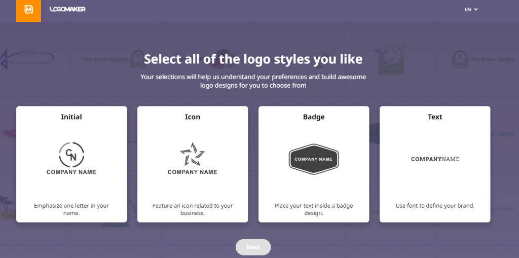
Next, select a logo style that best suits your brand. LogoMaker offers four popular styles: initial, icon, badge, and text-only. Each style has unique characteristics, so choose the one that aligns with your concept and desired aesthetic. Personally, we really like icons for restaurant and food-related businesses because they can add a great visual touch that initials or badges just can’t achieve.
3. Select a Font
The next step is to select a font. The font you choose communicates your brand’s personality and tone.
For example, a traditional serif font evokes a classic coffeehouse feel. The display font works well for something like a BBQ food truck because of how bold it is. You just have to figure out what matches the aesthetic of your food truck. If you’re having trouble finalizing one, just select them all to get a variety in the final results.
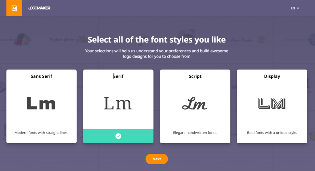
LogoMaker offers various fonts, including serif, sans-serif, script, and decorative styles.
Consider the message you want to convey and select a font that complements your overall design and resonates with your target audience.
Then click next to select the logo layouts.
4. Pick a Template
LogoMaker’s AI-powered design tool will generate thousands of logo variations based on your chosen style and font.
Browse the templates and select one that catches your eye and aligns with your concept.
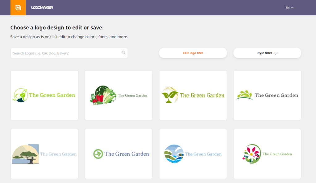
Consider the placement of your food truck’s name, slogan, and icon, and choose a layout that creates a balanced and visually appealing composition.
5. Customize Your Logo
LogoMaker gives you an intuitive editor that lets you easily change the colors of your logo’s icon, text, and background.
Experiment with different color combinations that reflect your brand’s personality and cuisine.
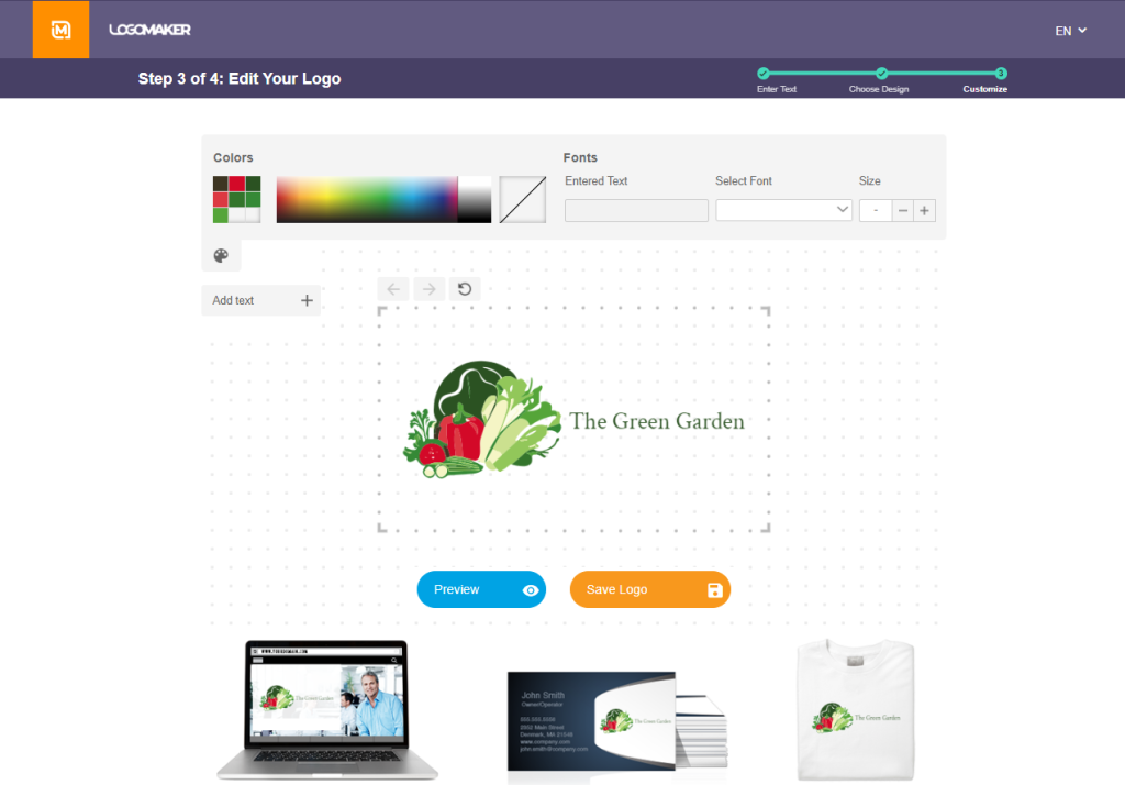
You can also swap out fonts, resize elements, and rearrange the layout until you are satisfied with the result.
If you’re wondering how the logo will look while being used, you can preview the logo on a website, a business card, and a shirt at the bottom of the page.
Once you’re done editing, click “Save logo.”
6. Refine and Download
LogoMaker also has a preview feature that lets you preview the logo. So, take a step back and review your food truck logo design with a critical eye.
Make adjustments to ensure your logo is clear, readable, and communicates your brand’s message effectively.
Once you’re happy with the final product, download your logo in various file formats, ready to use on your food truck, website, and promotional materials.
To get started, head over to LogoMaker and start designing today. With our user-friendly platform and extensive library of customizable templates, you’ll have a logo in no time.
Best food truck logos: Frequently asked questions
What is important to include on your food truck logo?
The most important components to incorporate in your logo are your food truck’s name, the type of cuisine or specialty you serve, and any unique selling propositions that set you apart from competitors.
How do I make a good logo for my food business?
Keep your logo uncluttered by avoiding too many colors, fonts, or complex graphics, and ensure that it looks great in various sizes and formats across different mediums.
Your logo should reflect the personality and style of your food business. Use online tools like LogoMaker to help you quickly design a logo.
What is the best color for a food truck logo?
The best color depends on your cuisine, target audience, and brand personality. However, certain colors are known to evoke specific emotions and associations that are beneficial for food businesses.
For example, red is often used to stimulate appetite and excitement, while green can convey freshness, health, and natural ingredients. Yellow and orange are associated with happiness, warmth, and affordability, while blue evokes trust, reliability, and calm feelings. It’s best to choose color schemes that best resonate with the type of food you’ll be serving.


