Whether they announce a new product, showcase an event name, or raise brand awareness, vinyl banners have a prominent and established place in the marketing world—even in the digital age. Vinyl banners appear at product rollouts, conferences, and tradeshows. They show up in malls, in airports, and near retail entrances.
At some point during the life of your business, you may need a few of these banners. Find out how to design your own vinyl banners so that you can grab the attention of your target audience and clearly communicate your intended message.
1. Make it easy to read
The people passing by your banner will only look at it for a couple seconds. They won’t absorb heavy information or detailed graphics during that limited window of time. Keep your message crisp and short.
Include no more than your logo, a few words, and a simple, memorable image. The exception to this would be on a showroom floor or at a conference, when you might want the informational banner next to your table or product to include some bullet points. But in general, the simpler the better.
2. Choose the right colors
Studies have shown that color in marketing can increase brand recognition by up to 80%, and that colored advertisements attract up to 42% more readership than non-colored ads. Design strong banners by choosing the right colors.
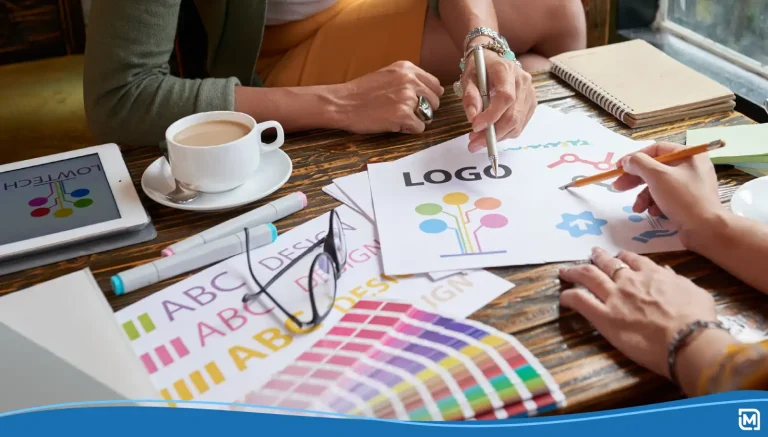
To choose high-contrast color combinations for your banners, consider using attention-grabbing combos like black on white, black on yellow, yellow on black, and white on blue. Then, if you want to draw special attention to a particular piece of information, like a phone number, event date, or website, you can use a third color that complements the others yet stands out on its own.
3. Select appropriate words and images
If you’re selling a product rather than marketing your brand, the rules change a bit. For example, if you’re displaying organic produce at a farmer’s market, consider making your banner a showpiece filled with images of plump, ripe fruit and fresh vegetables.
For a big sale on hand-crafted soaps and lotions, appeal to your audience’s bargain-hunting instinct by featuring words like “25% off,” “half-price,” “two for one,” and other key phrases across your banner. Are you having trouble designing a banner that appeals to your target demographic? Consider hiring a marketing expert to help you craft the right message and design.
4. Think about distance
Another key factor in banner design is the viewer distance. How far away will your customers or event attendees be from the banner? Will it be at eye level, next to your table? Do you plan to have two tall banners hanging above your retail location’s front door?
Perhaps you plan to have a hanging display or a window display. Whatever your plan, make sure you select the right banner size and the right font size so your intended audience can read it comfortably.
5. Ensure good lighting
Depending on where the banner will be placed, you may need to purchase some small clip-on lights to attach to it. For events in poorly-lit halls or events at night, lighting is especially important. Why spend the money on a custom banner if your guests won’t be able to see it clearly? Test lighting and visibility well in advance of the special event.
Want to learn more about branding and promoting your business? Check out these creative ideas to promote your business with branded promotional products.


