Consistency is key when building your brand and ensuring it’s successful. Did you know that of all the small businesses who started in 2014, 80% made it to their second year in business? This success rate is due largely in part to consistent branding methods – all of which revolve around a logo.
Branding your business consistently may seem daunting. In fact, we agree! There’s a lot you need to keep track of. There’s online channels on which you need to place your logo, business name, and brand message. There are also dozens of offline marketing channels you need continually update. Social media profiles, websites, storefronts, lawn signs, even TV and radio advertisements need to send a consistent brand message to your audience.
So, how do you go about branding your business for success? The answer is to create a style guide.
What is a style guide?
A brand style guide is a set of rules and guidelines as to how your brand should appear in front of an audience on all marketing mediums and platforms. Brand style guides will include details regarding the exact hex codes, font styles, font sizes, background colors, logo styles and business slogans should be used in any given situation. Brand style guides not only let employees of the company know how to market your brand effectively, but also tell others how to treat your brand if they are to partner, collaborate, or give credit to your brand at any point in time.
Who uses brand style guides?
While you may find that a very small percentage of local business owners do not use a brand style guide, this doesn’t make them any less important. Many small business owners gloss over the importance of a style guide, stating that their business is not noteworthy enough to go through the process. However, creating a style guide is just as important as trademarking your logo design or copyrighting your business website. Creating a style guide protects your brand and makes your business more credible to your employees, your customers, and even your competitors.
What do you include in a brand style guide?
We’re glad you asked! There are dozens of things you can include in your brand style guide, including (but not limited to) Brand Voice, Brand Imagery, Brand Story, Brand Archetype, and Brand Logo. We recommend starting with building a guide for your logo design first.
Building a style guide for your logo
If you haven’t yet designed a logo using our LogoMaker, now is the time to think long and hard about what your new business logo will look like. Try to imagine how your design will look when placed on different colored backgrounds. If you have a yellow logo, will it show up on a white background? If your logo is square and you add it as your Instagram profile picture, will parts of it get cut off? There are many details to consider before starting your design.
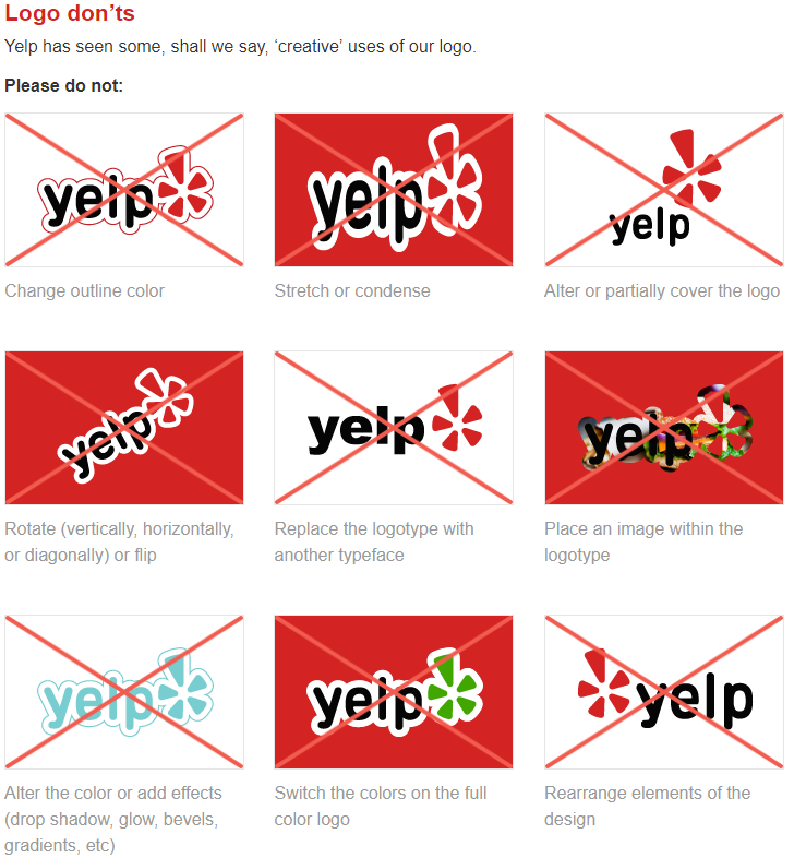
If you’re set on a particular logo style and have a feeling it might not look great across all platforms (including branded merchandise), then a style guide is something you should create along with your logo. The style guide will prevent mistakes regarding how your logo appears, such as stretching, condensing, altering or re-aligning. These mistakes make your brand appear less professional and gives your competitors an advantage.
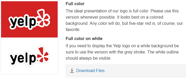
In your style guide, include all versions and variations of your logo and a brief description of when you should use each version. For example, if you have a combination style logo (icon + business name), then one of your logo versions may just include the icon. In this case, you would clearly state that the icon-only version of your logo design should only be used for social media profile pictures that are circular.
Don’t forget to also flush out the following information below. We’ve also included Yelp’s own brand style guide to give you a clear example of what to do for your own brand.
- Spacing. Provide clear instructions regarding how many pixels of white space should be around your logo. For example, “Leave 4 pixels of white space around the entire perimeter.” Extra white space surrounding your logo will ensure that the whole design fits within a certain parameter.

- Sizing. List both the minimum and maximum sizes along with image ratios so that your image can be clearly viewed and not distorted. To take things a step further, do some research on what size images each social media channel requires for a profile picture and include those exact dimensions in your size requirements. For example, the recommended Facebook profile picture size is 360 x 360 pixels.

- Colors. If you hired a logo designer, reach out to them and ask them for the 6-digit hex codes, RGB values and CMYK color codes chosen for your logo design. If your logo is black and white, then your two hex codes will be #000000 (black) and #ffffff (white). If you have a color or two in your design, then the hex code will look something like this: #752873 (purple). Hex codes are more exact when it comes to color matching and this will help you when it comes time to design promo products or create a business website.

- Adjustments. Ensure no one can manipulate your brand image by changing your logo design. Make sure to include specific copy stating that no one is legally allowed to crop, re-color, or edit the text on your business logo.

Pro Tips for Brand Style Guides: Don’t forget to include the specific font style and font size. For example, if you’re using Monsterrat for your business name and Merriweather for your business slogan, include this information in with the logo guidelines. This will help you quickly send information off to any marketing teams you might work with in the future. This information is also useful if you ever decide to rebrand and tweak your logo design.
Ready to make a logo for your business? Use our online logo maker and design a logo in a matter of minutes, then head back to this guide to put together your brand style guide requirements!


