A logo design speaks for your company, so you have to make sure it says the right things. Customers have more options than ever. You want them to single out your brand and think, “I know you. I trust you.”
As simple as they seem, logos inspire strong associations with your brand.
Once you form a connection, customers feel confident about purchasing your products. This feeling of trust can lead to an increase in sales and repeat business for you. To make an impact on your customers, create a great logo by choosing the right logo design elements to tell your story.
Identify your company’s core attributes
A logo isn’t doing its job if it doesn’t spark some emotion. It’s up to you to figure out what you want customers to experience when they engage with your brand. Do you want them to feel joyful? Amused? Nostalgic? Excited? Elite?
Focus on why your company exists and what you do differently from competitors. A clear story should start to emerge as you think about your values and the type of customers you serve. Are you committed to sustainability? A family-first mentality? Innovation and excitement?
 Brainstorm objects, animals, sayings, and ideas that relate to your brand story. A lot of logo designs draw from familiar cultural concepts. Take a look at the Evernote elephant, which has an ear modeled after a document icon. The logo comes from the saying, “An elephant never forgets.” It captures the value of Evernote as a reliable place to organize, store, and share ideas.
Experiment with logo shapes
No logo design truly begins with a blank canvas. That’s because many shapes already have layers of meaning in our society. For instance, shields are a common symbol of security, protection, and authority. Narrow down your ideas by working with shapes that match your brand attributes.
Circles and ovals
I think you’ll agree that circles never go out of style. You can’t eat a bowl of cereal, drive a car, or watch TV without seeing round shapes everywhere. Picture the round elements in the Target, Chanel, and Pinterest logos.
Circles can represent completeness, smiles, community, unity, and friendship. When you see wheels, you think of movement and cycles. Rings make you think of marriage, friendship, love, endurance, and commitment. Open circles conjure images of emptiness, depth, or mystery. And just about any curvy shapes remind you of sleekness and femininity.
Squares, rectangles, and triangles
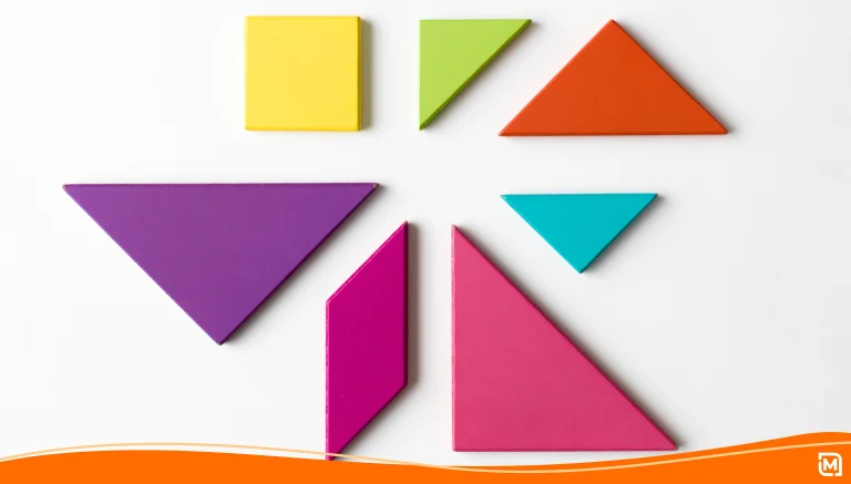
Straight lines and sharp edges are popular symbols of masculinity. So it’s no surprise that square or triangular shapes often represent power, strength, and stability. It’s also common to find them in science, technology, and legal fields. With their basic lines, these shapes are perfect for conveying simplicity, authority, or modernity. And much like circles, triangles can create a sense of completeness and unity.
Combine shapes to make interesting combinations
Do any of these traits sound like your brand? Think about how to incorporate relative shapes into your logo design. Remember those animals and objects you’ve been brainstorming? Get creative, and try to break those images into basic shapes. The panda logo for the World Wildlife Federation is a series of circles and curves. Spotting the shapes in everyday objects is great practice if you plan to create your own logo design online.
Keep in mind, shapes can take on new personalities with a little rearranging. Envision the logos of Ikea, Volkswagen, HP, and Domino’s. They all combine sharp and round elements with dramatically different end results. Try tilting or overlapping shapes, like Adidas and Mastercard. Or move a shape off center, like Goodwill. Framing your logomark or business name is also an easy way to add contrast. Ikea goes with a classic oval inside a rectangle. Imagine the legendary Superman emblem with an “S” inside a pentagon.
Reinforce your brand with logo colors
No one can help having an emotional response to different colors, and that’s good news for you. The right logo color can sell your brand story without words and make your company easy to remember. Here are common color associations.
- Red/pink: passion, love, excitement, energy, anger, spice, entertainment, action
- Orange/yellow: happy, fun, young, friendly, cheerful, positive, confident, forward-thinking
- Green: pure, natural, earthy, fresh, organic, calming, caring
- Blue: soothing, peaceful, honest, trustworthy, secure, sadness, new beginnings
- Purple: creativity, luxury, majesty, nostalgic, magical, mystical
- Black: sophistication, authority, modern, luxury, seduction, simplicity, mystery
Research common logo colors in your industry to get a sense of what works. It’s a good idea to put no more than two colors in your logo design. But if you prefer a multicolor look, include space between each logo color when possible. Brands like NBC, Google, and Windows achieve a clean, orderly look by breaking up colors.
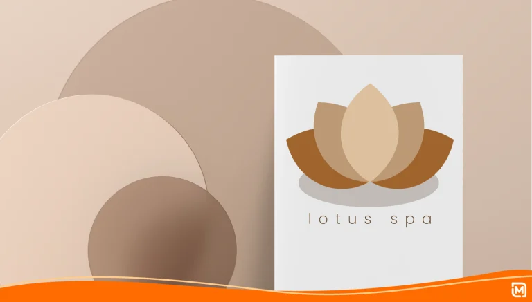
White space is your friend in a logo design. You can even use color and white space to create your main logo shape. The famous Playboy logo jumps off the page with its white bunny on a black background. And the Nike swoosh is easy to recreate with any color scheme.
Want to pack more color in without overloading a design? Don’t be afraid to play around with color gradients and transparency. Consider the Google Play logo. Google used a triangle that appeals to a modern, tech-savvy shopper. The symbol doubles as a “play” button, representing entertainment media. The final touch is a four-color scheme with transparency. All the logo design elements are simple and attractive with a clear story.
Choosing the best logo font
There’s a lot of ways a logo font can ruin your design.
- Texture/Line weight: Fonts that are too thin or patchy can look broken up when you change their size.
- Generic: Many fonts are so overused that they bore people on sight.
- Complicated: If the writing is too busy, it might make your logo hard to read.
- Trendy: Every few years, a fad takes over. A good logo font is timeless and customized to enhance your design.
With these “design don’ts” behind you, focus on making your font look unique. If you go with a pre-made font, think of ways to modify the size, orientation, spacing, or shape of the font. Remember looking at funhouse mirrors and seeing your form twisted into zany shapes? Bring that playful spirit to logo design. The Subway logo uses basic lettering, but the font is slanted. Another clever touch is the arrow tips on the first and last letter.
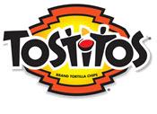 Try making your font part of the action. The “Ts” in the Tostitos logo are stick figures enjoying chips. The Pez font is made from tiny blocks of candy. For the most unique design, many big brands chose hand-drawn fonts. Brand logos like Coca-Cola, Disney, and Virgin have remained world-famous for decades for their distinct styling. If you take this route, be sure to create the font in a vector program for easy scaling.
Logo design is an art, and it takes patience and practice to make a winning look. As you add more elements, ask yourself whether they build upon your brand story. Great logo designers do everything with purpose, so resist the urge to pile on features you don’t need.
> To get some logo design ideas, browse through a few of our templates. You can try our logo maker to test out different colors and fonts.
