Are you creating a band? Launching your own label? To help your new musical venture take off, you’ll need a logo design that reflects the vibe and purpose of your business or group. Take a look at these tips and examples for some music logo design inspiration and get your creative juices flowing.
A bold image for a band
What do you want to convey to your audience? What does your band stand for? A logo can reflect and communicate both these things.
Let’s take a look at the logo history of one of the world’s top rock bands, The Rolling Stones. Millions of fans recognize their logo — a shiny red mouth with a red tongue sticking out. It’s known as the “tongue and lips” logo, or “Hot Lips.” In 1969, a 24-year-old student at London’s Royal College of Art drew the logo for a grand total of £50.
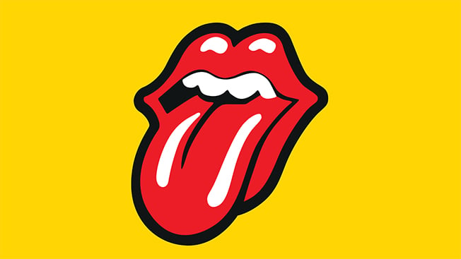
The artist was inspired by an interesting combination: the Hindu goddess Kali and Mick Jagger’s mouth. The provocative logo made its first appearance on the 1971 Sticky Fingers LP. Its sexy shape and bold colors made it a fan favorite, and the Rolling Stones continue to use “Hot Lips” decades later.
An old-school twist for a record label
If you want inspiration for a music logo design that includes irony, subversion, and anti-authoritarian messages, just take a look at the logos of older record labels. The label Alternative Tentacles was established back in 1979 and took in many of America’s top punk and alternative musicians.
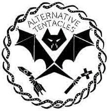
Alternative Tentacles’ bold, striking logo features a vicious-looking bat in stark white on black. In one claw, it clutches a broken cross marked with the dollar symbol. In the other claw, it holds a broken rocket. A series of wavy tentacles form a border around the bat.
The bat logo actually mimics the United States Presidential seal, and it strikes just the right tone for this offbeat record label from the eighties.
A professional, iconic image
Maybe you’re planning an entire range of products and services related to music. Your brand is more business than performer. In that case, you may want to have one iconic logo image that you can tweak slightly for each branch of your music business. Universal Music Group and Universal Studios deal with different sectors of entertainment, but they are visually linked by their logos.
They both share the image of a globe, featuring North and South America. While you usually see the Universal Studios logo in full color on a black background, the Universal Music Group logo is typically a sketched version in black and white.
Negative space as positive energy
The European record label Subtext has gained significant ground since its inception in 2004. Hosting artists like Paul Jebanasam, Roly Porter, and other up-and-upcoming talents, this label features a logo that echoes its name.

The logo makes excellent use of negative space, using a boldly curved “S” for Subtext, but slicing off the top of the letter and including a leaf shape to the right that conveys growth and freshness. It’s an energetic, modern design that serves this label well in the market.
Shapes instead of letters
DDS, a fairly new imprint from Demdike Stare, has a fascinating logo that also uses negative space effectively. Its logo is a combination of geometric shapes in black and white, with a series of half-circles giving only the barest impression of a font.
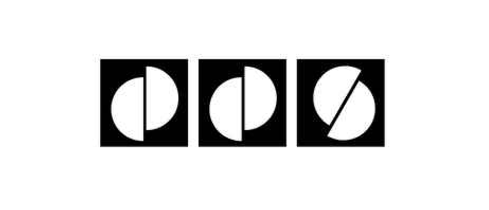
The white half-circles in the black squares also bring to mind the shapes of records or CDs in cases. Remember, you don’t have to stick with a traditional font. You can play around with shape and color to discover a whole new way of looking at logos.
Simple and spot-on
Perhaps you’re interested in developing a music app or service. Take a look at the logos for some successful services like Slacker Radio, Pandora, and others. Many of them keep their logos simple, just playing around with the fonts and colors a bit. Pandora has created a strong brand association with its particular shade of blue.

Napster (formerly Rhapsody), a music streaming service, has an interesting logo of a catlike face with the outline of headphones on its head. The logo is sometimes portrayed in thick blue lines with the cat’s eyes in green.
Another popular music streaming service is Spotify. To the left of its simple font, Spotify includes a green circle with three curved lines inside, representing sound waves or wireless streaming.
Sources of inspiration are everywhere
In the music world, it’s accepted and appreciated when you think outside the box. You can get music logo design inspiration from a person, a place, a song, an object, or a concept. Grab an idea that you love and play around with it using an online logo maker.
Experiment with colors, images, shapes, and fonts until you find the look you love — a look that communicates your message. Once you develop that logo, your brand can really begin to take off with your audience.
