Last week we posed the first seven of fifteen questions you should ask about your logo design, whether you already have a logo, or are considering a new logo design. These questions will help you make sure that what you end up with is right for your business or product. You’ll find the fist seven questions here (go and read those first). The last eight questions are asked below:
#8. Does your logo convey your brand personality?
Your company brand should stand for something—an idea or value that you believe in and deliver. In addition to that, you probably deliver your service with a particular attitude. Let’s think through a couple of examples to show what we mean:
Let’s first consider a few large consumer oriented brands that demonstrate how a logo can convey personality. In the world of video games, there are a wide variety of games targeted at different groups of customers. From Donkey Kong (a game targeted at kids) to Halo (a violent first-person shooter game), game logos are brilliantly designed to appeal to their target audiences.
One caveat: a lot of gaming logos are complex and don’t follow some of the suggestions above. That’s okay, these designs are appropriate for their audiences, just as your logo should be appropriate for yours.
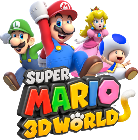
Let’s start with a recent game that while not limited to younger gamers, clearly is targeted at children and pre-teens: Super Mario 3D World. This game features several cartoon characters in a world of magic mushrooms, coins, and bells, where Mario has to rescue a “Sprixie” from the cartoon bad guy Bowser. The brand personality is young, colorful, fun, and perhaps just a little crazy. And the logo reflects that well. Take a look:
Now consider a different soft of game that targets an older, more mature audience: HALO. HALO is a first person shooter where the player tries to kill the bad guys set in a fictional future world where humans are battling religious aliens (called the Covenant) for survival. The action is semi-realistic and violent. The game is clearly intended for an audience more mature than that of Mario World. And again, the logo clearly reflects the difference:

Now imagine HALO’s logo designed in the Mario World font and colors. Or a Mario World logo with the stark cold lettering of the HALO logo. They simply wouldn’t work because they wouldn’t accurately reflect the brand personalities.
Now take another look at your logo. What is the brand personality your logo should be communicating. How is it doing?
#9. Does your logo communicate an idea?
A few weeks ago we wrote a bit about logos that communicate a specific story or idea—and how that might be a good thing for your logo. We’re not going to repeat that discussion here, except to say that it can be a visual help to your customers if your logo design includes this kind of visual short hand.
Some well-known logos that do this include FedEx, which has a forward pointing arrow within its design.
Chick-Fil-A ingeniously turns the Capital C into a chicken, reminding the customer who sees the logo that this is a chicken restaurant. In fact, when you see this logo, your eye “reads” the chicken icon before the rest of the logo, enhancing recognition.
One last example for the Pittsburgh Zoo. At first glance you see the tree, then you see the gorilla and the lioness. Nice.

For some reason our brains love these visual brain-teasers. And because your mind spends extra time figuring out the logo, it helps customers remember and like the design.
#10. If your logo doesn’t communicate an idea, what does it communicate?
While having a logo that quickly suggests an idea can be a good thing, that’s not the only option for your design. And in fact, it may not be the best option, especially if your logo needs to represent more than one idea. Disney and Proctor and Gamble have these kinds of logos.
Perhaps your logo simply needs to suggest a feeling of confidence or solitude. These kinds of things may be achieved by a great name and a color, or possibly by a simple icon (that doesn’t suggest a second meaning). This is the kind of thing we see a lot with consultants, attorneys, and investment brokers.
Another example may be helpful. Think of a large books store that sells non-fiction, fiction, poetry, magazines, study helps, and picture books. They sell mysteries and romance, as well as westerns and science fiction. And they sell a few games, note cards, and even fancy chocolate. What kind of logo can represent all of these products?

Waterstones, a large British book retailer (much like Barnes & Noble in the U.S.), has a very simple, font only logo. Nothing to indicate what kind of books you might find on their shelves. Rather their simple designs are effective at representing the wide variety of products you’ll find at these stores.
So what is your logo communicating with its colors, font, and icon (if you have one)?
#11. Does your logo stand out from your competitors?
The last thing you want is a logo design that looks to similar to your competitors. Especially if you are competing with other small companies in a small market.
Even big companies with similar products tend to carve out a unique space when it comes to their logos. Think of grocery stores, most of which carry the exact same products and very nearly the same prices. One of the only ways they have to differentiate is through the name over the door and the design of their logo.
The same is true for big brands selling commodities like Soda. Again, the main visual difference (and perhaps the only real difference) is the logo on the package.
Big businesses know this well. But what about small businesses?
In our hometown there are dozens of landscaping companies that offer the same kinds of services: lawn mowing, trimming, weed removal and fertilization. Even the flyers they use to promote their businesses look the same. One year we may hire AAA Landscaping to work in our yard, while the next year it’s Rick’s Landscaping. And to be quite honest, we’re not sure we’ve done it.
So if you are competing against similar companies offering similar services, does your name and logo create a unique visual reminder of who you are and what you do?
#12. Is your logo memorable?
This one is important, because even if you answer all of the above questions positively, have a great design, the right colors, and a beautiful logo, if people don’t remember it, you’ve failed.
Your logo’s job is to get noticed, liked, and remembered. That’s it.
So, what do people remember about your design?
#13. Are you asking your logo to do too much?
Your logo’s job is to get noticed and remembered. That’s about it. Bonus points if it includes a double meaning or represents a broad range of products or services.
Far too often, small business owners want their logo to do the work of a salesman too. They want to logo to explain what products a company has to offer. Or to explain the origin of the company. Or, in the case of cities and countries with logos, attract new travelers by helping them see all the unique things the area has to offer.
A logo simply can’t do all of this stuff. Entire websites often fail to do this well and they have unlimited space for graphics and content. How in the world is a logo supposed to do everything that a website or live salesperson often fails to do?
Keep it simple. A great name. A simple design that can represent the brand idea. One or two colors. Nothing extra.
What are you asking your logo design to do, that it can’t?
#14. Do people compliment your logo?
If you answered yes to this question, that’s a good sign. But go a step farther. Do your customers compliment your logo design? It’s one thing if your mother or best-friend likes the design. Quite another if customers like it—and return again and again because they remember it.
#15. If you were starting your business today, is this the logo you would choose?
This may be the most telling question of the entire list. Sometimes a business has a logo that is has outgrown. Or the company has changed its products or even its brand personality. A company that once appealed mainly to young people, may now be trying to appeal to the same customers as they grow older. Customers may become more sophisticated, styles change. And while your logo shouldn’t chase trends (see question #2), it should stay relevant.
So if you were sitting with your designer today and she presented your current logo as an option for your business, would you be enthusiastic about using it? Does it accurately represent your business or products? If yes, then you are in great shape.
If you answer no, it might be time to think about updating or creating an entirely new logo. Of course, we like to think that our Logomaker software could solve your problem. But if not, you might want to hire a live logo design (like the talented designers at Logodesign.com).
Either way, you deserve a logo that represents your business today.
Do you have a question you would recommend asking about your logo design? If so, let us know what it is in the comments.
