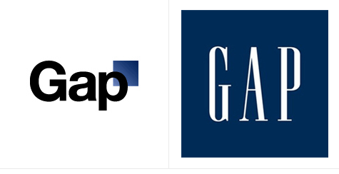
In the history of logo design there are lots of notable successes.
And a few logo disasters.
And while most of the logos-gone-bad belong to small businesses, plenty of big businesses have spent millions on logo designs and re-branding programs that fail badly. One of the worst logo re-designs in history, by far, is Gap’s.
Making sense of Gap’s rebranding blunder
After more than 20 years of consistent use, Gap announced a change to their well-known blue box logo. The new logo featured a small blue box in the top rich corner, almost like an asterisk to the name of the company. The reaction from customers was incredibly negative. It spawned a fake Twitter account mocking the change, Facebook pages calling for a restoration of the old logo, a fake logo generator that helped you to create your own bad logo (called CrapLogo), and dozens of online protests panning the change. The media response was just as bad. It didn’t take long for the Gap to reverse its decision (only 6 days, in fact) and opt to keep the old logo. Unfortunately, the clothing retailer had already sunk an estimated $100 million into the redesign, only to have to backpedal to the old version as quickly as possible.
So what lesson can a small business owner learn from this? Customers get attached to your logo. It represents their experience with your products and company. So once you’ve got a logo that works for you, stick with it. As one television sales person used to say, “Set it, and forget it!” Use your logo consistently. And if you absolutely need to update or change your logo in the future, incremental changes work best.


