Whether you already have a logo, or are considering a new logo design, you’ll want to make sure that what you end up with is right for your business or product. Perhaps your current logo just doesn’t seem to fit any more. Possibly it needs an update. Or maybe you are starting your search for a great logo design and want to make sure you end up with a logo that will last for years.
We’d like to help.
We’ve put together this short list of fifteen questions that every small business owner (or anyone else with a logo) should ask about their logo—to help make sure that the logo you end up with is right for your business. We’ve posted the fist seven questions here, and will post the last eight next week. Let’s get started:
#1. Is your logo design professional?
By asking this, we don’t mean was it designed by a professional. We’ve seen too many “professional” logo designers whose work looks cheap or unappealing. And we’ve seen thousands of logos made with our do-it-yourself logo design tool that look very professional.
Rather, we are asking, does it make your business look competent.
To illustrate, let’s take a look at a few examples. A small business owner running a confectionary or candy store might choose a logo that is whimsical and fun—something like the Willy Wonka logo would be perfect.
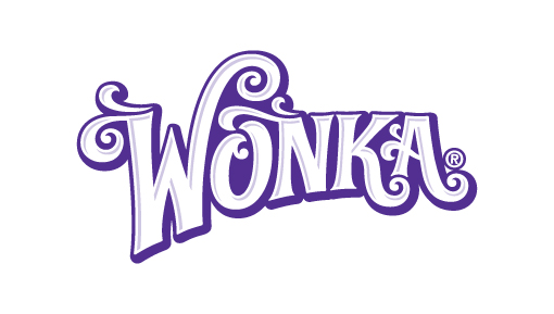
But as good as it is, that logo design is already taken, so we’ve got to come up with something else. The products our confectioner sells are meant to be eaten and enjoyed in the moment. The store will be full of colorful products and enticing treats—think chocolate bars and gummy bears. A logo design that is fun or even cute is perfectly appropriate and professional (these logos aren’t terribly good, but they illustrate the point).
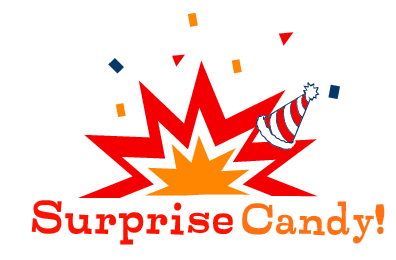
But try this same logo design for a law firm or an investment service and the message is completely unprofessional. In fact, it would be a branding disaster.
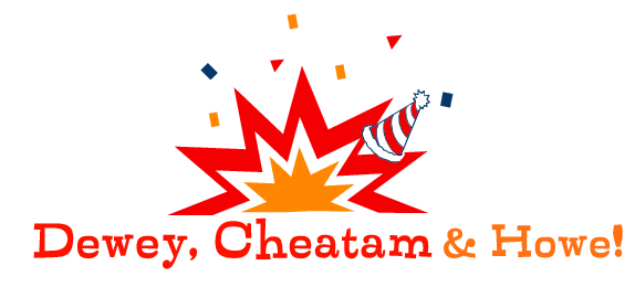
Nobody wants a lawyer who is playful and fun. Instead you want someone who is educated, hard working, and smart. A law firm wants to communicate its seriousness and capabilities with its logo. So the partners would be better off with a logo that conveys tradition and capability.
Make sure whatever logo design you choose, it helps you look competent and professional.
#2. Is your logo too trendy?
Every year, the folks at Logolounge release a report on the latest design trends they see in the thousands of logos that are uploaded to their site each year. Despite the shear numbers of new logos created every year, there are still several fashions or trends that seem to dominate the work done by hundreds of different designers.
Some of the trends are driven by the technologies designers use (like design programs that make it easy to create shadows or transparencies to show depth). Others trends are driven by the technologies used by customers (like the simplified logo favicons that show up near the URL in a browser).
No matter what the reason for the trend, designers like to create new designs that feel hip and new. Which is great for them, but might not be so good for your logo. A trendy logo might look great today, but in a few months or years will start to feel dated—a bit like bell-bottom jeans, bright neons shirts, and flannel grunge fashions.
Instead, if possible, your logo should be as timeless as possible (think the Golden Arches for McDonald’s or the target-like rings in Tide’s logo). When you have a logo that doesn’t need to be updated as the trends change, you will save time and money as well as have a brand that stays fresh and relevant.
#3. Does your logo appeal to your customers?
This question is critical to your business success. It’s harder to achieve than you might expect. Most small business owners and startup entrepreneurs choose a logo design based on the ideas, icons, and colors that appeal most to them (the business owner). The result is a logo that the owner loves, but which might not actually attract new customers.
It might be helpful to illustrate this with an example: Let’s imagine that Angela is a computer technology whiz. She has become an expert at finding and eliminating viruses, and setting up email systems, websites, and more. Now she’s ready to start her own business helping others with their computer problems. Angela knows a lot about computers so she chooses a very modern, technical-looking logo that reflects her computer genius.
But Angela’s customers are not computer experts. The very people who need her help don’t know anything about computers and aren’t at all comfortable with technology. Instead of being attracted to a techy logo, they may be turned off by a design that would appeal to someone like Angela.
Angela needs a logo that appeals to her customers. So when she chooses her logo design, she would be wise to show it to as many of her customers as possible and ask them how they feel about it and what it conveys.
Logos need to appeal to customers first. Business owners last.
#4. Does your logo design have too many colors?
For some reason we don’t really understand, small business owners have a thing for creating logos with lots of colors. Three. Four. More. Take a look at your logo.
Now take a look at the logos of your favorite brands. We’ve shown Coca-Cola, IBM, and Target here. You can think of others if you’d like. What do you see?

Most large and successful companies have logos that use just one color. We’re not saying that having a single-color logo will guarantee your success. But large companies are very effective communicators. They have big budgets to spend on advertising featuring their logos. And they’ve learned that simple logos are easier to remember than complex designs. On of the easiest ways to make your logo simpler is to use as few colors as possible.
Of the 50 most valuable brands in the world, 26 use just one color in their logo. 48 use two colors or less. The exceptions are Google and Microsoft. All of them have logos that are easily recognized when shown in only black and white.
Can your logo be simplified by using fewer colors?
#5. Does your logo design have unnecessary elements?
The software that professional designers use to create a logo comes with a lot of powerful features that allow designers to do some really cool things with their designs. They can add effects that make your logo look like metal (this was a common trend a few years back). They can add reflections and jelly effects that make your design look like it’s three dimensional. They can add shadows and transparencies.
But your logo may not need any of these effects to be a great logo. In fact, adding more than one may completely ruin your design. So before settling on a mark that includes any of these unnecessary elements, make sure you see a version without them as well.
And while we’re on the subject of unnecessary elements, please note that your logo design doesn’t need to include legal words like Inc, LLC, or Corp, even if the state where you incorporate requires you to use a legal term wherever your use your company name. (Your logo includes your company name, but it is not your company name—does that make sense?) Don’t believe us? Think back to those big corporate logos you like (and that we linked to above). Not one of them uses the word Corp. or Incorporated in their logo, even though all of them are corporations.
Like using fewer colors, using fewer unnecessary elements can make your logo more appealing and easier to remember.
#6. Does your logo work on a business card? Favicon?
This is really a question about the size of your logo. Is it recognizable when it is small? On a business card, your logo may be as small as just ½ inch wide. Sadly, when you shrink some designs down to that size, they look a bit more like a smudge of ink than an actual icon. Even more challenging is shrinking your logo to the size of a favicon (that’s the tiny logo you see in the URL address bar in your browser). Favicons measure just 16 pixels by 16 pixels, so they are very small. Does your logo design look good at that size? Could it?
#7. Where is your logo used the most?
Closely related to the previous suggestion is the question of where else you use your logo? Will your logo be printed on a T-shirt or embroidered on a hat? Will your logo appear on posters or billboards? Will you mostly use it online—on your website, or in an email footer? All of these uses will require design files of different sizes and types.
When you get your logo design, make sure you also get the appropriate files for the different uses. At the very least, get large and small JPG files for use online, large and small PNGs to use when the background color is something other than white (PNG files are transparent so the background will show through the “holes” in your logo), and an EPS file of your logo. The EPS file is a vector file that can be made larger or smaller without losing the resolution so your logo won’t look bitmapped when you put it on a poster. Most printers and embroiderers will require a vector file when working with your logo.
Knowing where you will be using your logo will help you know which kinds of files to request from your designer or logo design tool.
Note: the Logomaker software provides all of these files and more when you purchase high-resolution files.
That’s a lot to think about. So far we’ve covered seven questions, even though we promised fifteen. But we’ve been told that no one has time to read long articles these days, so stay tuned until next week for the last eight questions to ask about your logo design.
UPDATED: Read the last eight questions you should ask about your logo design here.
In the mean time, do you have a question to add? Let us know what it is in the comments.
