Trends aren’t always predictable. Designs that seem fresh and interesting can quickly lose context in a changing market.
Not to mention, early reactions can be completely wrong. Look at how the design community panned Instagram’s 2016 logo redesign, only to start copying the rainbow trend months later.
Being a trendsetter doesn’t protect brands from outdated logo syndrome, either. Too often, a new logo design trend gets used so much that people can’t wait for it to go away.
Have you noticed how cliche arcs and sunbursts inspire instant eye-rolling? All logos need an upgrade now and again, but a time-tested design has one important quality. It paves the way for a natural evolution that requires minor tweaking, rather than a major overhaul.
Creating a timeless logo design is an equal balance of luck and knowing your brand well. Some brands miss the mark and develop logos with a limited shelf life. Check out these logos from the past that couldn’t stack up to competitors today.
1. AirBnB
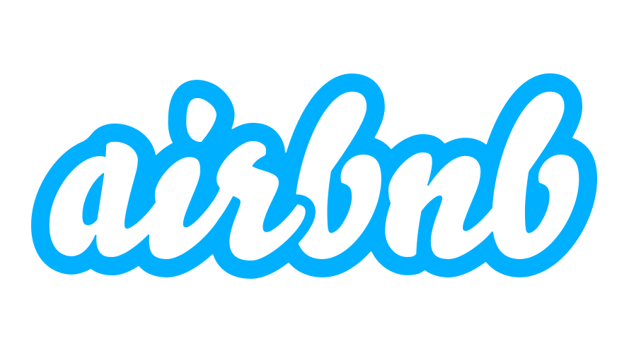
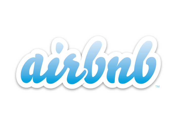
When AirBnB was founded in late 2008, the brand’s juvenile wordmark was probably just an afterthought. While hand-drawn script is going strong today, AirBnB frequently used the negative-space variant with chunky, bubble lettering that did little to distinguish the brand.
Sadly, the blue-script variant wasn’t much better. The cloudy outline is reminiscent of a junior high doodle. You almost expect to see hearts, stars, and exclamation points around it.
2. Reebok
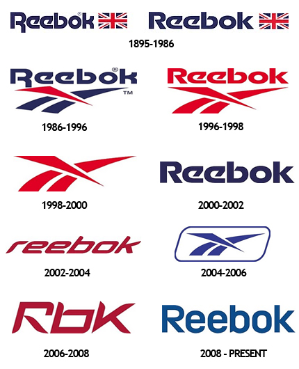
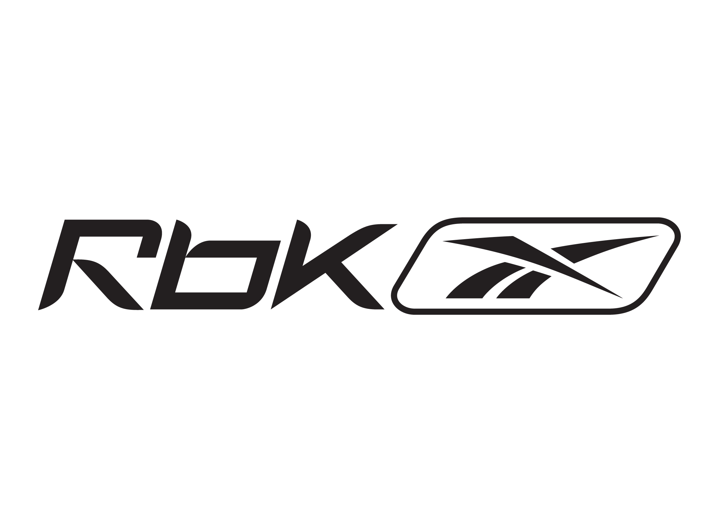
Reebok couldn’t seem to nail down a permanent logo design throughout the 2000s. From 2006 to 2008, the shoe company showcased a three-letter wordmark in a hideous font.
The logo featured a square typeface with tapered stems in random places that don’t seem to follow any consistent pattern. The end result is a confusing and unattractive look that doesn’t feel futuristic or sporty — just strange.
3. Hooters
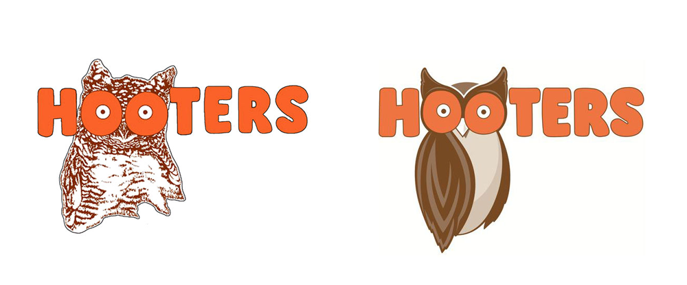
Admittedly, a trendy logo design isn’t the top priority for customers of Hooters. Still, the company made the right move by ditching the old logo in 2013 after using it for three decades.
The detailed artistic rendering of the famous Hooters owl is too busy for modern digital media. Unsurprisingly, the drawing was traced from a dictionary. The wobbly outline and hand-drawn lettering lacked the clean, clutter-free aesthetic of current logos.
4. Addicting Games
Just about anyone who owned a computer in the early 2000s is familiar with how easy it is to get sucked into endless rounds of internet games. AddictingGames.com perfected the art of entertaining people to the point of pleasant exasperation.
On the other hand, the company took far too long to redesign the wordmark used from 2006 to 2012. The logo typeface looks suspiciously like Comic Sans, the bane of modern designers.
The beloved font is fun, casual, and childish, which somehow made it one of the most frequently used typefaces of the 1990s and early 2000s. But in the professional design world, Comic Sans is an absolute no-no.
Using this outdated font is an instant sign your brand is behind the times and needs a makeover.
5. Dairy Queen
In 2007, Dairy Queen made an underwhelming update to its bright monogram logo…by adding pointless arcs. Random swoosh marks continue to frustrate the design community because they serve no purpose other than to make the design more festive.
One bright spot is the shift to a warmer serif font from the stark sans serif used since the 1960s. The majority of the DQ logo hinges on the red lips symbol, which is a bland representation of a fun ice cream and fast food brand.
Overall, the design is uninspired and dated. Not one single feature is unique or specific to the brand.
6. Doritos
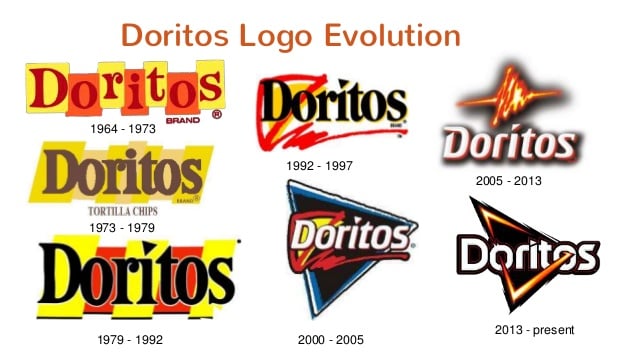
For eight years, the Doritos bag sported a pulse-shaped chip in a bright, flaming texture. The energetic logo certainly fit the company’s target demographic, but it lacked the versatility of later logos.
Today, the best brand visuals are designed with diverse multimedia in mind. Highly textured logos are hard to recolor for different uses or translate to digital environments.
Modern brands are moving away from logos with flashy visual effects, preferring simpler designs that are easier to reinvent for new marketing campaigns.
7. Spotify
Spotify’s original logo from 2008 isn’t bad — just out of touch with the industry. Technology and digital entertainment brands are at the forefront of the minimalist logo trend. Mobile-friendly icons are a must for these brands, so good logo design is all about doing a lot with a little.
Nowadays, sans-serif fonts are closely linked to digital and social media brands, and smart companies are emphasizing strong, recognizable icons over wordmarks.
This older Spotify logo also uses a mild, earthy shade of green, which doesn’t match up with a web-driven tech brand. Today, Spotify puts the radio wave icon at the forefront, making the brand easy to recognize in an app environment.
8. Twitter
Twitter has come a long way from the deranged bluebird that once graced its website. From 2006 to 2012, the Twitter mascot underwent frequent changes as the company struggled to find the right balance.
Although it was mainly used in development, the version from 2007 to 2009 is a good example of why it’s important to keep adjusting a design that doesn’t feel right. Originally known as Larry the Bird, this static mascot has terrifyingly vacant eyes, a pointy beak, and sharp wing tips that look less than friendly.
Unlike the company’s current logo, it lacked a genuine sense of movement or personality. Thankfully, Twitter didn’t give up on creating the perfect logo design.
9. Washington Wizards
What isn’t wrong with the Washington Wizards basketball team logo from 2008? The hokey design is like a clipart project gone horribly wrong. Not only are there two many elements, but it’s hard to take the wizard mascot seriously when he’s contorted into a strange samurai stance.
It’s also difficult to decide where your eyes should go, since there’s no true focal point in this overloaded design concept. The team used variations of this wizard mascot from 2007 to 2015 before retiring it for good.
10. Huggies
The Huggies logo of old combines several design elements that are now considered passé. Three-dimensional block letters. Drop shadows. You name it.
Huggies was one of many brands to jump on the 3D bandwagon, but now flat logos are the epitome of good design. Simplistic logos are less costly and challenging to print while removing distractions that take away from the brand image.
Huggies is still using a variation of this design in a warmer red hue, so the logo isn’t likely to get an overhaul anytime soon. Maybe, this classic brand can get away with block letters because of its child-oriented audience.
Keep the future in mind when you design a logo, but don’t get obsessed with trying to create an iconic look. Staying power is hard to predict, so it’s smarter to create a design you can subtly adapt over time without blindsiding your audience.
Ready to design your own logo? Browse thousands of designs with our free logo maker.
